

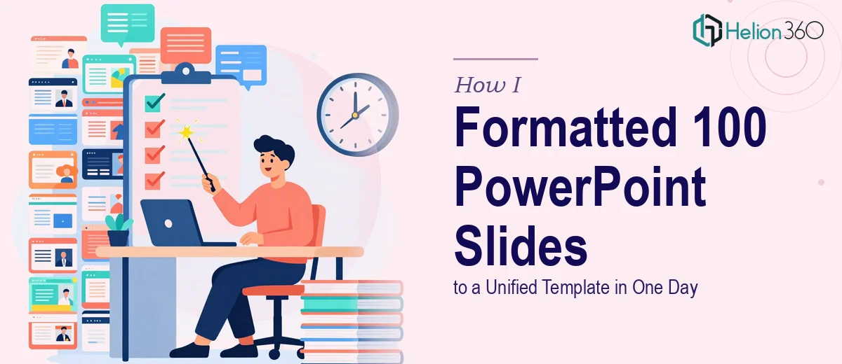
The Task Seemed Straightforward at First
We had a product launch coming up and 100 PowerPoint slides ready to go — introductions, feature breakdowns, customer testimonials, competitive comparisons, and a few summary sections. The content was solid. The problem was that the slides had been built by multiple people over several weeks, and it showed. Fonts were inconsistent, color usage was scattered, and spacing looked different from section to section.
The ask was clear: get all 100 slides formatted to a single, clean template before end of day. It sounded like a few hours of PowerPoint formatting work. I figured I could handle it.
Where It Started Breaking Down
I opened the file and immediately ran into the first problem — there was no existing template to apply. I had to build one from scratch based on our brand guidelines, then apply it uniformly across all 100 slides. That alone added an hour to the plan.
Then came the slide-level issues. Because each section had been built independently, the layouts varied significantly. Some slides had text boxes anchored to the wrong positions. Others had embedded images sized inconsistently. A few used custom fonts that weren't part of our brand system at all. Applying a master slide helped with some of it, but PowerPoint's Slide Master doesn't automatically fix everything — overrides, manual formatting, and embedded objects all had to be corrected individually.
By midday, I had worked through maybe 30 slides and the pace was not going to get me to 100 by the deadline. The formatting also needed to look sharp, not just technically consistent. Color hierarchy, font sizing for emphasis, and spacing around section headers all had to feel intentional across a 100-slide deck meant for a real product launch presentation.
Handing It Off
I reached out to Helion360. I explained the scope — 100 slides, one unified template, same-day turnaround — and shared the deck along with the brand guidelines. Their team asked a few focused questions about preferred layouts for specific slide types and confirmed the font stack. Then they took it from there.
What I handed off was a half-formatted, inconsistent deck. What came back was a clean, professionally formatted presentation where every slide followed the same visual logic. The template they built handled the title hierarchy, body text sizing, accent colors, and image placement in a way that actually felt cohesive across all 100 slides — not just technically compliant, but visually intentional.
What a Properly Formatted Deck Actually Looks Like
Seeing the finished version made something clear that I had underestimated: PowerPoint formatting at scale is not just about applying a theme. It's about making consistent decisions across every layout type — full-bleed image slides, text-heavy slides, data slides, quote slides — so that the deck reads as a single designed object rather than a collection of individual files stitched together.
The product launch content finally looked the way it should have from the start. The testimonial slides had consistent visual weight. The feature breakdown slides used the same grid structure. The section openers felt intentional and on-brand.
What I'd Do Differently Next Time
The lesson here was not that I lacked the skills — it was that formatting 100 slides to a production-ready template within a single workday is genuinely a high-volume task that requires both speed and design judgment simultaneously. Trying to do both under time pressure leads to shortcuts that show up in the final file.
For any deck above 30 slides, especially one tied to a product launch or external presentation, the smarter move is to get the right support early rather than discover the scope mid-task.
If you're facing a similar situation — a large deck that needs to look consistent and polished under a real deadline — Helion360 is worth reaching out to. They handled exactly what I couldn't finish alone, and the deck was ready on time.