

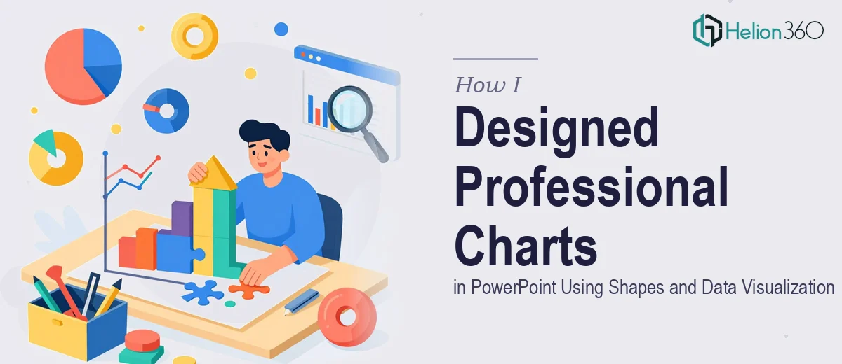
When a Simple Chart Request Turned Into a Real Design Challenge
I thought it would be straightforward. I had a dataset — a mix of financial performance figures and some scientific comparison metrics — and I needed to turn it into clear, visually polished charts inside a PowerPoint deck. Not the default bar charts that look like they came from a 2007 template. Custom charts, built using shapes, with proper axis labels, titles, legends, and gridlines that actually communicated something.
I had done basic PowerPoint formatting before. But this was a different level entirely.
The Problem With Default PowerPoint Charts
PowerPoint's built-in chart editor is functional, but it has real limits when you need something that looks deliberate and branded. I started by inserting standard chart objects and trying to customize them — adjusting colors, resizing elements, tweaking fonts. The results looked fine at first glance, but when I zoomed out and looked at the full slide, everything felt off. The proportions were awkward, the data labels overlapped, and the gridlines were either too heavy or invisible.
The bigger issue was that I was being asked to build charts using shapes — manually constructed visual elements that mimic chart behavior but give you full control over every detail. That meant drawing individual bars, arcs, and data points using PowerPoint's shape tools, then aligning them precisely to represent accurate values. It sounds manageable until you're dealing with twelve data series and a tight deadline.
I tried a few approaches. I experimented with grouping shapes and using the align and distribute tools to get consistency. I watched tutorials on building infographic-style charts. I even tried importing chart images from Excel and overlaying shape layers on top of them. Each method had trade-offs — either the accuracy suffered or the visual quality did.
Where It Got Beyond What I Could Manage Alone
The sticking point was precision. When you build custom charts using shapes in PowerPoint, every element has to be mathematically consistent with the underlying data. A bar that should represent 74% cannot just look roughly tall enough — it needs to scale correctly relative to the others, or the chart misleads the reader. Getting that right manually, across multiple chart types, while also maintaining clean typography and consistent spacing, was consuming far more time than I had budgeted.
That is when I reached out to Helion360. I explained the project — the chart types needed, the data sources, the visual standards required — and their team took it from there.
What a Proper Shape-Based Chart Design Actually Looks Like
The work that came back was a clear demonstration of what data visualization in PowerPoint should look like when done properly. Each chart was built with shapes that scaled accurately to the data values. The axis labels were clean and consistently sized. Legends were positioned logically without crowding the chart area. Gridlines were subtle — present enough to guide the eye, but not competing with the data itself.
What impressed me most was the treatment of the financial data. The charts for that section used a restrained color palette that made percentage changes easy to read at a glance. The scientific comparison slides used a different visual language — more technical in layout, with precise value annotations — but still looked like they belonged in the same deck.
Helion360 also built in some dynamic formatting, where changing the underlying values would update the visual proportions of the shape-based charts without requiring a full rebuild. That kind of forward-thinking structure saved a significant amount of time during the revision stage.
What I Took Away From the Process
Building custom charts using shapes in PowerPoint is genuinely a specialist skill. It sits at the intersection of design thinking, data accuracy, and software expertise. Understanding how to represent data honestly while making it visually engaging — with the right use of color, scale, and layout — is not something that comes from a single afternoon of tutorials.
The charts I ended up with were the kind that make an audience trust the data being presented. That credibility comes from details: consistent proportions, readable labels, clean hierarchy, and nothing decorative that does not serve the information.
If you are working on a deck that requires this level of chart design and are hitting the same walls I did, Helion360 is worth reaching out to — they handled the complexity precisely and delivered work that held up under close scrutiny. For similar transformations, see how others have tackled raw Excel data into branded PowerPoint charts and converted Excel data into interactive dashboards.