

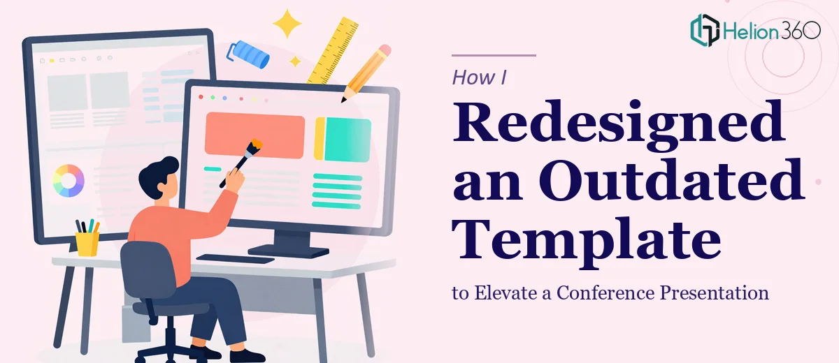
The Template Had Done Its Time
We had a conference coming up in less than two weeks, and the PowerPoint template our team had been using for nearly three years was painfully obvious in its age. Mismatched fonts, inconsistent color blocks, clip-art-era icons, and slides that just felt heavy and cluttered. It was not a bad deck when it was first built, but design standards move fast, and this one had not kept up.
I volunteered to take on the PowerPoint redesign. I figured I had enough of a handle on the basics to get it done — update the fonts, tighten the layout, maybe swap in some modern icons. A few evenings, and it would be sorted.
I was wrong about how long it would take.
Where the Self-Directed Redesign Fell Apart
The structural problems ran deeper than I expected. The slide master was a mess of overrides, which meant any change I made in one place broke something in another. The color palette had no real logic to it, so when I tried to create a cohesive visual theme, everything looked patched together rather than intentional.
Beyond the technical issues, I kept second-guessing the design decisions themselves. Should this be a two-column layout or a full-width visual? Is this typography hierarchy actually readable at a distance? Does this slide feel like it belongs to the same presentation as the one before it? These are not questions I was equipped to answer quickly, especially with a deadline closing in.
After two full evenings of slow progress and undoing my own changes, I accepted that this needed someone who does this work professionally.
Handing It Off to a Team That Knew What They Were Doing
A colleague pointed me toward Helion360. I sent over the existing file, explained what the presentation was for, shared our brand colors, and described the tone we were going for — modern, clean, professional without being stiff. The kind of deck that looks polished on a large conference screen.
What I appreciated was how quickly they grasped the scope. They did not just apply a coat of paint over the old template. They rebuilt the slide master properly, established a real design system across layouts, and made deliberate choices about typography, spacing, and visual hierarchy that actually held together across every slide.
What the Redesigned Presentation Looked Like
The difference between the before and after was significant. The redesigned PowerPoint template had a clean grid structure, intentional use of white space, and a typography system that made the content easier to follow without effort. Icons were consistent in weight and style. The color usage was purposeful — accent colors appeared where they needed to draw attention, not scattered randomly across slides.
More importantly, it worked as a system. Every layout variation — the title slide, the section dividers, the content slides, the data slides — felt like it belonged to the same family. That coherence is hard to achieve when you are improvising, and it made a noticeable difference when presenting on stage.
Helion360 delivered the file ahead of the deadline with clear layer naming and a brief note on how the master slides were organized, which made it easy for us to make last-minute content edits without breaking anything.
What This Experience Taught Me About Presentation Redesign
A PowerPoint redesign for a conference presentation is not just a visual task — it is a structural one. Getting the slide master right, maintaining consistency across layout types, and building something that scales without falling apart under pressure requires a level of design thinking that goes beyond knowing your way around the software.
I also learned that tight deadlines and complex design work are a bad combination when you are learning on the job. The time I spent struggling through the first two evenings would have been better spent preparing the actual content and speaker notes. Knowing what to delegate is its own kind of skill.
If your team is sitting on an aging PowerPoint template and a deadline is coming up, Helion360 is worth reaching out to — they handled what I could not and delivered a presentation that held up on the day.