

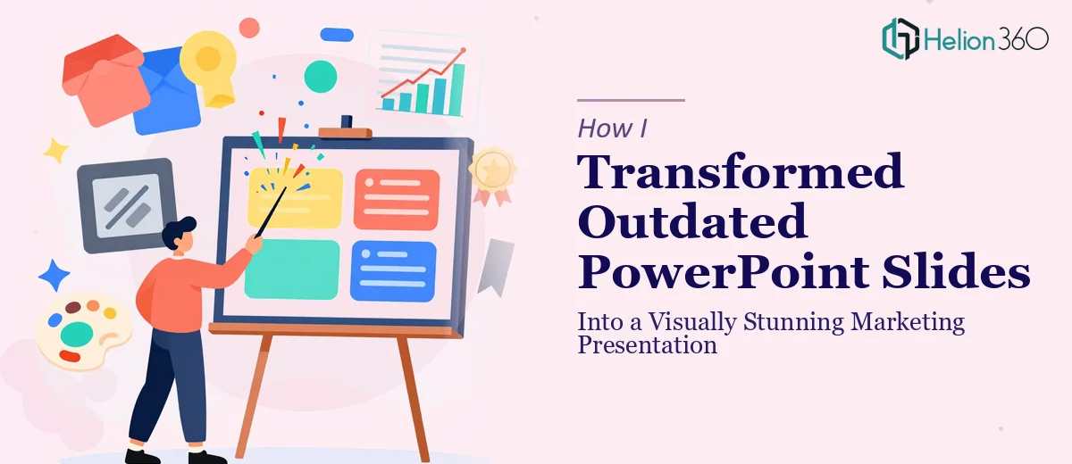
The Slides Were Holding the Campaign Back
We had a marketing campaign lined up — one we had spent weeks planning. The messaging was solid, the offer was clear, and the timing felt right. But when I opened the PowerPoint file we planned to use for the presentation, I immediately knew we had a problem.
The slides were outdated. Text-heavy, inconsistently formatted, mismatched fonts, and visuals that looked like they belonged to a different era entirely. For an e-commerce startup trying to make a strong first impression, these slides were doing the opposite of what we needed.
I decided to handle the PowerPoint revamp myself. How hard could it be?
What I Tried on My Own
I started by rearranging the layout on a few slides, swapping out some placeholder images, and adjusting the font sizes. It looked slightly better but still felt flat. The visual hierarchy was off — there was no clear flow from one idea to the next, and the color palette felt random rather than intentional.
I then spent time watching tutorials on slide design, trying to understand color theory and how to use it properly in a marketing context. I experimented with a few icon sets and tried building some simple charts to replace walls of text. Progress was slow, and every fix seemed to create a new inconsistency somewhere else in the deck.
The bigger issue was that I was spending hours on design decisions that a trained eye would make in minutes. We had a campaign deadline approaching and a presentation that still didn't reflect the quality of the product we were actually building.
Bringing in a Team That Knew What They Were Doing
After hitting that wall, I came across Helion360. I sent over the existing file along with a brief explaining the campaign context, the audience, and what kind of look and feel we were going for. Their team asked a few clarifying questions about brand colors and the tone we wanted to strike — professional but approachable — and then got to work.
What came back was a fully redesigned presentation. Every slide had been rebuilt with a consistent visual structure. The layout used proper visual hierarchy to guide the reader's eye naturally from headline to supporting detail. The color palette was cohesive and aligned with our brand. Icons and custom graphics had replaced the cluttered text blocks. Charts were clean and readable at a glance. Even the slide transitions felt purposeful rather than decorative.
This wasn't just a cosmetic cleanup. It was a complete PowerPoint redesign that elevated the entire deck.
What the Revamped Presentation Actually Delivered
When I shared the updated slides internally, the reaction was immediate. People who had seen the old version could not believe it was the same presentation. The new version communicated the same content, but it did so in a way that felt polished, credible, and campaign-ready.
More importantly, it held attention. The visual storytelling was there in a way I simply could not have achieved working alone in my spare hours. Each slide had a clear purpose, the data visualization was easy to read, and the overall flow made the pitch feel confident rather than scattered.
We used it for our marketing campaign presentations and the feedback we received on the deck itself — not just the content — was genuinely positive. Stakeholders mentioned how professional it looked compared to what they typically see from early-stage startups.
What I Took Away From This
A PowerPoint revamp sounds simple on the surface. In reality, transforming a tired, inconsistent deck into a visually stunning marketing presentation requires a real understanding of layout design, color theory, visual hierarchy, and how people actually process information on a slide. These are not skills you pick up in an afternoon.
The time I spent trying to fix the slides myself was time I could have spent on the campaign strategy. Knowing when a task exceeds your current bandwidth — and acting on that quickly — is its own kind of skill.
If you're sitting on a deck that isn't doing justice to the work behind it, Helion360 is worth reaching out to. They took a presentation I had nearly given up on and turned it into something our whole team was proud to put in front of an audience.