

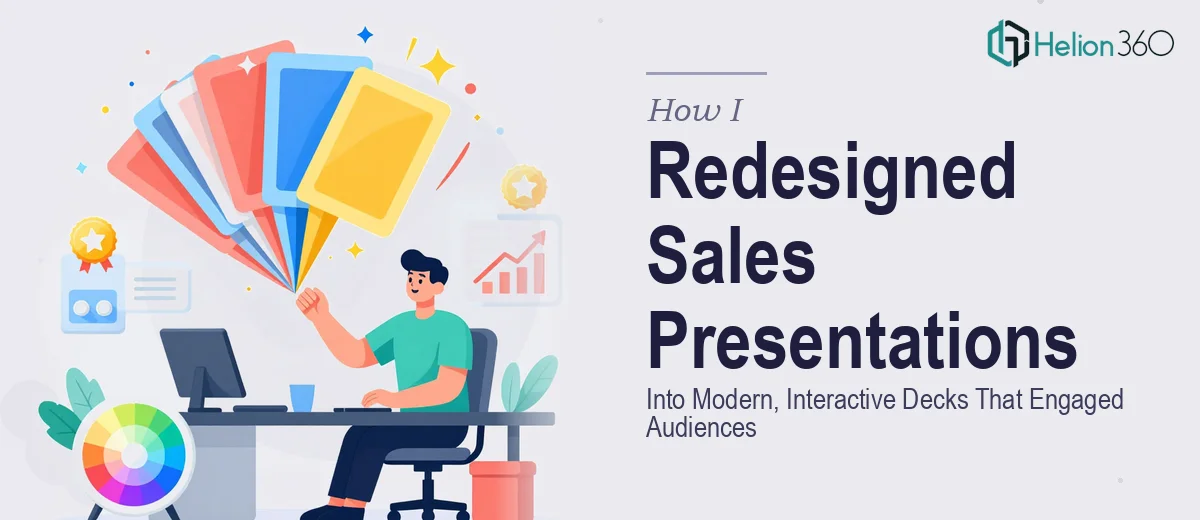
When Your Sales Deck Stops Doing Its Job
I had a set of sales presentations that had been in rotation for a couple of years. They covered all the right points — services, pricing, case studies — but every time I sat down to review them before a meeting, something felt off. The slides looked tired. The fonts were inconsistent, the layouts felt cramped, and the whole thing gave the impression that the company had not evolved since the decks were first built.
The problem was not the content. The underlying message was solid. But visually, the decks were not keeping up with what we were selling. When you are trying to present services professionally, the presentation itself becomes part of the pitch. Ours was quietly undermining us.
What I Tried to Fix on My Own
I opened the files and started making small edits — swapping colors here, adjusting font sizes there, replacing a few stock photos. It improved things slightly, but it created new inconsistencies. Different slides started pulling in different directions. The branding was not cohesive, and I realized I was patching holes in a structure that needed a full rebuild.
The bigger issue was interactivity. I wanted the redesigned sales deck to include clickable navigation, links to supporting resources, and embedded video references — things that would make the presentation feel less like a static handout and more like an experience. That level of work required a systematic approach I did not have time for.
I also had multiple decks to handle, each tailored to a different service line, which multiplied the complexity significantly.
Bringing in a Team That Could Handle the Scope
After hitting that wall, I came across Helion360. I explained the situation — outdated sales PowerPoint files, inconsistent branding, no interactive elements, and multiple decks that needed to feel like part of the same system. Their team understood the brief immediately and asked the right follow-up questions about audience, tone, and brand guidelines.
What followed was a structured redesign process. They started by establishing a master template — one set of layouts, one color palette, one type system — that would serve as the backbone for all the decks. Every slide would pull from the same visual language, which immediately solved the inconsistency problem.
What the Redesigned Decks Looked Like
The finished presentations were a significant step up from what we had started with. The layouts were clean and modern, with enough white space to let the content breathe. High-quality imagery replaced the generic stock photos, and every graphic element was aligned to the brand.
More importantly, the decks were actually interactive. Helion360 built in clickable section tabs so presenters could jump to any part of the deck without scrolling through everything linearly. Specific slides included hyperlinked call-outs that connected to external resources and case study pages. One deck had a video thumbnail placeholder built directly into a slide, formatted so the link opened cleanly during a live presentation.
Navigating the slides felt intuitive. A sales rep could move through the deck fluidly depending on what the conversation called for, rather than being locked into a fixed sequence.
What Changed After the Redesign
The immediate difference was confidence. Before, I would apologize for the slides before the meeting started. After the redesign, I was happy to put them on screen. The visual upgrade made the services look credible and current, which is exactly the job a sales presentation is supposed to do.
The consistent branding across all decks also made them easier to update going forward. Because everything was built on a shared template system, dropping in new content or refreshing a section did not break the overall design.
I also picked up a few things about what makes a sales presentation work: clarity over density, navigation that serves the presenter, and visual design that reinforces the message rather than competing with it. These are not complicated ideas, but executing them across multiple decks without a coherent system is genuinely difficult.
If your sales presentations are in a similar state — functional but tired, or visually inconsistent across versions — Helion360 is worth reaching out to. They handled the full scope of what I needed and delivered decks that were ready to use in front of real audiences.