

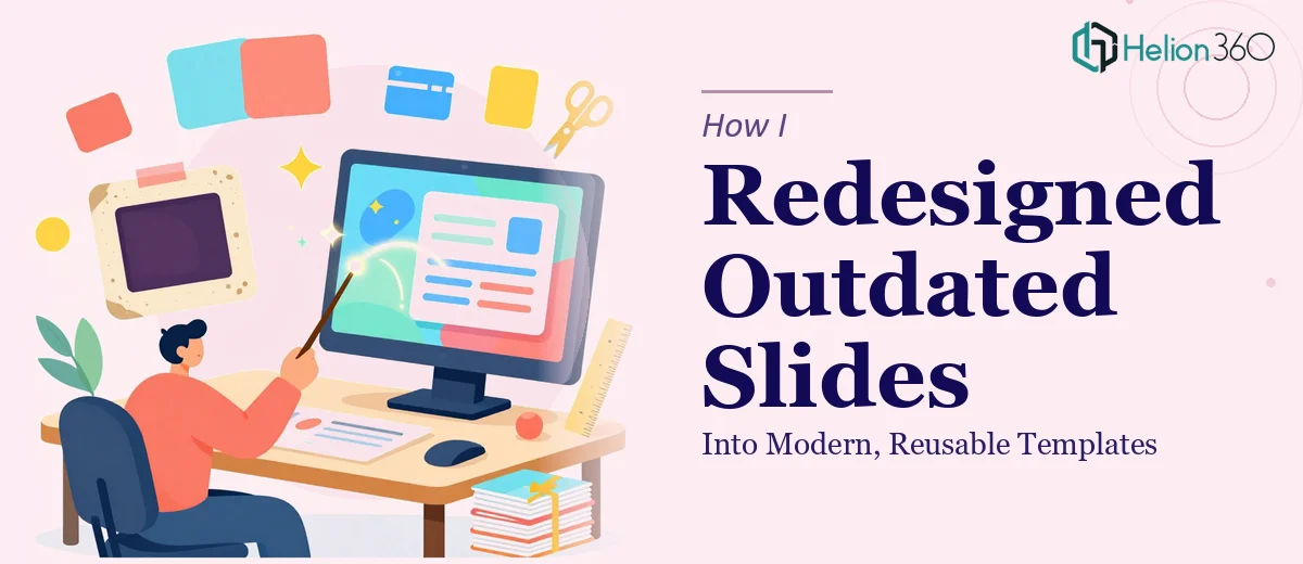
The Deck Was Functional — But It Looked Like It Was Built in 2009
I had a presentation that had been in use for a while. The content was solid, the structure made sense, and the information was accurate. But every time I opened the file, I felt a quiet sense of dread. The slides looked dated — mismatched fonts, heavy text blocks, inconsistent spacing, and colors that had no clear logic behind them. It worked, technically. But visually, it was a mess.
The bigger issue was that this wasn't a one-off deck. It was something we returned to regularly, updating slides here and there. Which meant the inconsistency compounded over time. Every new addition just made things worse.
I knew it needed a full rebuild, not just a polish.
I Tried to Fix It Myself — and Quickly Realized the Scope
I started by trying to clean things up on my own. I picked a new font pairing, adjusted some colors, and reworked a couple of slides. It looked better — but only in isolation. When I viewed the deck as a whole, nothing felt cohesive. The slides I had touched looked different from the ones I hadn't. And I still hadn't solved the core problem: we needed a set of reusable slide templates, not just a prettier version of what already existed.
Building a proper presentation template system is a different kind of work. It's not about making one slide look good. It's about designing a framework — master layouts, consistent type hierarchy, placeholder logic, color systems — that anyone on the team can use and extend without breaking the visual language.
That's where I hit a wall. I knew what I wanted, but I didn't have the bandwidth or the design depth to build it properly.
Bringing in the Right Help
After a bit of searching, I came across Helion360. I explained the situation: an existing deck that needed a full visual overhaul and a set of standard slide templates we could reuse going forward. Their team asked the right questions — about our brand, how the deck was typically used, what kinds of slides came up most often, and what platforms we were working in.
I sent over the original file along with our logo and brand colors. From there, they took over.
What the Redesign Actually Involved
The Helion360 team didn't just restyle the existing slides — they rebuilt the deck from the ground up with a proper design system behind it. The typography was cleaned up into a clear hierarchy that made the content easier to scan. The color palette was structured so there was a primary, a secondary, and a set of accent tones — all consistent across every slide.
They also created a set of master slide templates covering the most common layouts: title slides, content-heavy slides, image-with-text combinations, data summary slides, and section dividers. Each one was built so that dropping in new content wouldn't require any design decisions. The layout would just work.
The result was a deck that looked intentional — like someone had actually planned how it should look, rather than built it slide by slide over several years.
What I Took Away From the Experience
The biggest lesson was the difference between editing a presentation and designing a presentation system. I had been doing the former for years without realizing the latter was even an option. Once you have a proper template structure in place, updating or expanding a deck becomes much faster — and the output stays consistent regardless of who touches the file.
The presentation redesign also made it easier to present confidently. When the slides look polished, you spend less mental energy worrying about how things look and more on what you're actually saying.
If your current deck has been patched together over time and you know it needs more than just a cleanup, Helion360 is worth reaching out to — they handled both the visual rebuild and the template system, and delivered something the whole team could actually use going forward.