

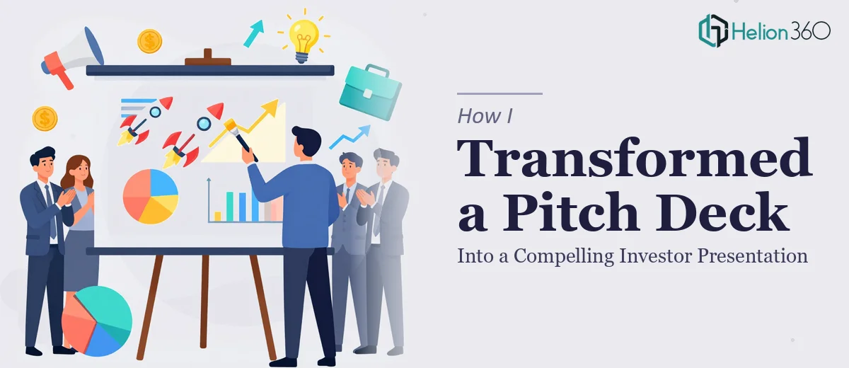
The Deck Was There. The Problem Was Everything Underneath It
I had a pitch deck. Slides existed, the content was technically present, and the meeting with investors and partners was already on the calendar. But when I sat down and read through it honestly, I knew it wasn't doing the job. The value proposition was buried. The story jumped around. Some slides were visually dense, others felt empty. And the overall impression it left wasn't the one we needed to make.
This wasn't a low-stakes internal update — this was a room full of people who would be making real decisions about our company's direction. The deck needed to communicate our unique value proposition clearly, show credible growth potential, and move the audience from curiosity to conviction. That's a very different bar than "has the right information somewhere on the slides."
I recognized quickly that this needed more than a cosmetic touch-up. A compelling investor presentation requires a specific kind of thinking — part narrative strategy, part visual craft — and I wasn't going to get there by spending evenings rearranging slides.
What I Found a Strong Pitch Deck Actually Requires
Once I started researching what separates a forgettable pitch from one that lands, the scope of the work became clear fast.
The first thing that struck me was how much narrative architecture matters. Investors don't absorb slide-by-slide facts — they follow a story. The sequence of the pitch has to build a case: problem, solution, market, traction, team, ask. Each section has to earn the next. Getting that sequence wrong, or letting the logic break down between slides, is enough to lose the room.
The second thing was visual communication depth. An investor presentation isn't a document — it's a visual argument. Charts need to be the right type for the claim being made. Text needs to be ruthlessly edited. Layout decisions affect what gets read first, what gets skipped, and what gets remembered.
The third signal was the polish and consistency requirement. A deck with inconsistent font sizes, misaligned elements, or off-brand color use signals carelessness — and that signal gets read by people deciding whether to trust you with money. Small visual inconsistencies carry disproportionate weight in high-stakes rooms.
That's when I was clear: this was not a weekend project.
What the Refinement Work Actually Involves
Refining a pitch deck for investors starts with a full narrative audit. The right approach maps every slide against the story the audience needs to follow — problem framing, solution clarity, market sizing, traction evidence, team credibility, and the ask. Each of those sections has a job to do, and the job changes depending on what the audience already believes walking in. Restructuring the flow means making deliberate choices about what leads, what follows, and what gets cut entirely. That editorial judgment — knowing what to remove as much as what to add — is where most self-edited decks fall apart. People overestimate how much context an audience will carry from one slide to the next.
Visual mechanics are the second layer, and they're more exacting than most people expect. A well-executed investor presentation uses a consistent layout grid — typically a 12-column system — with a clear typographic hierarchy: headline at 36pt, subhead at 24pt, body at 16pt, with no deviations. Charts are selected by data type, not aesthetics: a bar chart for comparisons, a line chart for trends, a single bold callout number when the data point is the whole argument. Getting these decisions right across 15 to 20 slides, while keeping everything visually coherent, means working inside a system — not making one-off design calls per slide. Without that discipline, the deck looks inconsistent even when the content is strong.
Polish and brand consistency close the gap between a deck that looks professional and one that looks assembled. That means a controlled palette — typically no more than 4 brand colors applied with strict rules about where each one appears — along with consistent icon style, aligned imagery, and margin discipline across every slide. The execution friction here is real: applying this level of consistency retroactively across an existing deck takes longer than building it from scratch, because every slide needs to be audited individually. One misaligned text box or slightly off-hex brand color, and the cumulative effect undermines the credibility the visual system was supposed to build.
Why I Brought in Helion360 to Handle It
I looked at what the work actually involved and made a straightforward decision: I wasn't going to attempt this myself. Not because the individual pieces are mysterious, but because doing all of them well — narrative restructuring, visual system, and polish — simultaneously, on a deadline, requires a team that does this work every day with the tooling already in place.
Helion360 handled the full project end-to-end. That meant auditing the existing deck and rebuilding the narrative flow, designing a consistent visual system aligned with our brand, and delivering a presentation that was ready to walk into a room. They turned it around quickly — done in days, not weeks — which mattered given the timeline we were working against.
What made the difference wasn't just the design output. It was the depth of execution: the story held together, the visual hierarchy made the right things land, and the overall deck felt like it had been built with a clear purpose rather than assembled slide by slide.
The Result and What I'd Tell Anyone Who Sees What I Saw
The final deck was a materially different document. The narrative moved cleanly from problem to ask without losing the audience. The value proposition was visible within the first two slides. The visual consistency made the whole thing feel considered and credible — which, in an investor meeting, is part of the argument you're making.
The meeting went well. The deck did the job it was built to do: it gave the people in the room a clear, confident picture of what we're building and why it's worth their attention.
If you're looking at a similar situation — a deck that has the right information but isn't landing the way it needs to — Helion360 is the team I'd engage. They handled the full scope fast, and they brought the kind of execution depth this work genuinely requires.