

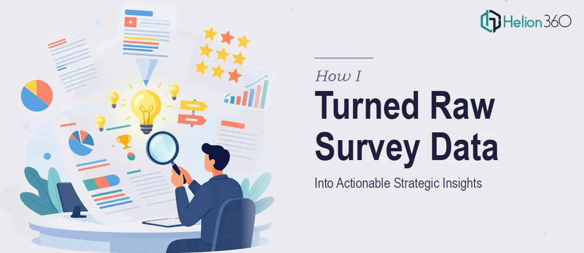
When the Data Was There but the Story Wasn't
We had run a comprehensive alumni survey — hundreds of responses covering everything from career outcomes to institutional satisfaction. The data was rich, varied, and genuinely valuable. The problem was that it was sitting in a sprawling spreadsheet, and no one on the team had the bandwidth to make sense of it properly.
I took it on myself to start the analysis. I knew the basics of Excel and had worked with data before, but this was a different level of complexity. The survey had both quantitative questions with numerical scales and open-ended qualitative responses. Cleaning the data alone took hours. Then came the task of identifying trends, cross-tabulating responses by graduation year and program, and figuring out which findings actually meant something strategically.
Where the Complexity Started Stacking Up
The more I dug in, the more I realized how much was buried in the numbers. Alumni sentiment varied significantly depending on the program type. Engagement rates told one story, but when I looked at motivation and post-graduation outcomes together, a different picture emerged. I was making progress, but it was slow and I wasn't confident the insights I was pulling were as complete or accurate as they needed to be.
The goal was not just to summarize the data — it was to present findings in a way that could influence real strategic decisions. That meant the analysis had to be thorough, the visualizations had to be clear, and the final presentation had to speak to leadership without requiring them to interpret raw numbers themselves.
I spent time building pivot tables, experimenting with chart formats, and drafting a few slides. But the more I worked on it, the more I felt I was doing three jobs at once — analyst, data visualizer, and presentation designer — and none of them as well as they needed to be done.
Bringing in the Right Help
After hitting that wall, I reached out to Helion360. I explained what the project needed: Data Analysis Services, meaningful insight extraction, and a presentation that could translate findings into strategic recommendations. Their team asked the right questions upfront — about the audience, the key decisions the data needed to support, and the level of detail required.
From there, they took over the heavy lifting. The data analysis side involved cleaning and structuring the survey responses, segmenting alumni by relevant cohorts, and identifying the trends that had the most strategic relevance. On the presentation side, they built a clean, organized deck that used data visualization to make the findings immediately readable — comparison charts, trend lines, and summary callouts that gave leadership exactly what they needed at a glance.
What the Final Deliverable Looked Like
The finished presentation covered key themes across alumni engagement, career outcomes, program satisfaction, and institutional recommendations. Each section led with the core finding, supported it with the relevant data visualization, and closed with a practical implication. It was structured the way a good research presentation should be — not just data on slides, but a clear narrative built from evidence.
The qualitative responses had been grouped and interpreted thoughtfully, so the open-ended feedback didn't get lost or treated as decoration. It was woven into the story alongside the numbers, which made the overall picture much more persuasive.
Leadership walked through the deck and immediately flagged three areas they wanted to act on. That kind of response doesn't happen when a presentation is just numbers in a table. It happens when the data has been genuinely analyzed and communicated with intention.
What I Took Away From This
Alumni survey analysis looks manageable on the surface. But when the data is complex, the audience is senior, and the stakes involve real strategic decisions, doing it properly requires more than spreadsheet skills. It requires someone who can hold the analysis and the communication together at the same time.
If you're sitting on survey data that needs to become a clear, decision-ready presentation and the scope is bigger than one person can handle cleanly, Helion360 is worth reaching out to — they handled exactly that for this project and delivered something the team could actually use.