

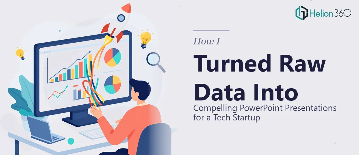
When Your Data Is Ready But Your Slides Are Not
We had the numbers. We had the research. We even had a rough narrative about where the company was headed. What we did not have was a way to put it all together in a format that anyone outside our team could actually follow.
I was handling marketing for a fast-growing tech startup, and part of my role involved creating PowerPoint presentations for investor check-ins, partner meetings, and internal strategy reviews. On paper, that sounds straightforward. In practice, it was anything but.
The raw data we were working with included growth metrics, user behavior trends, product roadmap timelines, and competitive positioning data — all sitting in spreadsheets, Google Docs, and half-finished slides that had no visual consistency. Every time I tried to stitch it together into something presentable, it either looked cluttered or stripped too bare to be useful.
The Gap Between Data and Visual Storytelling
I tried several approaches before accepting I needed help. I started by using standard PowerPoint templates, but none of them accommodated the density of information we needed to communicate. Then I spent time rebuilding slides from scratch, adjusting layouts manually and experimenting with chart styles. That took hours and still did not produce anything that felt professional or cohesive.
The core problem was not that I lacked access to the data — it was that translating complex startup metrics into clear, visually compelling slides requires a very specific skill set. Understanding what to emphasize, how to simplify without losing accuracy, and how to build a visual flow that guides the viewer through the story — that combination was harder to execute than I anticipated.
I also realized that our brand was still young. There were no established slide templates, no approved color palette applied consistently, and no visual system to keep everything aligned. Every presentation looked like it came from a different company.
Bringing In the Right Support
After hitting that wall, I came across Helion360. I explained the situation — raw data, no visual system, multiple presentation types needed — and their team took it from there.
What stood out immediately was that they did not just ask for the files and start designing. They took time to understand the message behind the data. They asked about the audience for each deck, what decisions those presentations needed to support, and what the startup's brand direction looked like. That context shaped everything.
They built a visual framework that worked across presentation types — a consistent slide structure, a clean data visualization style for our charts, and a layout system that made it easy to add or rearrange content without breaking the look. Each chart was rebuilt to highlight the most relevant data point rather than just displaying everything at once.
What the Finished Presentations Actually Did
The difference between what I had handed over and what came back was significant. The investor-facing deck told a coherent story from problem to solution to traction, with supporting data presented in a way that was easy to scan and hard to misread. The internal strategy deck used the same visual language but was structured for a different kind of audience — one that needed detail and context, not just highlights.
Meetings that previously required me to spend time explaining our slides became much more focused on the conversation itself. That shift was noticeable.
On the production side, having a proper slide system meant future updates took a fraction of the time. Adding a new data set or swapping out a chart no longer required rebuilding the entire layout from scratch.
What I Took Away From This
Turning raw data into compelling PowerPoint presentations is a discipline that sits at the intersection of design, data literacy, and communication strategy. It is not just about making things look good — it is about making information work for the audience, not against them.
For a startup especially, where every presentation either builds or erodes credibility, the quality of those slides matters more than most teams realize early on.
If you are in a similar position — sitting on solid data but struggling to turn it into presentations that actually land — Helion360 is worth reaching out to. They handled what I could not and delivered a system that kept working long after the initial project was done.