

When a Dense Document Needs to Communicate Clearly
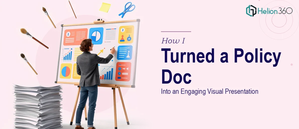
I had a 10-page policy document that needed to reach a non-specialist audience — employees, stakeholders, and new team members who were never going to sit down and read it cover to cover. The document was thorough, but it was written for compliance, not communication. Dense paragraphs, nested clauses, footnotes. The kind of material that causes eyes to glaze over in the first two minutes of a meeting.
The stakes were real. This wasn't a nice-to-have. The information in that document needed to land — people needed to understand it, retain it, and be able to act on it. A presentation that just reproduced the text in bullet points wasn't going to cut it. I needed something that actually worked as a visual communication tool. It was clear to me pretty quickly that this needed to be done properly.
What I Found the Solution Actually Required
I started looking into what a proper document-to-presentation conversion actually involves, and the gap between "good enough" and "done well" was wider than I expected.
The first thing that became obvious is that this isn't a copy-paste exercise. The content has to be restructured entirely — the logic of a written policy document and the logic of a slide-based visual presentation are fundamentally different. One is built to be read linearly; the other has to work in fragments, with each slide carrying a single clear idea.
The second thing I noticed is that visual hierarchy rules are non-negotiable if the presentation is going to be readable. Font sizing, whitespace, and color weight all have to do specific jobs. And third, turning policy language into plain-language summaries without losing accuracy is genuinely skilled editorial work — it's not something you can rush without introducing errors or stripping out meaning that matters.
That combination — structural rethinking, visual mechanics, and careful editorial judgment — made it clear this wasn't a weekend project.
What the Work Actually Involves
The first layer of work is the structural and narrative audit. A 10-page policy document typically contains multiple themes, procedural steps, exceptions, and definitions — all mixed together. Doing this well starts with mapping every distinct idea in the source document, grouping related concepts, and building a slide-by-slide narrative arc that a non-specialist can follow. In practice, this means the practitioner is deciding what belongs on its own slide, what gets consolidated, and what gets cut entirely — which requires editorial judgment about what the audience actually needs to know versus what was written for legal or compliance completeness. Getting this wrong means the presentation either overwhelms the audience with detail or loses critical nuance. This mapping phase alone can take several hours on a dense 10-page source.
The second layer is visual mechanics — and this is where most DIY attempts fall apart. Proper presentation design for this kind of content uses a consistent typographic hierarchy: title text typically sits at 36pt, supporting headers at 24pt, and body copy no smaller than 16pt. A 12-column layout grid ensures alignment is consistent across every slide rather than eyeballed. Color usage needs to be disciplined — no more than four brand-aligned colors — with contrast ratios that meet basic readability standards. Setting up master slides and slide layouts that enforce all of this correctly, so they propagate across the full deck without breaking, is the kind of technical setup that trips up anyone who doesn't work in presentation design regularly.
The third layer is polish and brand consistency across the full deck. Every icon, divider, call-out box, and section header needs to follow the same visual language. A 20-slide presentation built from a policy document will have multiple slide types — definition slides, process slides, summary slides, section breaks — and keeping all of them visually coherent requires discipline at the template level, not just at the individual slide level. Even small inconsistencies — a misaligned text box, an icon from a different set, an off-brand color used once — erode the professional quality of the final product. For someone doing this without an established design system, catching all of it takes repeated review passes.
Why I Brought in Helion360 to Handle It
I recognized early that attempting this myself wasn't the right call. I didn't have the design infrastructure, the editorial bandwidth, or the time to build all of this from scratch while managing everything else on my plate. The smart move was engaging a team that already had the process in place.
Helion360 handled the full project end-to-end — the source document audit, the narrative restructuring, the visual design and layout build, and the final consistency pass across the complete deck. They turned it around quickly, delivered in days rather than the weeks it would have taken me to even get up to speed on the tooling. The kind of execution depth this work requires — the layout systems, the editorial judgment, the polish — is what they do every day. There was no learning curve on their side, which meant there was no wasted time on mine.
What the Result Looked Like — and What I'd Tell Anyone in My Spot
What came back was a clean, structured visual presentation that took the same policy content and made it genuinely accessible. Each slide carried one clear idea. The visual hierarchy was immediate — you could scan a slide and know what mattered in under five seconds. The language had been distilled into plain summaries without losing the substance. Stakeholders who would have tuned out a document read got through the whole presentation and left with actual retention.
The business outcome was straightforward: the information reached the audience it needed to reach, in a format they could actually absorb. That was the job, and it got done right.
If you're looking at a similar problem — a dense document that needs to become a working presentation, and you want it handled end-to-end without the weeks of learning curve — Helion360 is the team I'd engage. They delivered for me fast and brought exactly the kind of execution depth this work needs.