

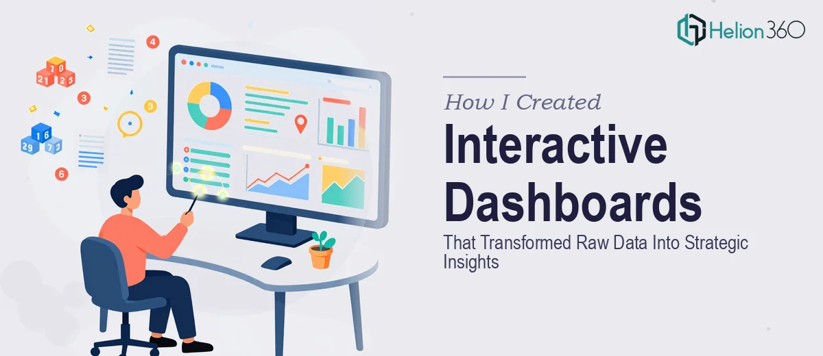
The Data Was There. The Clarity Wasn't.
Our team had no shortage of data. SQL exports, Excel sheets, Tableau workbooks — all of it sitting in folders, waiting to mean something. The ask from leadership was straightforward: build interactive dashboards that could support strategic decision-making and give stakeholders a clear view of operational performance.
Simple enough in theory. In practice, it was a different story.
Where Things Started to Break Down
I started by pulling together the data sources myself. The SQL queries were manageable, and I could get the raw numbers into shape. But the moment I tried to connect everything into a cohesive dashboard — one that non-technical stakeholders could actually read and act on — the gaps became obvious.
The visualizations I built in Tableau looked fine to me, but when I shared them with the leadership team, the reaction was flat. The charts were technically accurate but visually cluttered. KPIs were buried. There was no clear narrative guiding the viewer from one insight to the next. I had data visualization without real communication.
I also realized I was spending more time fighting formatting than analyzing the data itself, which defeated the entire purpose.
Bringing in the Right Support
After hitting that wall, I came across Helion360. I explained the situation — multiple data sources, a mixed audience of technical and non-technical stakeholders, and a need for dashboards that could actually drive decisions rather than just display numbers. Their team understood the brief immediately and took it from there.
What stood out was how they approached the structure before touching any visuals. They worked through the data logic first — making sure the KPIs being surfaced were the right ones for each audience layer. The executive view was simplified to high-level performance metrics. The operational view gave the team the granular breakdowns they needed. Both connected to the same underlying data.
What the Final Dashboards Actually Delivered
The interactive dashboards that came back were a significant step up from what I had. Each dashboard had a clear visual hierarchy — the most critical metrics at the top, with drill-down capability for deeper analysis. The data visualization was clean, with consistent color coding across charts and a layout that made it easy to scan even under time pressure.
In Tableau, the filters and interactive elements were set up in a way that let different teams slice the data without needing any technical knowledge. Leadership could toggle between time periods, regions, and product lines with a single click. That kind of usability is harder to build than it looks, and it made a real difference in how the dashboards were received.
The Excel-based reporting layer was also cleaned up — pivot structures organized by business unit, with clear column naming and consistent formatting. When we presented the findings to stakeholders, the conversation shifted from "what does this mean" to "what do we do next," which was exactly the goal.
What I Took Away From This
Building functional dashboards for internal data analysis is one thing. Building interactive dashboards that communicate clearly to a mixed audience, support strategic decision-making, and hold up in executive presentations — that requires a different level of precision.
I learned that data visualization is only half the work. The other half is information design: deciding what to show, what to hide, how to sequence insights, and how to make the visual language accessible to people who didn't build the model.
The SQL and Tableau work I did early was not wasted — it gave the team clean inputs to work with. But the layer of design thinking and dashboard architecture that Helion360 brought made the difference between a report and a tool people actually used.
If you're sitting on a stack of data that isn't yet translating into clear business insights, Helion360 is worth reaching out to. They bridge the gap between raw numbers and the kind of strategic clarity that actually moves decisions forward.