

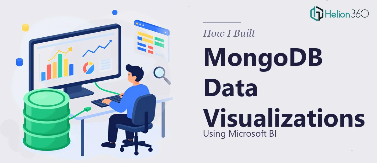
When Raw MongoDB Data Stopped Making Sense
We had been collecting data in a MongoDB database for months. Operational data, user activity logs, transaction records — all of it sitting there in collections, structured but completely invisible to anyone who needed to act on it. The team could query it, but nobody could look at it in a way that actually helped them make decisions.
The ask seemed straightforward at first: connect the MongoDB database to Microsoft Power BI and build dashboards that made the data readable. Charts, filters, drill-downs — the kind of visual representation that turns a table of documents into something a manager or stakeholder can actually interpret in a meeting.
I figured I could handle the initial setup myself. I had used Power BI before for simpler SQL-based reports, so I assumed the path from MongoDB to Power BI would be similar.
Where the Setup Got Complicated
MongoDB does not behave like a relational database, and that difference matters enormously when you try to connect it to a BI tool built around tabular data models. The nested document structure, arrays within fields, and the lack of fixed schema made every connector attempt messy. I tried the ODBC connector route, then the MongoDB Power BI Connector, and then attempted flattening collections through Atlas Data Federation — each approach exposed a different layer of complexity.
Beyond the connection issues, there was also the modeling problem. Once data was flowing, it needed to be shaped correctly inside Power BI — relationships defined, DAX measures written, date hierarchies configured, and filters set up in a way that made the dashboards actually interactive rather than just static images of numbers.
I was spending more time troubleshooting connector configurations than actually building anything useful. The deadline was real, and the gap between what I had and what was needed kept widening.
Bringing in the Right Expertise
After hitting a wall on the connector and data modeling side, I came across Helion360. I described the setup — MongoDB Atlas as the source, Microsoft Power BI as the target, and a need for clean interactive dashboards with filters and drill-through capability. Their team understood the technical stack immediately and took it from there.
What followed was structured and efficient. They handled the connector configuration, resolved the schema flattening issue that had been blocking me, and built a proper data model inside Power BI with the relationships and calculated measures the reports needed. They also designed the visual layer — choosing the right chart types for each data category, applying consistent formatting, and building a layout that was easy to navigate without any training.
The result was a set of dashboards that the team could open, filter by date range or category, and read without needing to understand what was happening underneath.
What the Final Dashboards Actually Delivered
The Power BI reports connected live to the MongoDB source, which meant the data updated without anyone having to manually export or refresh files. Stakeholders could filter by time period, drill into specific segments, and see trends that had previously required someone to write a query and paste results into a spreadsheet.
The data visualization layer made a real difference in how quickly the team could spot patterns. Instead of parsing raw documents, they were looking at trend lines, bar comparisons, and summary KPI cards — all pulling from the same MongoDB collections they had always had, just finally in a form that communicated something.
From a technical standpoint, the MongoDB to Power BI integration was something I could have eventually figured out, but not within the time available and not with the level of polish the dashboards ended up having. The combination of BI tool configuration and visual presentation design required a specific skill set that sat at the intersection of data engineering and design — and that combination is not common.
If you are working with a MongoDB database and trying to get meaningful visual reports out of Microsoft Power BI, Helion360 is worth reaching out to. They handled the parts that were slowing me down and delivered dashboards that actually worked the way the team needed them to.