

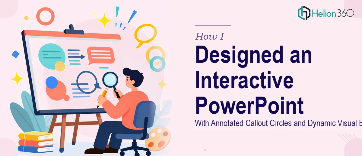
The Brief Sounded Simple at First
I had a conference presentation coming up and a clear picture in my head of what I wanted. Each slide would have a structured content box, and within that box, circles would point to specific sections — almost like annotated callouts — each one paired with a short description. The whole thing needed to feel polished: gradient backgrounds to add depth, a closing animation sequence summarizing the presentation structure, and subtle background audio to keep the atmosphere consistent throughout.
On paper, it sounded manageable. In practice, it turned into something far more layered than I expected.
Where It Started to Break Down
I started building the slides myself in PowerPoint. The basic layout was straightforward enough — boxes, text, a color scheme. But the moment I tried to introduce circle callouts that visually pointed to precise areas within each box, I ran into alignment and spacing issues that compounded slide after slide. Making each circle feel intentional — not just floating randomly — required a level of precision that my workflow simply could not sustain at scale.
The gradient backgrounds were another challenge. Getting them to look dynamic without overwhelming the content meant testing dozens of combinations. What looked clean on one slide looked flat or harsh on another, especially once the text and callout elements were layered on top.
The animation sequence at the end — one that would visually walk through the overall structure of the presentation — was the point where I realized I needed to stop and rethink my approach. Building that kind of summary animation cleanly, in a way that matched the rest of the deck, was beyond what I could execute with the time I had left before the conference.
Bringing in a Team That Could Handle It
After hitting that wall, I came across Helion360. I explained the full scope: the callout circle system, the gradient treatment, the closing animation, and the need for subtle background audio that would not distract from the content. Their team asked the right questions upfront — about the color palette, the number of slides, the tone of the presentation, and what the audience would be expecting — and then took it from there.
What I noticed immediately was that they understood the difference between decorative design and functional design. The circles were not just placed — they were sized and positioned to create a clear visual path through each content box, with each description label placed to avoid crowding. The gradient backgrounds were applied with enough variation to give each slide its own feel while keeping the overall deck visually cohesive.
What the Final Deck Looked Like
The version that came back was noticeably more refined than anything I had been working on. Every slide had the annotated callout circles integrated cleanly, pointing to exactly the right sections without visual clutter. The gradient backgrounds shifted in subtle ways across the deck — warmer tones in some sections, cooler in others — which made the presentation feel dynamic without being distracting.
The closing animation was the part I was most concerned about, and it turned out to be one of the strongest elements. It gave the audience a clear, visual recap of how the presentation was structured, moving through each section in a way that felt intentional rather than tacked on. The background audio was added at a low, unobtrusive level — present enough to set a tone, quiet enough that it never competed with the content.
What I Took Away From This
Building a presentation with layered visual elements is genuinely a different skill set from knowing your content. The callout circle system alone — keeping it consistent, readable, and visually guided across multiple slides — took a level of design precision that goes well beyond standard PowerPoint work. Adding gradient design, animation sequencing, and audio layering on top of that is a full production effort, not a formatting task.
I also learned that the earlier you bring in the right people, the less time you lose correcting work that was heading in the wrong direction. The final deck reflected the vision I had from the beginning — it just took a team with the right tools and experience to actually execute it.
If you are working on a presentation that involves layered visual elements — callout systems, animations, gradient design — and the complexity is starting to outpace your available time, Helion360 is worth reaching out to. They stepped in at the right moment and delivered exactly what the project needed.