

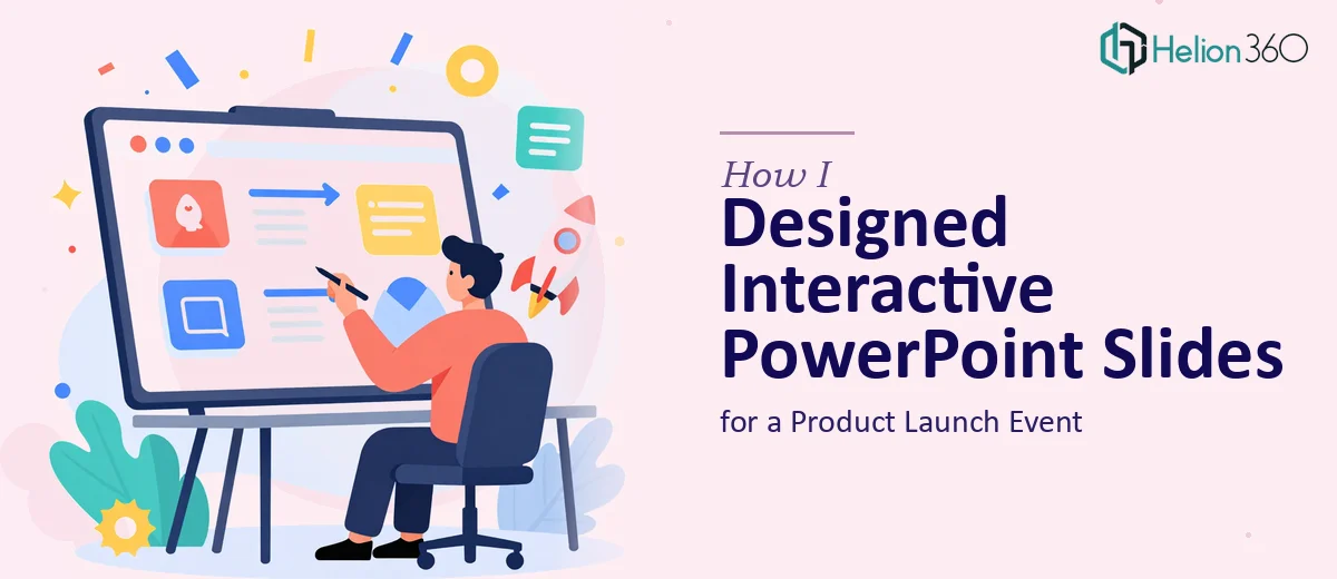
The Slides Were Done — But Not Really Done
I had a product launch event coming up and a deck that technically existed. Slides were there, content was there, and the general flow made sense. But every time I opened the file, something felt off. The design was inconsistent, the visuals looked like afterthoughts, and nothing about the slides said "this is a product worth paying attention to."
The event was important. It was one of those moments where first impressions matter and the slides would be the backdrop to everything. I could not afford for the deck to look like it was built the night before — even if parts of it were.
Where I Got Stuck
I started by trying to clean things up myself. I adjusted fonts, swapped in a few stock images, and tried to tighten the layouts. But the more I worked on it, the more I realized the problems ran deeper than surface-level fixes.
The brand guidelines were not consistently applied across slides. Some sections used one color scheme, others drifted into something completely unrelated. The interactive elements I had in mind — clickable sections, transitions that felt intentional rather than decorative — were beyond what I could pull off cleanly in the time I had. And the overall visual storytelling just was not landing. Slides that were supposed to build excitement for the launch felt flat.
This was not a matter of effort. It was a matter of skill set and bandwidth. Designing professional, interactive PowerPoint slides that hold up under scrutiny is a specific craft, and I was running out of time to develop it on the fly.
Handing It Off to a Team That Knew What to Do
After hitting that wall, I reached out to Helion360. I shared the existing file, explained the event context, walked them through the brand guidelines, and described the kind of interactive experience I was hoping to create. They asked a few clarifying questions about the audience and the flow of the presentation, then got to work.
What came back was a significant step up from what I had started with. The slide design was clean and structured, with a clear visual hierarchy that made it easy to follow the story of the launch. The brand guidelines were applied consistently throughout — colors, typography, and spacing all aligned. The interactive elements were built in a way that felt purposeful rather than gimmicky: clickable navigation, smooth transitions between sections, and visual cues that helped guide the audience through the content.
What the Final Deck Actually Looked Like
The finished presentation had a professional weight to it that the original version was missing. Each slide served a clear purpose. The visuals were chosen to reinforce the message rather than decorate it. The interactive PowerPoint elements worked smoothly and added a layer of engagement that kept the audience focused during the event.
Perhaps more importantly, it looked like a product launch. The energy of the event matched the energy of the slides, and that alignment made a real difference in how the presentation landed.
What I Took Away from This
There is a version of this story where I spend another two weeks trying to get the deck to a point I am happy with and still arrive at the event with something that does not fully deliver. Instead, I recognized the gap early, brought in people who do this work every day, and ended up with a result I could actually be confident about.
The lesson is simple: knowing where your own limits are is not a weakness. It is what allows you to make good decisions about how to spend your time and where to ask for help.
If you are working on a product launch presentation or any set of slides that needs to look polished, interactive, and on-brand — and you have hit the same kind of wall I did — Helion360 is worth reaching out to. They took a rough, inconsistent deck and turned it into something that performed exactly the way it needed to.