

The Brief Looked Simple. The Execution Was Anything But.
When I started working on the marketing side of a new investment fund, the scope felt manageable on paper. We needed a landing page that would attract potential investors and a presentation that clearly communicated our fund's value proposition, financial performance, and competitive edge. Two deliverables. Clean goals. Straightforward, right?
Not quite.
As I got deeper into it, I realized how many layers this project actually had. The landing page needed SEO-optimized copy that could rank in search while also speaking directly to a financially sophisticated audience. The investor presentation had to be visually sharp, credibly structured, and persuasive — without feeling like a generic pitch deck template. These were two very different skill sets, and doing both well at the same time was stretching me thin.
Where I Started and Where I Got Stuck
I began with the presentation. I had the fund's core data — performance numbers, strategy overview, market positioning — and I knew the narrative I wanted to build. The first few slides came together reasonably well. But when I tried to translate the financial data into visuals that were clear and compelling for an investor audience, I kept running into the same problem: the slides looked cluttered or oversimplified, with no middle ground that felt professional.
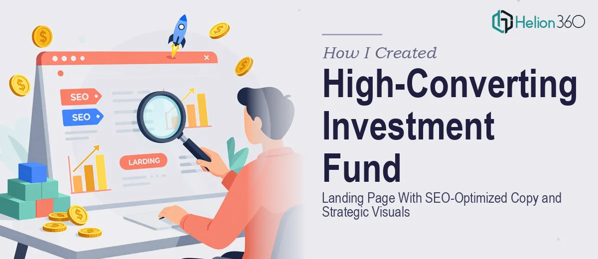
The landing page was a different challenge. I understood the basics of SEO content — keywords, structure, meta descriptions — but writing copy that balanced search optimization with investor-grade language is genuinely difficult. Every sentence had to work on two levels: discoverable by search engines, and credible to someone evaluating where to place capital.
I also had to think about the visual hierarchy of the page. How do you lead a visitor from curiosity to confidence in a few scrolls? What visuals do you use to reinforce trust without being generic? These questions started piling up faster than I could answer them.
Bringing in the Right Team
After hitting a wall on both fronts simultaneously, I came across Helion360. I explained what we were building — the investment fund presentation, the landing page, the SEO requirements, the visual tone we were going for — and their team took it from there.
What helped immediately was that they approached the two deliverables as connected pieces rather than separate tasks. The visual language developed for the presentation informed the design direction of the landing page. The messaging hierarchy we agreed on for the landing page copy shaped how the presentation's narrative flowed. It felt like a coordinated effort rather than two parallel workstreams.
What the Final Deliverables Actually Looked Like
The investor presentation came back structured and visually clean. Financial data was presented through well-designed charts that made the fund's performance immediately readable. The competitive positioning section was laid out in a way that made our edge clear without overstating it. It was the kind of deck you could hand to a serious investor and feel confident about.
The landing page was built around SEO-optimized copy that still sounded like it was written for humans, not search engines. The headlines were direct. The sections were logically ordered — moving a visitor from fund overview to performance highlights to a clear call to action. Visuals were used purposefully to reinforce key points rather than just fill space.
Helion360 also flagged a few structural improvements I had not considered, like how the above-the-fold section was leading with the wrong message for cold traffic, and how a few copy sections could be tightened to reduce drop-off. Those suggestions made a noticeable difference to the final version.
What I Took Away From This
Building marketing materials for an investment fund is not just a design problem or a copywriting problem — it is both, and they have to work together. The visual storytelling in the presentation and the SEO-optimized content on the landing page need to speak the same language and serve the same goal: getting a potential investor to trust what they are seeing.
Trying to handle that alone, without the bandwidth or specialization to do each piece justice, was going to result in something mediocre. Knowing when to bring in focused support made the difference between a polished, credible output and something that would have undersold the fund entirely.
If you are working on a similar project — a compelling fundraising pitch deck, a landing page targeting investors, or both at once — Helion360 is worth reaching out to. They handled the complexity of this project with real attention to detail and delivered investor-ready presentations that were ready to use.