

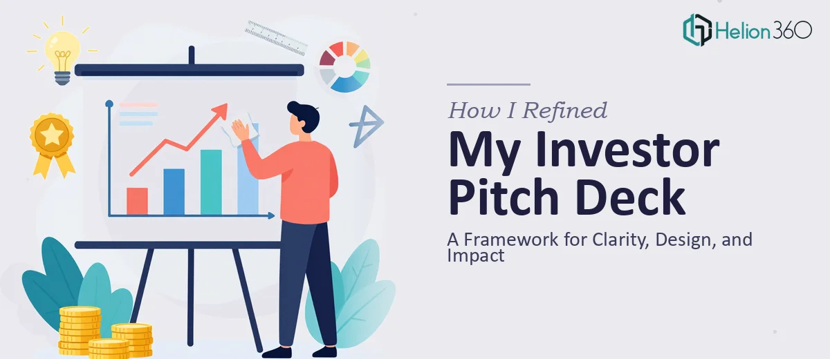
We Thought the Deck Was Done
After weeks of work, our investor presentation felt solid. The slides were built, the numbers were in, and the story — at least to us — made sense. We had covered the problem, the solution, the market opportunity, and the financials. Everyone on the team had reviewed it at least twice.
But the closer we got to actually sharing it with investors, the more uncertain I felt. Would someone outside our company read it and instantly understand what we do? Would the design hold up against other pitch decks competing for attention in the same room?
I decided to step back and evaluate it the way an investor would see it for the first time.
What I Found When I Looked Harder
Reading the deck with fresh eyes revealed a few uncomfortable truths. The message clarity was inconsistent — some slides explained too much while others assumed too much prior knowledge. A few data charts were accurate but hard to read at a glance. The visual hierarchy was uneven, with some slides feeling cluttered and others too sparse.
The overall impact wasn't where it needed to be. An investor presentation needs to communicate value fast. Ours was doing the opposite in places — burying the key point under supporting detail.
I tried adjusting the layout manually, rewrote some of the copy, and experimented with different chart formats. But design decisions I thought would help often made things worse, and I kept second-guessing the structural flow of the narrative.
Getting Outside Eyes on the Problem
That's when I reached out to Helion360. I described where we were — a finalized deck that needed expert review and refinement before going to investors — and their team took it from there.
They reviewed the entire presentation with a focus on the three things that mattered most: clarity of the message, visual appeal, and overall investor impact. They didn't just make cosmetic changes. They provided structured feedback on which slides were working, which were creating friction, and where the narrative was losing momentum.
The Framework That Changed How I Think About Pitch Decks
Message Clarity Comes Before Design
The first thing Helion360 flagged was message hierarchy. Several slides were trying to say three things at once. Their feedback pushed us toward a one-idea-per-slide discipline that made the story significantly easier to follow. Once the message was tight, the slide design had room to breathe.
Visual Appeal Is About Investor Attention, Not Just Aesthetics
The team pointed out that visual appeal in an investor presentation isn't about making things look beautiful in isolation — it's about directing attention to what matters in the first few seconds of viewing a slide. They refined the data visualizations so the key insight was visually dominant, not buried in a table. The result was a deck that felt more confident and deliberate.
Overall Impact Depends on the Arc
Helion360 also looked at the structural arc of the presentation — how it opened, how it built tension around the problem, and whether the solution and financials landed with appropriate weight. A few slides were reordered. The opening was sharpened. The closing call-to-action was made more direct. These weren't dramatic changes, but the cumulative effect on the deck's overall impact was significant.
What the Refined Deck Actually Delivered
When we ran the updated presentation past a few trusted advisors before the investor meeting, the feedback was immediately different. People understood our value proposition within the first three slides. The financials were easier to interpret. The design felt polished without being overproduced.
More importantly, the deck now held up under scrutiny. That confidence going into the room made a real difference.
The experience taught me that finishing a presentation and finishing it well are two different things. An investor pitch deck is not just a document — it's a carefully structured argument for why someone should trust you with their capital. Clarity, visual design, and narrative impact all have to work together, and that's hard to evaluate when you're too close to the content.
If your investor presentation is technically complete but you're not fully confident it will land the way you need it to, consider fundraising presentation design services — they bring the outside perspective and design expertise that can make the difference between a deck that gets a polite nod and one that moves a conversation forward.