

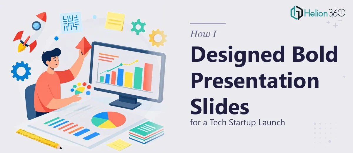
The Brief Sounded Simple — Until It Wasn't
When our team started preparing for the upcoming product launch event, I volunteered to lead the presentation design. The brief seemed manageable: clean slides, bold visuals, modern layout, and something that matched our startup's dynamic brand energy. I had the content ready and a rough idea of what I wanted each slide to communicate.
But the moment I opened the design software, I realized that "clean yet bold" is a lot harder to execute than it sounds — especially when the stakes are a live launch event in front of potential investors and early customers.
Where the Design Process Broke Down
I started by pulling together some templates I found online, but none of them felt right. The free templates were either too generic or too rigid. The premium ones had layouts that didn't match our brand direction. I spent two evenings trying to adjust fonts, tweak color contrast, and rework slide layouts — and still couldn't land on something that felt cohesive.
The core issue wasn't the content. The content was solid. The problem was translating that content into a visually compelling presentation design that could hold an audience's attention from the first slide to the last. Getting the balance right between bold visual elements and a user-friendly layout is a genuine design skill, and I was stretching beyond what I could confidently execute under a deadline.
I also noticed that visual storytelling across the deck was inconsistent. Some slides felt strong, others looked flat. There was no clear visual thread connecting the narrative.
Bringing in a Team That Knew What They Were Doing
After hitting that wall, a colleague pointed me toward Helion360. I reached out, explained the project — a tech startup launch presentation that needed to feel modern, bold, and clean without being cluttered — and shared the content and rough layout ideas I had already drafted.
Their team got to work quickly. What impressed me early on was how they asked the right questions upfront: brand colors, tone of voice, the audience profile, and the specific moments in the deck where we needed the most visual impact. It wasn't a generic design job to them — they treated it like a communication problem that needed a design solution.
What the Final Slides Looked Like
When the first draft came back, the difference was immediately visible. The slides had a consistent visual language — bold typography, smart use of white space, and layout choices that made each section easy to follow. The startup pitch deck design felt like it belonged to our brand rather than borrowed from a template.
The data slides were particularly well done. Instead of raw bullet points, the numbers were presented as clean visual summaries that were easy to read at a glance. The product feature slides used iconography and layout hierarchy to guide the viewer's eye naturally through the content.
Slide transitions and visual pacing were handled thoughtfully too — nothing flashy, just consistent and polished. The kind of presentation design that doesn't distract from what's being said.
What I Took Away From This
The experience reinforced something important: knowing your content and knowing how to design for it are two different things. A well-structured presentation design for a tech startup launch isn't just about making slides look attractive — it's about building visual storytelling that reinforces the message, builds trust, and keeps the audience engaged from start to finish.
I now understand why slide layout, typography, and visual hierarchy matter so much. When they work together, the audience follows along without effort. When they don't, even strong content falls flat.
The launch event went well. The slides drew positive comments from the room, which honestly surprised me given how rough my original attempts were.
If you're preparing a startup presentation or launch deck and finding that the design side is taking more time and energy than the content itself, Helion360 is worth a conversation — they took on the heavy lifting and delivered exactly what the project needed.