

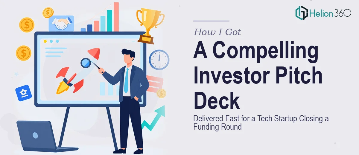
The Funding Window Was Open and the Deck Wasn't Ready
We were in the final stretch of closing an investment round for a high-potential tech startup, and the pitch deck was the centerpiece of every conversation happening with prospective backers. The founding team had a genuinely strong story — clear product vision, a differentiated market position, early traction — but none of that was coming through on slides. What existed was a rough collection of bullet-heavy slides, inconsistent formatting, and financial data that looked like it had been pasted in from a spreadsheet without any translation for a non-technical audience.
The stakes were real. Investor meetings were already scheduled. First impressions in those rooms matter enormously, and a investor pitch deck that looks unpolished signals something about the team behind it — whether that's fair or not. I recognized immediately that this wasn't something to patch up over a weekend. A properly designed investor pitch deck is a specific, demanding piece of work. It needed to be handled by people who do this well.
What I Found the Solution Actually Required
Before engaging anyone, I spent time understanding what a genuinely effective investor pitch deck for a tech startup involves. The short version: it's far more layered than most founders realize.
The first thing that stood out was the narrative architecture. Investors aren't just looking for data — they're looking for a story with a clear logic: here's the problem, here's why it's worth solving now, here's why this team solves it better than anyone else. Every slide has to earn its place in that sequence. Getting the story arc wrong — putting financials too early, burying the competitive advantage, or leading with product features before establishing the market need — kills the deck before the design even matters.
The second complexity was the financial visualization. Growth trajectories, unit economics, and market sizing all need to be presented in ways that are immediately readable to investors who are scanning dozens of decks. That means choosing the right chart types, simplifying the data without misrepresenting it, and making sure the visual hierarchy of each chart directs attention to the right number first.
The third signal of real complexity was brand discipline. A startup pitching institutional investors needs to look like a company that has its act together. That means consistent typography, a locked color palette, and visual language that feels intentional across every single slide — not just the cover.
What the Work of Building This Deck Actually Involves
The right approach to an investor pitch deck starts with a structural audit of the source material. That means mapping the full narrative arc across a standard pitch framework — problem, solution, market size, product, business model, traction, team, financials, ask — and deciding what each slide actually needs to communicate versus what it's currently trying to say. The deck needs to follow a story logic that investors recognize intuitively. Restructuring that narrative from raw content requires both domain knowledge of what investors respond to and editorial judgment about what to cut. Getting this right is the part that takes the most time, and it's where decks built without that judgment tend to fall apart.
Visual mechanics are the next layer. Proper execution involves a consistent layout grid — typically a 12-column structure — applied across master slides so that alignment holds throughout the deck without manual adjustment on every frame. Typography hierarchy follows a clear rule: headline at 36pt, subhead at 24pt, body at 16pt or below, with no more than two typefaces in the system. Charts need to be purpose-built for the data they're showing — bar charts for comparisons, line charts for trends, waterfall charts for funding structure — and each one needs a properly weighted data label so the key number reads first. Getting all of this to hold consistently across 15 to 20 slides is painstaking work that trips up even experienced designers who aren't used to pitch-specific conventions.
Polish and brand consistency are what separate a deck that reads as credible from one that looks assembled. The palette should be locked to four colors maximum — a primary, a secondary, an accent, and a neutral — applied with clear rules about where each appears. Icon sets need to be from a single family. Slide padding should be uniform, typically 40 to 60px on all edges. These aren't aesthetic preferences; they're the difference between a deck an investor flips through quickly and one that holds attention. Maintaining this discipline across a full deck, through multiple rounds of content revisions, is where the execution friction gets real.
Why I Brought in Helion360 to Handle It
I didn't attempt any of this myself. The combination of narrative strategy, design execution, and financial visualization — all under time pressure, with investor meetings already on the calendar — made it clear that this needed a team with the process and tooling already in place.
Helion360 handled the full project end-to-end. That meant working through the narrative structure with the founding team, rebuilding the slide architecture from the ground up, designing the full visual system, and translating every financial chart into clean, investor-readable visuals. The deck was turned around quickly — done in days, not weeks — which was the only timeline that made sense given where we were in the fundraising process.
What stood out was that this wasn't a team figuring out pitch deck conventions as they went. They already knew what a Series A-stage tech startup deck needs to communicate, slide by slide, and executed against that standard at a level the founding team couldn't have reached in the time available.
The Result and What I'd Tell Anyone Looking at the Same Situation
The delivered deck was a complete transformation from what we started with. The narrative was tight, the financials were clean and immediately legible, and the visual design signaled a company that had thought carefully about how it presented itself. The founding team walked into investor meetings with genuine confidence in what they were handing across the table.
If you're staring at a rough deck, a compressed timeline, and a funding conversation that matters — and you can see clearly that doing this well is a specific kind of work that takes more than a few evenings — Helion360 is the team I'd engage. They delivered fast, handled the full execution depth this work requires, and took the entire problem off the table.