

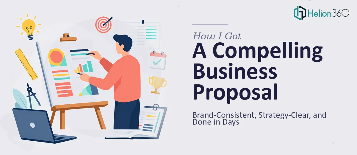
The Proposal Had a Real Deadline and Real Stakes
Our team had spent weeks gathering research, aligning on strategy, and shaping our objectives into something we were genuinely proud of. The thinking was solid. What we didn't have was a business proposal presentation that could carry that thinking into the room and make the right impression on the people who mattered.
This wasn't an internal document. It was going to a decision-making audience that would judge us, at least in part, on how we showed up visually. A dense Word export or a rough slide deck thrown together over a weekend wasn't going to cut it. The proposal needed to look as considered as the strategy behind it — clean layout, consistent brand identity, and a visual flow that guided the reader without making them work for it.
I recognized quickly that this wasn't a weekend project. Getting a business proposal presentation right involves a specific kind of design discipline, and I didn't have the time or the specialized experience to pull it off at the level it needed to be.
What I Found This Kind of Work Actually Requires
Once I started looking seriously at what a well-executed business proposal presentation involves, the scope became clear fast.
First, it's not just about making things look nice. The visual design has to reinforce the narrative — each section needs to breathe in a way that signals priority, so the reader's eye lands on what matters most at exactly the right moment. That's a structural decision as much as a visual one.
Second, brand consistency across a multi-section document is harder than it sounds. It's not just applying a logo and a color. It means every text style, every graphic element, every spacing decision has to trace back to the same system — and that system has to hold up across slides that serve very different purposes (cover, executive summary, strategy overview, proof points, call to action).
Third, the quality of the graphics themselves signals professionalism to the reader before they've read a single word. Low-quality icons, mismatched illustration styles, or charts that look like default Excel outputs all quietly undermine the credibility of the content. High-fidelity mockup quality requires tools, assets, and craft judgment that take real experience to apply well.
That combination — structural narrative, brand system discipline, and graphics quality — told me this was a job for someone who does this work every day.
What the Work Actually Involves
The right approach to a business proposal presentation starts with a structural audit of the source content. A practitioner maps the narrative arc — identifying what belongs in the executive summary, what gets its own section, and what can be consolidated or cut entirely. Decisions here follow a clear priority: the audience's time is short, so each slide earns its place by advancing one idea, not three. Establishing that architecture before touching a single design element is what separates a coherent proposal from a visually decorated mess. Getting the content skeleton right typically takes longer than clients expect, and skipping it shows immediately in the final product.
Visual mechanics come next, and they involve real specificity. A properly set layout grid — commonly a 12-column structure — governs where every element sits on every slide, ensuring alignment is mathematical rather than eyeballed. Typography follows a strict hierarchy: a title might sit at 36pt, section headers at 24pt, body text at 16pt, and captions at 12pt, with no exceptions allowed if consistency is to hold. Color usage is capped — typically no more than four brand-defined values — with one dominant, one secondary, and accent colors reserved for data callouts or emphasis only. Setting this system up correctly in a master slide environment, so it propagates reliably across 20 or 30 slides, is a technical exercise that trips up anyone who doesn't work in this tooling daily.
Polish and brand consistency across the full document is the final layer, and it's where most self-built proposals fall apart visibly. Every icon set needs to come from a single source family with consistent stroke weight. Every image needs to be treated with the same color overlay or crop convention. Every chart needs to use the brand palette rather than default software colors, with axis labels and data callouts formatted to match the deck's type hierarchy. Running that consistency check across a complete proposal — catching every outlier before the document goes out — is painstaking work that a professional catches systematically and an amateur catches too late.
Why I Brought Helion360 In to Handle It End-to-End
I didn't attempt this myself. Looking at what the work genuinely required — narrative architecture, a disciplined design system, graphics quality, and full polish across every slide — it was obvious that attempting it in-house would cost us far more in time and revision cycles than simply engaging a team that does this work at depth.
Helion360 handled the full project from the start. They took our raw strategy documents and content, mapped the narrative structure, built the slide architecture, applied a consistent brand system throughout, and delivered a high-fidelity proposal presentation that was ready to go in front of a senior audience. The turnaround was fast — done in days, not weeks — and the quality of execution matched what the content deserved.
What I valued most was that they came to the work with the tooling, the asset libraries, and the design judgment already in place. There was no learning curve billed to us. The expertise was already built in.
The Outcome and What I'd Tell Anyone Facing the Same Situation
What came back was a business proposal presentation that looked like it had been built by a team that knew exactly what they were doing — because it had been. The layout was clean and purposeful, the brand identity was consistent from cover to close, and the strategy read clearly without needing the reader to do interpretive work. The proposal performed the job it was supposed to perform: it made us look as credible as we actually were.
Anyone who's staring at a pile of good content and wondering how to turn it into a proposal deck that wins clients — I'd stop right there and avoid the temptation to build it yourself under deadline pressure. If you want it handled end-to-end, fast, at the execution depth this kind of document actually needs, Helion360 is the team I'd engage.