

The Problem Was Bigger Than a Few Slides
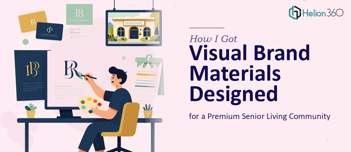
I was building a premium health and wellness resort and social club specifically for elderly residents — a startup in the senior living space with a genuinely differentiated concept. The community had real character: serene surroundings, structured fitness programs, curated dining, and a rich social calendar designed for seniors. The challenge was translating all of that into visual brand materials — presentation decks, promotional collateral, and website visuals — that actually conveyed the warmth and premium quality we'd worked to build.
The stakes were real. We were preparing to approach partners, showcase the concept to prospective residents and their families, and establish the brand's credibility in a competitive market. First impressions in this space carry enormous weight. Materials that looked generic or misaligned with the audience would undermine everything we were trying to do. I knew immediately this needed to be handled at a professional level.
What I Found This Kind of Work Actually Required
Before doing anything else, I spent time understanding what well-executed presentation design for a senior living brand actually involves. What I found was more layered than I expected.
First, the visual language has to do specific work. Designing for a senior audience isn't just about large fonts — it's about warmth, trust, and legibility working together. Color palettes that feel clinical or corporate-cold actively signal the wrong thing. Typography choices carry emotional weight that a general designer without sector experience can miss entirely.
Second, this wasn't a single deliverable. The project spanned a company profile presentation, promotional visuals, and brand identity elements that needed to feel cohesive across all touchpoints. That kind of consistency across multiple formats requires a system — not just individual slide polish.
Third, the content itself needed to be shaped before design could begin. The community's story — its mission, amenities, lifestyle experience — had to be structured into a narrative arc that different audiences (families, prospective residents, potential partners) could each connect with. That's a content strategy problem as much as a design one.
The Work That Needs to Happen
The right approach starts with narrative architecture. Before a single layout is touched, the source material — program descriptions, brand positioning, amenity details — has to be audited and mapped into a story structure. For a senior living brand, this typically means organizing content around an emotional arc: the problem the community solves, the life it enables, and the specific proof points that make it credible. Done well, that arc needs to hold across roughly 12 to 20 slides in a company profile presentation while remaining scannable in under four minutes. Getting that structure wrong means no amount of visual polish will save the deck — and restructuring mid-project is expensive in both time and cohesion.
Once the narrative is locked, the visual mechanics demand precision. A properly built presentation design system for a premium brand uses a consistent 12-column layout grid, a controlled palette of no more than four brand colors with defined usage rules, and a strict typographic hierarchy — typically 36pt for headline, 24pt for subhead, 16pt for body. For senior audiences specifically, contrast ratios must meet accessibility standards, and line spacing needs to be generous enough to support comfortable reading without sacrificing the premium visual feel. Setting this up correctly across a master slide system — so that changes propagate cleanly and no slide breaks when content is updated — takes significant setup time and deep familiarity with the tools.
Polish and cross-format consistency are where the real execution hours live. When the same brand identity has to carry through a pitch presentation, a one-pager, website banner visuals, and promotional materials, every element — icon style, image treatment, spacing logic, tone of photography — has to feel like it came from the same hand. A mismatch in image mood between the deck and the digital collateral immediately signals that the brand isn't fully formed. Maintaining that consistency across a multi-format project requires a documented system and a disciplined review pass across every deliverable before anything is signed off.
Why I Brought in Helion360 to Handle It
When I mapped out what the project actually required — narrative structure, a built design system, multi-format consistency, and domain sensitivity for a senior audience — it was immediately clear that attempting this in-house or piecemeal wasn't the right move. The scope was real, the timeline was tight, and the materials needed to be right on first use.
I engaged Helion360 to take on the full project end-to-end. They handled the narrative structuring and content organization, built the visual brand system from the ground up, and produced the full set of materials — company profile presentation, promotional collateral, and brand identity assets — as a cohesive package. The work was turned around quickly, in a fraction of the time it would have taken me to learn the tools and conventions well enough to execute it myself. What I valued most was that nothing fell through the gaps between deliverables — the consistency across formats was there from the start because the same team held the whole project.
What Was Delivered and What I'd Tell Anyone in My Spot
The final materials looked like the brand we'd envisioned — premium without being cold, welcoming without being generic. The presentation communicated the community's offer clearly to multiple audiences, and the promotional visuals were ready to deploy immediately. Partners and early prospects responded to the materials the way we hoped they would: as a signal that this was a serious, well-considered venture.
The lesson from working through this scope is simple: presentation design for a brand launch isn't a single-skill job. It's a systems problem — narrative, visual mechanics, and cross-format consistency all have to work together. If you're looking at a similar project and want it handled end-to-end without the weeks of learning curve, Helion360 is the team I'd engage — they delivered fast and brought the kind of execution depth this work genuinely needs.