

When Your Research Is Solid but Your Slides Are Not
I spent months collecting data, running analysis, and documenting every stage of my thesis. By the time I reached the progress review stage, the research itself was in good shape. The problem was the presentation. My committee expected a clear, well-structured academic presentation that communicated the methodology, key findings, challenges, and next steps — and it needed to look polished enough to hold up in a formal setting.
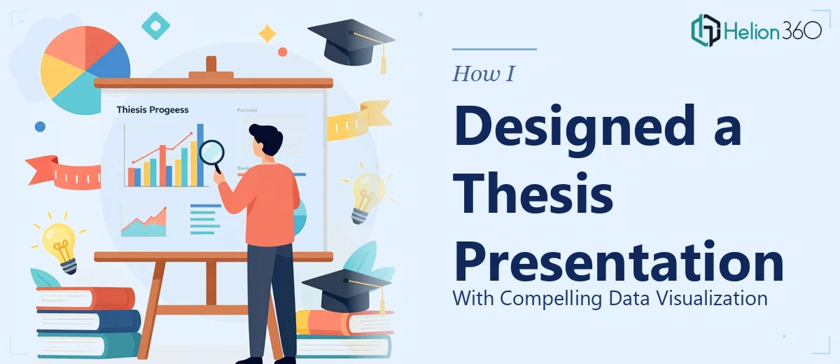
I opened PowerPoint and started building it myself. A title slide, a few text-heavy content slides, a rough chart pasted in from Excel. It was functional but flat. The kind of slides that make a committee member glance at their watch.
The Gap Between Research and Visual Communication
The challenge with an academic research presentation is that it sits at the intersection of two very different skills. On one side, there is the depth of the research itself — methodology, data interpretation, citations, nuanced findings. On the other, there is visual communication — layout, typography, data visualization, flow. I was strong on the first and genuinely struggling with the second.
I tried a few presentation templates I found online, but nothing fit cleanly. The structure of a thesis progress presentation is specific: it needs to open with the research context, walk through the methodology clearly, present findings in a way that is both accurate and visually readable, and then close with a credible view of next steps. Generic templates do not account for that kind of logical sequence.
The data visualization part was particularly difficult. I had survey results, comparison tables, and timeline data — and I needed charts that were clean and easy to interpret without oversimplifying the underlying research.
Reaching Out to a Team That Understood the Brief
After a few frustrating evenings of reworking the same slides, I reached out to Helion360. I explained the situation — masters thesis progress review, academic audience, roughly 15 to 18 slides needed, with several charts and a clean modern design that still felt rigorous.
Their team asked the right questions upfront. What was the field of study? Who was the audience — internal committee or broader academic panel? What tone did the presentation need to carry — formal, structured, or slightly more accessible? That level of specificity made it clear they had worked on research presentations before and understood what academic work actually requires.
I shared my outline, my raw data files, and a few notes on design preferences. From there, they handled the rest.
What the Final Presentation Looked Like
The delivered presentation covered the full arc of my thesis progress: the introduction to the research topic, the methodology section with a clear visual framework, the key findings broken into digestible data visualization slides, a candid look at the challenges I had encountered, and a forward-looking section on next steps and future directions.
The charts were clean and purposeful — no decorative clutter, just well-labeled visuals that made the data easy to follow. The layout had a consistent academic tone without feeling dry or dated. Every slide had enough breathing room that the committee could actually read and absorb the content during the presentation rather than just staring at a wall of text.
What struck me most was how the structure held together. The flow from one section to the next felt logical in a way my self-built version never quite achieved. When I ran through it before the actual review, it felt like a presentation I was genuinely confident walking into.
What I Took Away From the Experience
Working through this process taught me something practical: knowing your research deeply does not automatically translate into knowing how to present it visually. Those are separate competencies. The research is yours — no one else can build that. But the presentation layer, the layout, the data visualization choices, the slide-by-slide flow — that is a craft that takes time to develop, and sometimes the timeline simply does not allow for it.
A thesis progress presentation has real stakes. It reflects on the quality of the work you have done. Getting the visual side right matters.
If you are working on an academic research presentation and the visual design is holding you back, Helion360 is worth reaching out to — they handled the complex design and data visualization work so I could stay focused on the research itself, and the result was exactly what the moment called for.