

The Problem Was Simple on the Surface — and Complicated Underneath
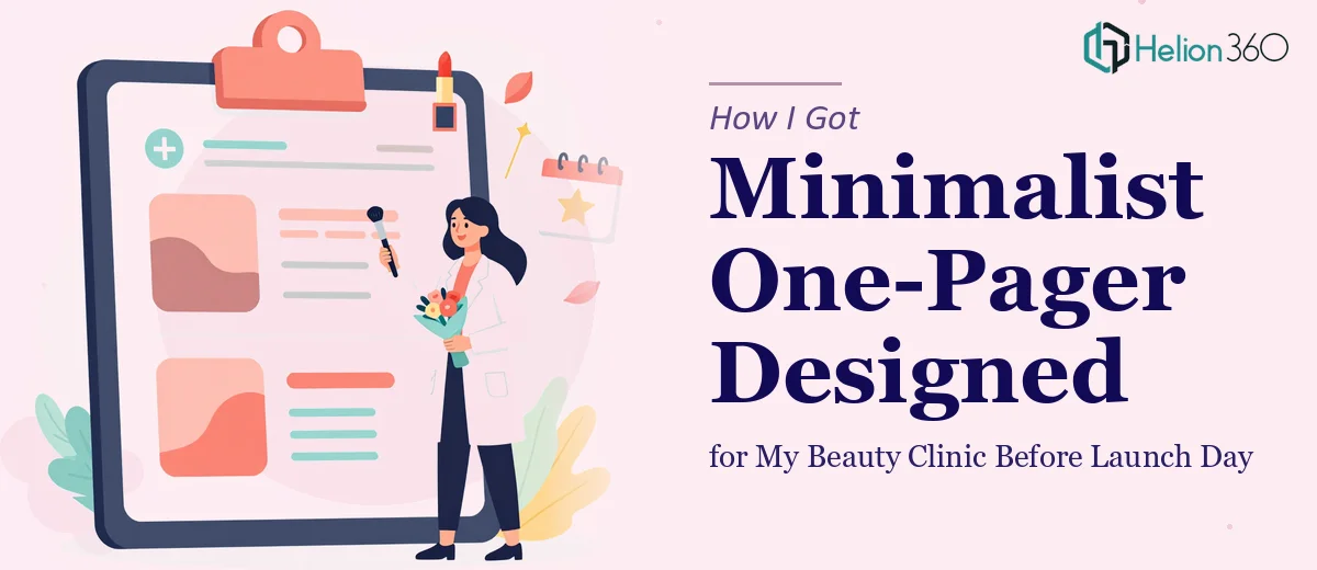
I was weeks out from opening my beauty clinic and needed a single-page document that did one job: show a potential client what we offer and get them to book an appointment. No long brochure, no multi-page deck. Just one clean, well-designed page that communicated facials, skincare services, and a clear path to booking.
Simple enough, right? Except the stakes were real. This one-pager was going to be the first impression for walk-ins, digital visitors, and anyone we handed a printed sheet to at our launch event. It had to look like a clinic that knew what it was doing — polished, minimal, and trustworthy. Getting it wrong wasn't just an aesthetic failure; it was a business one.
I knew straight away this wasn't something I could rough out in a weekend and call done.
What I Found a Good One-Pager Actually Requires
I started by looking at what well-executed minimalist one-pagers in the wellness and beauty space actually look like. What I found was that the good ones aren't simple at all — they just appear that way. The simplicity is engineered.
The first thing that signaled real complexity: content architecture. A one-pager for a service business has to communicate brand identity, a service overview, a value statement, and a call to action — all without crowding the page or losing the reader's eye. Every line of text earns its place or gets cut.
The second thing: visual restraint is harder than visual abundance. Choosing to use only two typefaces, a limited palette of three to four colors, and negative space as a design element requires confident, experienced decision-making. Beginners fill the space. Professionals know when to leave it empty.
The third: a digital version needs an embedded or linked call-to-action that actually functions — a button or QR element that routes directly to a booking page. That's a different layer of thinking than pure layout work.
All three of those things together told me this needed someone who does this kind of work regularly.
What the Work Actually Involves
The right approach to a minimalist one-pager starts with a content audit and narrative map. Before a single design element is placed, someone has to decide what the page is actually saying and in what order. For a beauty clinic, that means sequencing a headline that speaks to the client's desire, a concise services summary, a brief credibility line, and a single focused call to action. The rule practitioners follow is that a reader's eye should complete the page in a Z or F pattern — meaning every element has a deliberate position relative to that path. Getting the content hierarchy wrong before opening a design tool means rebuilding the layout from scratch later, which costs hours.
Once the narrative is locked, the visual mechanics take over — and this is where minimalist design earns its difficulty. A proper minimalist layout uses a constrained grid, typically 12 columns, with generous margin gutters that create breathing room. Typography runs on a tight hierarchy: a display headline at 36–40pt, a subhead or service label at 20–24pt, and body copy no smaller than 11pt for print viability. Color discipline is strict — a maximum of three to four brand colors, with one dominant neutral and one accent used only for the CTA element. Practitioners who try to eyeball this without a grid system end up with layouts that look almost right but feel slightly off in ways readers notice without being able to name.
Polish and cross-format consistency close the project out. A one-pager often needs to work in two contexts: as a print-ready PDF and as a digital asset with an active booking link or embedded QR code. That means two production versions, each checked for bleed margins, resolution, and color mode — CMYK for print, RGB for screen. The digital version requires the CTA to be hyperlinked correctly and tested. This stage trips people up not because it's conceptually hard, but because it's detail-intensive and unforgiving — a misaligned margin or a broken link at launch undoes everything that came before it.
Why I Brought in Helion360 to Handle It
I looked at what the work genuinely required — content sequencing, layout grid discipline, typography hierarchy, dual-format production — and I made a fast decision. I didn't have the design tooling, the production experience, or the time to learn and execute all of that properly before launch. Attempting it myself would have cost me days and likely produced something that looked like I attempted it myself.
Helion360 handled the full project end-to-end: content structure and narrative flow, the complete visual design with the minimalist aesthetic the clinic needed, and both a print-ready and digital version with a working booking CTA. They turned it around quickly — done in days, not weeks — which is exactly what a pre-launch timeline demands. The kind of execution depth this work requires is already built into what they do, and it showed in the result.
The Outcome and What I'd Tell Anyone in My Spot
What came back was a one-pager that looked exactly like a clinic that had its act together. Clean layout, clear services overview, restrained color palette, and a CTA that actually worked in the digital version. It went out at our launch event in print form and as a link we shared digitally, and visitors told us it was one of the clearest, most professional-looking things we'd handed them.
The business outcome was direct: we saw appointment bookings start before the clinic's doors officially opened. Whether the one-pager was the single cause is hard to isolate, but it was doing its job — moving people from curious to booked.
If you're looking at the same kind of project — a tight deadline, a real first impression on the line, and a design standard you know you can't fake — Helion360 is the team I'd engage without hesitation. They delivered fast, handled every layer of execution, and the work reflected the kind of expertise that only comes from doing this every day.