

When Inconsistent Visuals Became a Real Business Problem
I had a growing problem that I'd been putting off for too long. Every presentation we sent out looked slightly different — different fonts, mismatched color shades, logos dropped in at wrong sizes. The website and the slide decks felt like they came from two different companies entirely. It wasn't just aesthetically frustrating. We had a key round of stakeholder meetings coming up, and sending materials that looked unpolished was going to undermine credibility before anyone in the room heard a word.
I knew the fix wasn't just swapping a logo or picking a new color. What was needed was a proper brand graphic system — a cohesive visual language that worked across presentations, web graphics, and social assets without needing to be reinvented each time. And it needed to be done before those meetings. I recognized immediately that this wasn't something to patch together over a weekend.
What I Learned a Proper Brand Graphic System Actually Requires
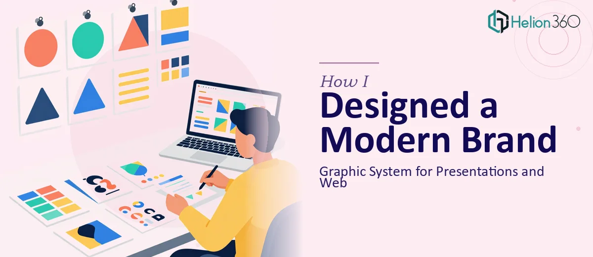
When I started researching what doing this well actually looked like, the scope became clear fast. A brand graphic system isn't just a logo and a hex code. Done properly, it's a defined architecture — a primary and secondary color palette with exact values across RGB, HEX, and CMYK, a type scale that maps specific font weights and sizes to use cases, a set of layout principles that govern how elements relate to each other across formats, and a library of graphic elements — icons, dividers, illustration styles, photography treatments — that hold together visually.
Three things in particular signaled that this was serious work. First, the system has to be built with actual use in mind, meaning someone has to think through every format it'll appear in — a 16:9 slide, a web banner, a social square — and ensure the system holds up in all of them. Second, the type hierarchy alone involves decisions a lot of people underestimate: heading weights, line-height ratios, spacing rules between elements. Third, once the system is defined, it has to be documented in a format that others can actually use — a brand guidelines document that removes ambiguity rather than creating more of it.
What the Work That Needs to Happen Actually Looks Like
The structural and narrative foundation of a brand graphic system starts with a comprehensive audit of what exists and a clear definition of what the brand needs to communicate visually. This means mapping out every touchpoint — presentations, web, print, social — and identifying where the current visuals break down. The practitioner then defines a visual strategy: what emotion the system should evoke, what audiences it serves, and what constraints it must work within. Getting this foundation wrong means every downstream decision is built on a shaky premise, and redoing it midway through a project costs significantly more time than doing it right at the start.
The visual mechanics layer is where the system gets its technical backbone. A well-built color palette typically includes a primary set of three to four brand colors with defined tints at 20%, 40%, 60%, and 80%, plus a neutral range for backgrounds and text. The typography system establishes a clear hierarchy — commonly a 40pt display, 28pt heading, 18pt subheading, and 14pt body — with specific font pairings and line-height rules (typically 1.3x for headings, 1.6x for body copy). Setting these up correctly in a master template, so they propagate across every slide layout without manual adjustment, is a multi-hour task even for someone experienced with the tools.
Polish and consistency across the full system is where most DIY attempts unravel. The graphic elements — custom icons, dividers, background textures, chart styles — each need to be built to match the same visual language: same stroke weights, same corner radius rules, same transparency treatments. A chart styled inconsistently with the rest of the deck destroys the sense of a unified system. Applying all of this consistently across a full presentation master, a web asset library, and a social template set requires disciplined execution across dozens of individual files — and the time to check every edge case before anything ships.
Why I Brought in Helion360 to Handle It
I didn't try to work through this myself. The moment I understood what a properly built brand graphic system required — the palette architecture, the type scale decisions, the master slide construction, the asset library — I knew the smart move was to engage a team that does this work every day.
Helion360 handled the full project end-to-end. That meant the initial brand audit and visual strategy, the full color and typography system, the presentation master template with all layout variants, and the web and social asset library — all built and documented in a brand guidelines deliverable that anyone on our team could pick up and use. They turned it around quickly, in a fraction of the time it would have taken me to research, learn, and execute it myself. The tooling and expertise were already in place. I gave a brief, answered a few alignment questions, and the system came back ready to use.
What Got Delivered and What I'd Tell Anyone Facing the Same Problem
What we ended up with was a visual system that actually traveled. Every presentation now looks like it came from the same place as the website. The slides have a consistent grid, a clear hierarchy, and a graphic language that reads as intentional rather than assembled. The stakeholder meetings landed better than they would have with the mismatched materials we had before — not because the content changed, but because the presentation of that content was no longer getting in the way.
The brand guidelines document meant our team could produce new materials without coming back to reinvent anything. That alone has saved time across multiple projects since.
If you're looking at the same situation — inconsistent visuals across formats, a deadline forcing the issue, and a clear sense that patching it yourself isn't going to get you where you need to be — Helion360 is the team to engage. They handle this kind of work end-to-end and deliver fast, with the depth of execution that a proper brand graphic system actually requires.