

The Brief Sounded Simple — Until It Wasn't
When our company launch was coming up, I volunteered to handle the presentation. The ask seemed manageable enough: a clean PowerPoint template, no more than three slides, covering our mission, vision, and key achievements. Modern design, cohesive colors, something that would hold up in a boardroom and still feel fresh six months from now.
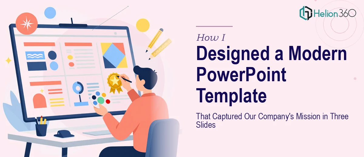
I opened PowerPoint with a rough idea in my head and started building. A title slide with our logo, a second slide for mission and vision, a third for milestones. Simple enough in concept. But the moment I started placing elements, I realized how much goes into making a slide actually look considered rather than just assembled.
Where the Process Started to Break Down
The content was clear. The challenge was the design layer underneath it. I wanted the PowerPoint template to carry a visual identity — not just brand colors slapped on a white background, but something with structure, spacing, and hierarchy that would make every element feel intentional.
I spent time trying different layouts. I pulled in some stock graphics, tried a few font pairings, tested a color palette that felt modern but not trendy. Nothing was clicking. The slides looked either too plain or too busy. The graphics I found online felt generic. The color scheme I was working with looked fine in isolation but lost coherence when all three slides were viewed together.
The issue was not a lack of effort. It was that professional slide design involves decisions I had not thought through — grid alignment, type scaling, visual weight, how imagery interacts with text at different sizes. Each small choice affects everything around it.
Bringing in a Team That Knew What They Were Doing
After a few rounds of rework that were going nowhere, I reached out to Helion360. I explained the scope: a custom PowerPoint template built around our brand, three slides, company launch context, professional and polished without being overcrowded.
Their team asked the right questions upfront — color preferences, font direction, the tone we wanted to strike, whether any existing brand guidelines needed to be followed. That initial conversation alone signaled they were thinking about the design the way it should be thought about: as a system, not a set of individual slides.
What the Final Template Looked Like
What came back was exactly what I had been trying to build but could not quite get there on my own. The PowerPoint template had a clean, modern structure with a consistent grid across all three slides. The color scheme was cohesive — a restrained palette that felt confident without being loud. The typography was layered properly, with clear hierarchy between headings, subtext, and supporting details.
Each slide had a distinct purpose but felt like part of the same visual story. The mission slide led with a strong headline and supporting text anchored by a graphic element that drew the eye without distracting from the words. The vision slide used whitespace deliberately. The achievements slide organized our milestones in a way that was easy to scan but still visually engaging.
The high-quality graphics they sourced and incorporated felt native to the layout — not like afterthoughts dropped on top of text.
What I Took Away from the Experience
The biggest lesson was understanding that a good presentation template is not just about making something look nice. It is about building a visual framework that can carry a message clearly and consistently. When three slides need to tell a company's story, every design decision matters more, not less.
Having a team that could execute at that level made the difference between something presentable and something that actually represented the company well at launch. The template has since been reused for follow-up communications, which was an added benefit I had not even planned for.
If you are working on a company launch presentation and finding that the design is not coming together the way you envisioned, Helion360 is worth a conversation. Learn more about how modern PowerPoint presentations can showcase your company's story — they took a brief I could not fully execute on my own and turned it into something the whole team was proud to present.