

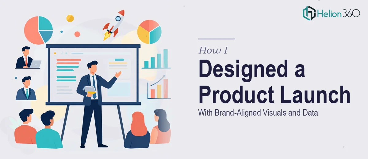
The Presentation That Had to Work for Everyone in the Room
We had a product launch coming up, and the slide deck wasn't optional — it was the centerpiece. The audience wasn't a single, predictable group. On one side were tech-savvy product enthusiasts who wanted to see architecture, specs, and performance data. On the other were business professionals who needed to walk away with a clear value story, not a feature list. The deck had to speak to both without losing either.
On top of that, the presentation had to carry our brand without looking generic. That meant real visual decisions — color systems, typography, layout structure — not just dropping a logo on a slide. The deadline was firm, the stakes were real, and I knew immediately that this wasn't something to patch together in PowerPoint over a long weekend. It needed to be done right.
What I Found Out Designing This Well Actually Requires
Once I started looking at what a proper product launch presentation design actually involves, the scope got clearer — and bigger. It isn't just making slides look polished. A multi-audience deck requires a deliberate narrative structure: deciding what each audience segment needs to hear first, how technical depth gets layered in without overwhelming non-technical readers, and how the story arc holds together from the opening hook to the closing call to action.
Then there's the visual system. Delivering three distinct color scheme options and three font pairings isn't a stylistic exercise — each combination has to be evaluated for contrast ratios, readability at projection size, and brand coherence. A color palette that looks clean on a laptop screen can fail completely on a large display under conference lighting.
And the data. The brief called for statistics and product metrics embedded throughout. Getting data into a presentation isn't the hard part — presenting it so a business professional and a technical evaluator both find it credible and clear is where the real skill lives. I recognized straight away that attempting this myself wasn't a realistic use of my time.
What the Work That Goes Into a Deck Like This Actually Looks Like
The right approach starts with a structural and narrative audit of the source material. A product launch presentation for a mixed audience needs a clear information hierarchy: lead with the business value proposition, layer in technical validation where credibility demands it, and sequence the features-and-benefits content so it answers the questions each audience type is asking in the order they're asking them. Getting this mapping right before a single slide is designed typically takes several hours of content architecture work. Skip it, and the deck reads like a feature dump no matter how well-designed the visuals are.
Visual mechanics are the next layer, and they're more exacting than most people expect. A production-ready slide deck built for a multi-audience product launch uses a 12-column layout grid, a type hierarchy of roughly 36pt for headlines, 24pt for body, and 16pt for captions or data labels, and a controlled brand palette of no more than four primary colors with two or three supporting neutrals. Producing three fully realized color schemes and three font pairings — not mockups, but working master slide sets with correct style propagation — means building out multiple complete theme files. For someone doing this for the first time, that alone can consume two full days before any content slides exist.
Data visualization for a technical and non-technical audience simultaneously requires deliberate chart selection and annotation discipline. Technical audiences trust specificity — precise axis labels, source callouts, and granular breakdowns. Business audiences need the headline finding front and center, with supporting data subordinated visually. The practitioner decision here is to run two visual registers in parallel: a summary layer readable in three seconds and a detail layer available for those who look closer. Building this into every data slide while maintaining visual consistency across the full deck is the kind of work that trips up even experienced designers who aren't accustomed to audience-segmented decks.
Why I Brought in Helion360 to Handle the Full Project
I looked at what the work actually involved — the narrative architecture, the multiple design system options, the dual-audience data visualization — and made the call quickly. This wasn't a job for trial and error on my end. I needed a team that already had the process, the tooling, and the design judgment built in.
Helion360 handled the project end-to-end. That meant taking the raw product brief and source content, building the narrative structure for a mixed technical and business audience, producing three complete color scheme options and three font pairings as fully working PowerPoint master files, and designing all data slides with the layered visualization approach the brief required. They turned the full deck around in a fraction of the time it would have taken me to work through even the first round of design options. Done in days, with everything production-ready and brand-consistent on delivery.
The Result, and What I'd Tell Anyone Looking at the Same Problem
What came back was a deck that genuinely worked across both audience types. The narrative held together from opening slide to close. The data slides carried enough specificity to satisfy a technical reviewer without burying the headline metrics a business stakeholder needed to see at a glance. The three design system options gave the team real choices — not variations of the same safe template — and the final selection came together cleanly because the underlying structure was already sound.
The product launch went forward with a presentation that reflected the quality of what we were launching, not the limitations of what we could produce under deadline pressure.
If you're looking at a similar brief — multi-audience, brand-critical, data-heavy, with real deadline pressure — and you want it handled end-to-end without the weeks of learning curve, Helion360 is the team to engage. They delivered fast, and they handled exactly the kind of execution depth this work demands.