

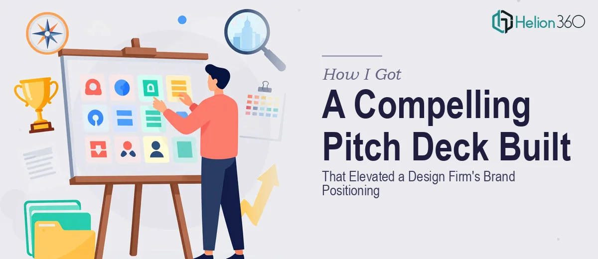
The Problem With Presenting a Design Firm's Story
When your company is in the business of design, the bar for your own pitch deck is painfully high. Prospects and partners aren't just evaluating what you say — they're evaluating how it looks, how it flows, and whether the whole thing holds together as a coherent visual argument. I was sitting with exactly that problem: a growing design firm with a genuine story to tell, key projects worth showcasing, and a team with real expertise — but no presentation that did any of it justice.
The stakes were straightforward. We had conversations coming up with potential clients and partners who would form impressions fast. A mediocre deck wasn't just a missed opportunity — in our industry, it would actively undermine credibility. This needed to be done properly, and I knew quickly that "properly" meant more than I could define off the top of my head.
What I Found a Good Pitch Deck Actually Requires
Before engaging anyone, I spent time understanding what a well-executed company pitch deck for a design firm actually involves — and the scope surprised me.
The first thing that became clear: the narrative structure isn't optional. A pitch deck isn't a portfolio dump or a capabilities list. The right approach sequences information so that each slide creates a question the next slide answers — a deliberate arc that moves from context to credibility to capability to call to action. Getting that sequence wrong means the deck feels like a brochure rather than a story.
The second signal of real complexity: brand consistency at the slide level. A design firm's deck has to demonstrate, not just describe, design thinking. That means every typographic decision, every color application, every image choice has to be intentional and coherent. Amateur execution is immediately visible to exactly the audience this deck is meant to impress.
Third: the visual mechanics of a multi-slide deck — master slide architecture, grid systems, icon consistency — are far more involved than they appear from the outside. A deck that looks clean took real structural work to get there.
What the Work Actually Involves
The structural and narrative work comes first and sets everything else up. A pitch deck for a design firm needs a clear information hierarchy: typically an opening problem or opportunity frame, a positioning statement, proof-of-capability through selected case studies, a team section that conveys depth, and a closing that makes the next step obvious. The practitioner's job at this stage is to audit every piece of source content, decide what earns a slide and what gets cut, and map a story arc where slide five earns its place because of what slide four established. This kind of editorial discipline takes time — a single round of restructuring can consume a full day — and people underestimate how much back-and-forth it requires before the sequence feels inevitable rather than arbitrary.
The visual mechanics layer sits underneath everything and determines whether the deck reads as professional or homemade. Done well, this means establishing a 12-column layout grid, a strict three-level type hierarchy (typically 36pt headline, 24pt subhead, 16pt body), a palette limited to four brand colors with defined usage rules, and a consistent icon set treated at uniform weight and scale. Master slides need to propagate these rules automatically so that every new slide inherits the system without manual correction. For someone without deep experience in slide architecture, configuring master slides that hold across 25 or 30 slides — without spacing drift, font substitution, or color inconsistency — is a multi-hour exercise that frequently goes wrong in subtle ways that only surface on a second screen or in print.
Polish and consistency at the project level is where most self-built decks fall apart quietly. Individual slides may look acceptable in isolation, but a deck reviewed in sequence reveals misaligned text boxes, inconsistent image treatment, padding that shifts by four pixels between slides, and logo placements that aren't anchored to the same grid point. For a design firm presenting to design-literate audiences, these inconsistencies are noticed instantly and read as carelessness. Getting a 28-slide deck to full consistency — checking every element against the grid, standardizing image crop ratios, aligning all interactive or animated elements — is not a pass that takes an hour. It is a systematic review that typically surfaces 40 to 60 individual corrections before the deck is truly production-ready.
Why I Brought Helion360 in to Handle It
After understanding what the work actually involved, the decision to engage Helion360 was immediate. There was no point attempting to build this myself — the combination of narrative strategy, visual system architecture, and consistency work required a team with the tooling and pattern recognition already in place.
Helion360 handled the project end-to-end: they took the source content and assets, built the narrative arc from scratch, established the full visual system, and delivered a production-ready deck. The turnaround was fast — done in days, not weeks — which mattered because the timeline was real. What would have taken me weeks of learning, trial, and revision was handled in a fraction of that time by a team that does this kind of work every day. The depth of execution — from slide master architecture to image curation to final consistency pass — was exactly what a brand story presentation design services demands.
The Outcome, and What I'd Tell Anyone in the Same Position
What came back was a deck that felt like the firm it represented: confident, visually coherent, and structured to move a viewer from introduction to interest without ever feeling like a hard sell. The case study slides communicated capability without overwhelming detail. The team section conveyed depth without reading like a résumé wall. The overall arc made the firm's positioning clear within the first three slides — which is exactly where that clarity needs to land.
The business outcome was tangible. Conversations that used to start with explanation now started with engagement. The deck did the positioning work before anyone in the room had to.
If you're looking at a similar situation — a pitch deck that needs to hold up to a design-literate audience and actually move the conversation forward — Helion360 is the team I'd engage. They delivered fast, handled the full execution depth this kind of project requires, and the result was a visually coherent presentation we were genuinely proud to put in front of people.