

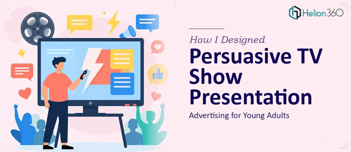
The Pitch That Couldn't Afford to Miss the Room
I was working on a TV show advertising proposal aimed squarely at young adult audiences — the 18-to-34 demographic that every broadcast and streaming partner wants to court but few teams know how to speak to convincingly. The presentation needed to land with media buyers and content commissioners in a single sitting. There was no second meeting penciled in, no follow-up deck planned. This was it.
The stakes were real. A weak presentation meant the concept gets shelved, the budget doesn't get approved, and months of creative development go nowhere. I knew early on that a slide deck built from a generic template wasn't going to cut it. A persuasive TV show advertising presentation for this audience and this room had to do specific things — things that required more than a clean layout and a few bullet points cleaned up overnight.
I recognized quickly that this needed to be done properly, and that doing it properly meant understanding exactly what "properly" looked like.
What Doing This Well Actually Requires
I started researching what makes advertising presentations in the TV and media space actually work — not just look good, but move decision-makers. What I found was humbling.
First, the narrative architecture has to carry the weight. Young adult audiences are a fragmented, skeptical group. Media buyers know this. Any presentation claiming to reach them needs to demonstrate a deep understanding of viewing behavior, platform preferences, and cultural relevance — not just assert it. The story arc has to move from insight to opportunity to proof, and every slide has to earn its place in that sequence.
Second, the visual language has to match the audience being pitched. A deck selling a show targeting 22-year-olds should not look like a corporate compliance report. The typography, color energy, pacing of content, and motion cues all need to signal cultural fluency. Getting that tone wrong undermines the credibility of the pitch before a single word is spoken.
Third, the data layer has to be handled with care. Viewership stats, demographic reach figures, and engagement benchmarks are table stakes in media pitches — but how they're visualized determines whether they land as evidence or noise. That combination of narrative precision, visual tone-matching, and data presentation is not a one-afternoon problem to solve.
What the Actual Build Involves
The structural work starts with auditing every claim in the source material and mapping it to a clean story arc. For a TV advertising pitch, that means sequencing the deck so the audience insight comes first — establishing the problem the show solves for viewers — before moving into the advertising opportunity and the proof points that support reach. A well-structured pitch deck in this space typically runs 14 to 20 slides, with no more than one core argument per slide. Getting that architecture right before touching a single design element takes concentrated effort, and skipping it produces a deck that looks polished but fails to persuade.
The visual mechanics of a youth-facing media presentation carry their own requirements. Typography hierarchy in this context typically follows a 40pt title, 24pt subtitle, and 16pt body rule — with font choices that read as current without being gimmicky. Color palettes are kept to four brand-aligned tones maximum, and motion is used deliberately: entry animations on key stats, subtle transitions between sections, nothing that distracts. Setting up a master slide system that propagates these rules consistently across 18 or more slides is genuinely time-consuming for anyone who doesn't live in this software daily.
The data visualization layer in a TV advertising pitch is where many decks lose credibility. Viewership index figures, demographic composition charts, and platform reach comparisons need to be translated into chart types that match the argument — a clustered bar for competitive comparison, a slope chart for trend momentum, a simple callout card for a single striking number. Each chart needs clean axis labeling, a visible insight headline above the visual, and source attribution below it. Choosing the wrong chart type for the data, or leaving the insight implicit, forces the audience to do interpretive work they shouldn't have to do.
Why I Brought in Helion360 to Handle It
After understanding the scope of what a genuinely persuasive TV show advertising presentation required, I didn't try to build it myself. The combination of narrative strategy, visual design calibrated to a youth audience, and properly executed data visualization was not something I could pull off at the level this pitch needed — not in the time available, and not without the specialized tooling and pattern recognition that comes from doing this kind of work repeatedly.
Helion360 handled the full project end-to-end through their business presentation design services. That meant working through the story architecture from scratch, building the visual system from the master slide level down, and translating all the viewership and demographic data into charts that were clear, credible, and visually consistent with the tone of the pitch. They turned the whole thing around quickly — done in days, not the weeks it would have taken me to learn and execute it at this standard. What came back was a deck that felt like it belonged in the room it was going into.
What the Deck Delivered and What I'd Tell Anyone in My Position
The presentation landed. The story moved cleanly from audience insight through opportunity to proof. The visual tone matched the energy of the show concept without feeling overdone. The data slides read as evidence rather than filler. Everyone in the room could follow the argument without having to work for it — which is exactly what a persuasive advertising presentation is supposed to do.
Building something at this level takes real structural thinking, design discipline, and data visualization skill applied in combination. If you're facing the same kind of pitch — a media proposal, an advertising presentation, anything where the visual and narrative standards are high and the timeline is short — Helion360 is the team I'd engage. They handled the full execution fast, and the depth of the work showed.