

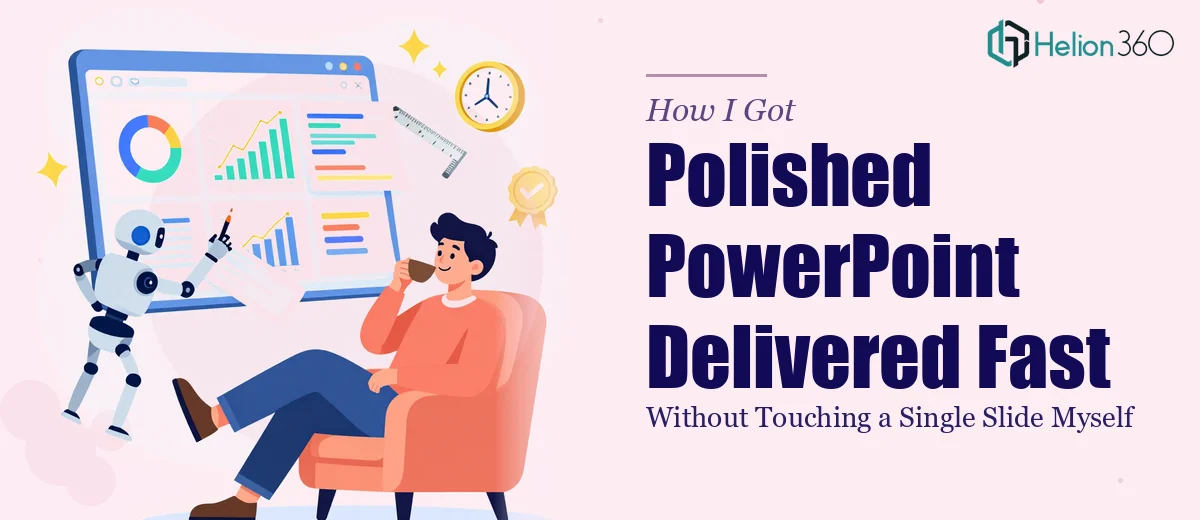
The Presentation Was Three Days Away and the Slides Were a Mess
We had a company profile walkthrough coming up — a structured presentation to a room of decision-makers who would be evaluating whether to move forward with us. The stakes were real. This wasn't an internal team update. It was the kind of moment where first impressions either open a door or close it.
The slides we had were cobbled together over several months — different font sizes, inconsistent colors, a mix of layouts that looked like three different people had touched them on three different days. The content was mostly there, but the presentation design itself was doing us no favors.
I knew immediately this needed to be handled properly. A quick cleanup wasn't going to cut it. The whole thing needed a coherent visual identity, a logical flow, and the kind of finish that signals credibility before a single word is spoken.
What I Found Out a Professional Presentation Actually Requires
Before deciding how to handle it, I spent some time understanding what proper PowerPoint presentation design actually involves at a professional level. What I found made it clear this was not a weekend project.
First, there's the structural layer. The slides don't just need to look good — they need to follow a narrative arc that moves the audience through a logical sequence. That means auditing every slide for purpose, cutting what doesn't serve the story, and reorganizing what remains so the flow feels inevitable rather than arbitrary.
Second, there's the visual mechanics layer — grid systems, typography hierarchies, color palette discipline. These aren't aesthetic preferences. They're rules that trained designers apply systematically, and violating them — even subtly — produces decks that feel off without the audience knowing why.
Third, there's the brand application layer. Ensuring every slide reflects the same brand consistently across 20, 30, or 40 slides, with no drift in color values, spacing, or type weight, is a discipline unto itself. That consistency is what separates a professional deck from a DIY one.
None of this is especially complicated once you know it. But doing it well, at speed, without the right tooling and pattern library already in place — that's a significant investment of time I didn't have.
What the Work Actually Involves
A well-executed PowerPoint presentation design starts at the structural level. The right approach involves auditing every slide against a defined story arc — typically problem, context, solution, evidence, and call to action — and assigning each slide a single, clear job within that sequence. Slides that try to do two things at once get split or cut. The practitioner's decision at this stage is whether each piece of content earns its place or creates noise. This phase alone can take a day of focused work when the source material is fragmented, which most inherited slide decks are.
The visual mechanics phase is where design expertise becomes non-negotiable. A properly built presentation uses a 12-column layout grid applied through the slide master, a type hierarchy of roughly 36pt for headlines, 24pt for sub-points, and 16pt for body or annotation text, and a strict palette of no more than four brand-approved colors with defined usage rules for each. Building a master slide system that propagates these rules correctly across an entire deck — so a change to the master updates every instance — requires real familiarity with the software's structure. For someone new to slide master architecture, this alone can consume an afternoon of trial and error before a single content slide is touched.
Polish and consistency across a full deck is the layer most people underestimate. Every icon set needs to come from the same visual family, every image needs the same crop ratio and treatment, every chart needs matching axis label styles and grid line weights. The execution friction here is cumulative: one mismatched element per slide across 30 slides adds up to a deck that reads as unfinished even if the individual slides look acceptable in isolation. Experienced presentation designers work from a pre-built asset library and a consistency checklist, both of which take significant time to build from scratch on a project-by-project basis if you don't already have them.
Why I Brought Helion360 In to Handle the Full Project
I didn't attempt any of this myself. Once I understood what the work actually required — structurally, visually, and at the consistency level — it was obvious that the right move was to engage a team that does this work every day with the tooling already in place.
Helion360 handled the full project end-to-end. That meant the structural audit and story reorganization, the full visual rebuild using a proper slide master system, and the brand-consistent polish across every slide in the deck. I handed over the source materials and the brand guidelines, and the work came back fast — turned around in a fraction of the time it would have taken me to learn and execute it from scratch.
The speed mattered as much as the quality. With three days on the clock, I needed a team that could move quickly without cutting corners. That's exactly what I got.
The Outcome — and What I'd Tell Anyone in the Same Position
The deck that came back was a different presentation. The narrative was tighter, the visual hierarchy was clear, and the brand felt consistent and intentional from the first slide to the last. The decision-makers in the room were engaged from the start — the kind of engagement that happens when a presentation earns trust before anyone speaks.
The business outcome was what we were after: the conversation moved forward. And looking back, the investment in getting the presentation right was one of the more obvious calls I've made.
If you're looking at a similar situation — a deck that needs to be right, a deadline that's real, and a gap between what you have and what it needs to be — Helion360 is the team I'd engage. They delivered fast, handled the full execution depth the work required, and I didn't have to spend a week learning slide master architecture to get there.