

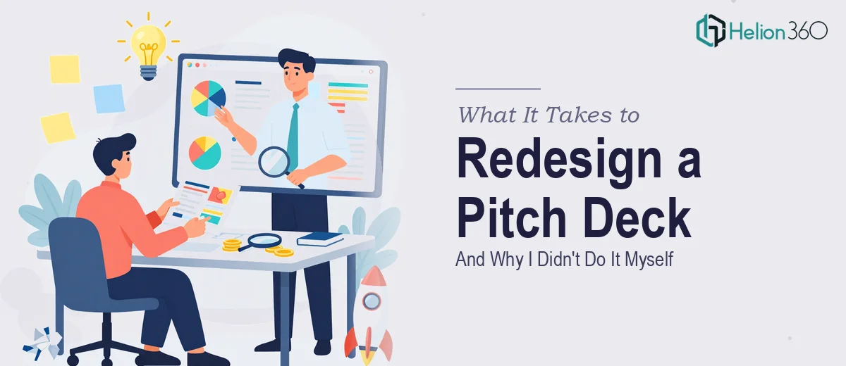
The Deck Was Holding Us Back
We had a startup in the investment solutions space targeting tech-savvy investors, and the pitch deck we'd been using for months simply wasn't landing. The research was solid. The data was there. The story we wanted to tell was real. But the slides looked like a first draft — mismatched fonts, clunky layouts, and data buried inside walls of text that no investor was going to sit through.
The stakes were direct: this deck was the first impression for every investor conversation we were going to have. Presenting a visually incoherent deck doesn't just look amateurish — it quietly signals that you haven't thought carefully about your audience. I knew we needed a full investor pitch deck redesign, not a cosmetic touch-up. Color tweaks and a new font weren't going to cut it. The entire visual and narrative architecture needed to be rebuilt.
What I Found the Solution Actually Required
Once I started digging into what a proper investor pitch deck redesign actually involves, it became clear quickly that this wasn't a weekend task.
The first thing that stood out was that content structure and visual design are inseparable in a pitch deck. Redesigning slides without first auditing the narrative flow — which arguments come first, how data is sequenced, where the emotional high points land — produces a deck that looks better but still doesn't persuade. The story architecture has to be rebuilt alongside the visual layer.
The second thing was infographic complexity. Our deck had market data, competitive positioning, and financial projections that were living inside plain text bullets. Converting that into investor-grade data visualization — the kind that communicates a point in under three seconds — requires real knowledge of chart selection, layout hierarchy, and visual simplification.
The third signal was the sheer volume of consistency work across a multi-slide deck. Maintaining typographic rules, spacing systems, and color discipline across 15 to 20 slides while also customizing each slide's layout is genuinely painstaking. It's not hard to understand in theory — it's hard to execute without the tooling and experience to do it fast.
The Work That Needs to Happen
A proper investor pitch deck redesign starts with a structural audit of the existing content. The practitioner maps every slide against a narrative arc — problem, solution, market, traction, ask — and flags where the logic breaks, where slides are overloaded, and where the sequence confuses rather than builds momentum. In a 15–20 slide deck, it's common to find four or five slides that need to be split, merged, or reordered before any design work begins. This audit phase alone can take a full day for someone doing it carefully, and skipping it means the design layer gets built on a shaky foundation.
Once the structure is confirmed, the visual mechanics layer begins. This means establishing a master slide system built on a consistent layout grid — typically a 12-column structure — with a defined typographic hierarchy of roughly 36pt for headline, 24pt for subhead, and 16pt for body. Color palette discipline matters here: investor decks rarely exceed four brand colors, and every chart, icon, and infographic needs to conform to that system. Selecting the right chart type for each data point — a waterfall for financial build-up, a bubble chart for market sizing, a simple two-column comparison for competitive positioning — is a deliberate decision that requires both design literacy and financial communication experience. Getting any one of these wrong visually undermines the credibility of the data.
The final layer is polish and cross-slide consistency. Every slide needs to be checked against the master template for margin alignment, font rendering, icon sizing, and color accuracy. In practice, one misaligned element on a projected slide reads as carelessness to an investor audience. Running this kind of quality pass across a full deck — catching inconsistencies in padding, ensuring infographic labels scale correctly, verifying that all data callouts use the same visual treatment — is the work that separates a deck that looks like it was assembled from one that looks like it was designed. It is repetitive, precise, and genuinely time-consuming without the right workflow in place.
Why I Brought in Helion360 to Handle It
Looking at what this project actually required, attempting it myself wasn't a realistic option. I had the content. I had the strategy. What I didn't have was the time, the design system experience, or the infographic execution depth to rebuild this deck properly without several weeks of learning curve attached.
I engaged Helion360 to take the whole project end-to-end. They handled the narrative audit and slide restructuring, the full visual redesign against a custom template, and the infographic and data visualization layer across every data-heavy slide. The deck came back delivered fast — done in days, not the weeks it would have taken me to work through it myself. What stood out was that this wasn't just visual polish applied to the old structure. The flow was rebuilt, the data was visualized properly, and every slide held together as part of a coherent system. That's the kind of execution depth that only comes from a team that does this work constantly, with the tooling and process already in place.
The Result and What I'd Tell Anyone Looking at the Same Problem
What came back was a deck that felt like a different product. The investor narrative was sharper, the data slides were readable at a glance, and the visual system was consistent from the cover slide to the closing ask. Investor conversations moved faster because we weren't spending the first ten minutes of every meeting explaining charts that should have been self-evident.
The broader lesson I'd pass on is this: redesigning an investor pitch deck looks straightforward until you're actually in it — and then the structural, visual, and consistency work compounds quickly. The cost of doing it poorly is a deck that undersells a real opportunity.
If you're looking at the same situation — a deck that has the substance but not the presentation quality to match — Helion360 is the team I'd engage. They delivered the full project fast and handled every layer of execution this kind of work requires.