

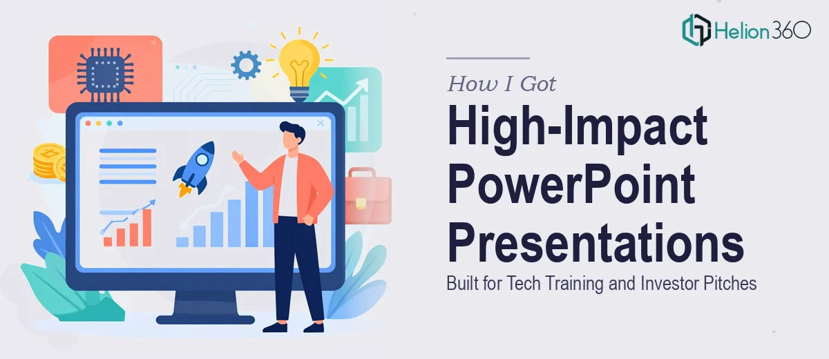
The Situation I Was Looking At
We were at a point where two very different but equally important presentation needs had converged at the same time. On one side, our internal tech training materials had grown into a disorganized pile of slides that no longer reflected who we were or how we taught. On the other side, we were preparing for investor conversations that couldn't afford a weak first impression.
Both presentations needed to work hard. The training decks had to make complex technology concepts genuinely accessible to learners — not just readable, but clear enough that someone could follow a module without a facilitator holding their hand. The investor pitch deck had one job: make our case compellingly enough to earn the next conversation.
I knew quickly that doing both of these at the level they needed to be done — simultaneously, under real time pressure — was not something to attempt on the fly.
What I Realized These Projects Actually Demanded
Once I started looking at what doing this well actually required, the scope became obvious.
A training deck isn't just a slide deck with bullet points. Effective instructional PowerPoint presentations for a tech training company need a clear learning arc — objectives upfront, concept introduction, worked examples, knowledge checks, and summary reinforcement. Each module has its own internal logic. Skip any of it and learners disengage. Get the visual hierarchy wrong and even good content gets ignored.
The investor pitch deck is a different discipline entirely. There's an expected structure that experienced investors recognize immediately — problem, solution, market size, traction, team, ask. Deviate from it without good reason and you signal inexperience. But within that structure, every slide has to pull weight, and the visual design has to project credibility, not just competence.
Two different formats, two different audience expectations, both requiring real craft. That combination is what told me this wasn't a one-person, spare-weekend project.
What the Execution of Both Projects Actually Involves
The structural work on a tech training presentation starts with auditing the source material and mapping a learning arc before a single slide is touched. A properly structured training module follows a sequence: learning objectives stated in measurable terms, concept delivery in digestible sections, applied examples that mirror real scenarios, and checkpoint moments to test retention. For a tech training company operating in a fast-moving space, this also means ensuring that the content hierarchy signals what's foundational versus what's advanced — typically enforced through a clear typographic system using no more than three heading levels, often 36pt/24pt/16pt, with consistent color cues distinguishing instructional text from example content. Getting this architecture right across a multi-module deck takes significant time, and any inconsistency across slides erodes learner trust immediately.
The visual mechanics on an investor pitch deck operate under a different but equally strict set of rules. The layout needs to guide the eye from headline claim to supporting data to the takeaway without the viewer doing interpretive work. A 12-column grid applied consistently across all slides ensures that charts, text blocks, and images land in predictable, professional positions. Data visualizations — market size, growth trajectories, traction metrics — need to be chart types chosen for the story they tell, not default templates. A bar chart and a waterfall chart communicate fundamentally different narratives, and the wrong choice undermines the argument even when the underlying numbers are strong. Setting this up cleanly across a full pitch deck, while keeping the brand palette disciplined to four colors or fewer, is the kind of work that compounds in complexity as slide count grows.
Polish and brand consistency across both decks is where a lot of self-managed attempts fall apart. Consistent padding, aligned master slide elements, typography that doesn't drift between sections, icon sets that stay on-model — none of these are individually difficult, but maintaining all of them simultaneously across two separate decks with different purposes requires a systematic approach from the start. A font that appears in two weights in one slide and three in the next, or a logo that shifts position across slide masters, signals a lack of control that audiences pick up on subconsciously. Propagating master slide changes correctly so that global edits don't break individual slides is a technical discipline that trips up even experienced PowerPoint users who don't work in the tool daily.
Why I Brought Helion360 In to Handle Both
I looked at what both projects actually involved and made the decision quickly. Attempting this myself — or trying to coordinate it internally across two parallel workstreams — would have taken weeks and likely produced something that looked like the effort it was.
Helion360 handled both decks end-to-end. That meant taking the raw training content and building out the full instructional structure, not just formatting what was handed over. It meant building the investor pitch deck from the narrative foundation up — story arc, slide-by-slide logic, visual design, and data visualization — not just making existing slides look better. And it meant applying brand consistency across both decks so that everything we handed an investor or put in front of a learner felt like it came from the same company.
The turnaround was fast. Both decks were done in days, not weeks — handled in a fraction of the time it would have taken me to learn and execute it myself, and at a quality level that would have been very hard to reach without a team that does this work every day.
What We Got and What I'd Tell Anyone in This Position
What came back was exactly what both contexts demanded. The training presentations gave our instructors a clean, structured tool they could actually use — modules with a real learning flow, visual cues that guided attention, and a consistent look that reflected the quality of the education we deliver. The investor pitch deck was tight, confident, and built around a clear narrative arc that held together under scrutiny.
The business outcome mattered more than the aesthetics. Learners engaged with the training material differently when the structure supported them. And investor conversations moved forward because the deck projected a level of preparedness that matched the seriousness of what we were asking for.
If you're looking at the same dual challenge — training materials that need real instructional design and a pitch deck that has to perform in front of sophisticated investors — Helion360 is the team I'd engage without hesitation. They delivered fast, handled the full execution depth both projects needed, and freed me to focus on the conversations that mattered.