

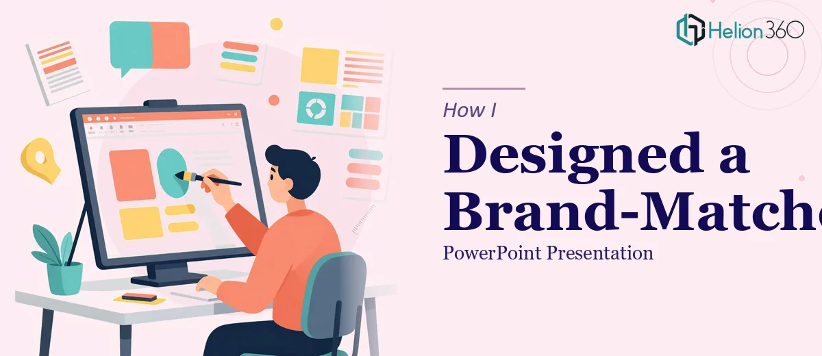
The Brief Looked Simple Enough
We had an upcoming marketing event, and I was responsible for putting together a PowerPoint presentation that would represent our brand in front of a room full of potential partners. The raw content was ready — messaging, data points, product highlights. On paper, the task seemed manageable.
I opened PowerPoint, picked a template that looked close enough to our brand colors, and started dropping in content. Two hours in, I had something that technically worked but looked nothing like what I had in mind. The slides were cluttered. The fonts didn't feel cohesive. The color palette I was using didn't match our brand guidelines closely enough, and I kept second-guessing every design choice.
Where PPT Presentation Design Gets Complicated
The challenge with PPT presentation design isn't just making slides look good. It's about making every visual decision — spacing, hierarchy, color, iconography — work together to tell a story. And when you're also the person who wrote the content, it's genuinely hard to step back and see the presentation the way an audience will.
I spent another evening trying to clean things up. I watched tutorials on slide design, downloaded a few custom PPT templates to see if they'd help, and tried rebuilding from scratch. The structure improved, but something was still off. The slides didn't feel like they belonged to a brand. They felt like a competent attempt at one.
With the event a week out, I knew I needed a different approach.
Bringing in the Right Support
After hitting that wall, I came across Helion360. I explained the situation — the deadline, the brand assets I had, the tone I was going for, and the gaps I couldn't seem to bridge on my own. Their team asked the right questions upfront: Who is the audience? What's the one thing they should remember after seeing this? What does the brand feel like in terms of energy and visual style?
That conversation alone changed how I thought about the project. They weren't just asking for files to work with — they were trying to understand the presentation's purpose before touching a single slide.
What the Design Process Actually Looked Like
Helion360's team took the raw content and brand assets and started with a layout structure before any visual styling. They mapped out a slide flow that supported the narrative arc of the presentation rather than just organizing bullet points. Once the structure was solid, the visual design came together quickly.
The color scheme was pulled directly from brand guidelines and applied consistently — backgrounds, accent colors, chart fills, even icon styles. Typography was tightened to two fonts used with clear hierarchy. Data that I had thrown into a table became a clean visual infographic. The result was a presentation that looked intentional, not assembled.
I reviewed two rounds of drafts, gave feedback on a few specific slides, and the final version was delivered with time to spare.
What This Experience Taught Me
Good presentation design is its own discipline. Knowing the content deeply is not the same as knowing how to present it visually. The moment I stopped trying to do both at once, the project moved faster and the output was significantly better.
I also learned that brand consistency in a presentation is not just about matching colors. It's about making sure the slide design communicates the same personality as the rest of the brand — the confidence, the clarity, the level of detail. That's hard to achieve without intentional design thinking behind it.
The event went well. The slides held up on a large screen, the narrative was easy to follow, and more than one person asked who designed the deck.
Working on a Presentation That Needs to Perform?
If you're in a similar spot — solid content, a real deadline, but the design just isn't coming together — Helion360 is worth reaching out to. They handled what I couldn't, asked the right questions to understand the brief, and delivered a polished result without the back-and-forth that usually drags these projects out. Sometimes the smartest move is knowing when to hand it off to a team that does this every day.