

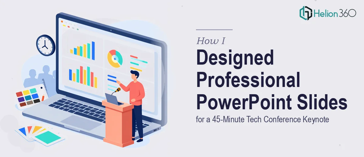
The Pressure of a 45-Minute Stage Slot
When our startup locked in a 45-minute keynote slot at an upcoming tech conference, the excitement was immediate. Then reality set in. We had the content — talking points, product screenshots, market data — but the slides themselves looked like an internal draft, not something ready for a conference stage. Mismatched fonts, inconsistent colors, walls of text on nearly every slide. The content told a strong story, but the visuals were not doing it any favors.
I figured I could handle the redesign myself. I knew our brand guidelines, I had used PowerPoint for years, and how hard could it be to clean things up over a weekend?
Where It Started Getting Complicated
The first problem was scope. A 45-minute keynote is not a short pitch. We had over 50 slides to work through, and making them look cohesive — not just individually cleaned up — required a design system, not just slide-by-slide edits. Every section needed a visual rhythm, smooth transitions between topics, and a consistent layout language that would hold attention for the full duration.
I started with the opening slides and spent four hours on just the first eight. The font pairing looked off. The hero images I was using felt stock-heavy. And every time I fixed one slide, it created an inconsistency with the ones around it. I also realized that for a tech conference, the slides needed to feel modern and minimal — the kind of presentation design that signals credibility before a single word is spoken.
That is when I accepted this was beyond a weekend project.
Bringing In a Team That Knew What They Were Doing
I came across Helion360 while looking for professional presentation design support. After a quick conversation about the project — the startup context, the conference format, our brand aesthetic, and the timeline — their team took over the deck completely.
What impressed me was how quickly they understood the brief. They were not just making things look prettier. They restructured how information was presented visually, created a consistent slide template system across all sections, and made sure the design scaled well for a large conference screen. The typography, color palette, and icon style all aligned with our brand without feeling stiff or templated.
What the Final Deck Actually Looked Like
The difference between the original slides and what came back was significant. The opening section had a strong visual hierarchy that set the tone immediately. Data slides used clean charts and callouts instead of cluttered tables. Product screenshots were framed properly and given enough breathing room to actually read. Transition slides between sections gave the presentation a sense of pacing — something I had not even thought to consider.
Slides that previously had six bullet points were redesigned as single-focus layouts where one idea led clearly to the next. The whole deck felt like it belonged on a conference stage.
What I Took Away From This Experience
The content work I had done was solid. The problem was that turning solid content into a professional keynote presentation requires a different skill set — one that involves layout logic, visual consistency, and an understanding of how audiences absorb information on a large screen during a live talk.
Handling the PowerPoint redesign myself would have cost far more time than it saved, and the output would not have matched what a tech conference audience expects. Getting the design right actually made us more confident going into the event. The slides did not distract — they supported.
If you are working on a conference keynote or any high-stakes presentation and the design side is slowing you down, Helion360 is worth reaching out to — they handled the heavy lifting and delivered exactly what the project needed. Learn more about how modern slide design can transform your presentation impact.