

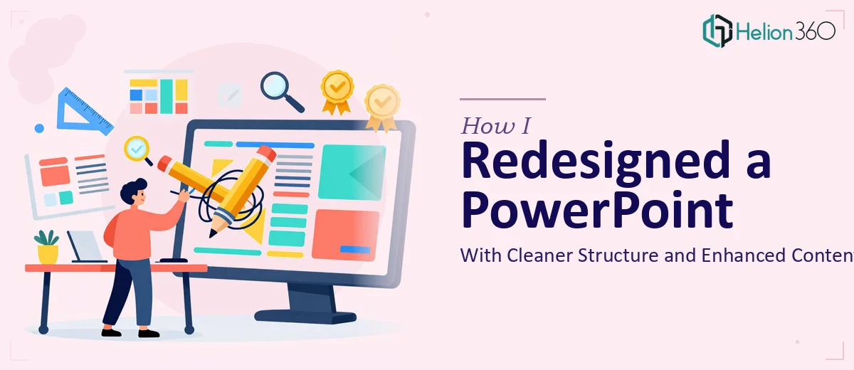
When a Presentation Needs More Than Just a Touch-Up
I had a PowerPoint file that had been put together over time — different sections added by different people, formatting that drifted from slide to slide, and content that had grown into something harder to follow than it needed to be. The goal was straightforward: clean it up, tighten the structure, remove what did not belong, and add a few elements to make it more complete.
On paper, it sounded like a quick afternoon task. In practice, it was anything but.
The Problem With Editing Your Own Slides
When you are too close to a document, it is genuinely difficult to see what needs to go. I kept second-guessing which sections to cut, whether the flow made sense to someone reading it fresh, and whether the design changes I was making actually improved anything or just shifted the same problems around.
I spent a few hours reworking the layout — adjusting fonts, reorganizing slide order, trying to bring some visual consistency across the deck. But every time I stepped back and reviewed it, something still felt off. The slides I thought were fixed still looked cluttered. The sections I had reorganized still felt disconnected. And the new content I had drafted to fill certain gaps did not match the tone of the rest of the presentation.
The problem was not my familiarity with PowerPoint. The problem was that presentation redesign with an eye for both structure and visual clarity is a specific skill — and doing it on a file where the existing design needs to be respected while still being refreshed makes it harder still.
Bringing in the Right Support
After a few rounds of edits that were not getting me where I needed to be, I reached out to Helion360. I explained the situation: the file needed a content strategy presentation design that preserved the overall look but brought better organization, removed the redundant sections, and added a few elements to fill the gaps. I also wanted to make sure the updated version was different enough from the original to feel like a proper revision — not just a copy with minor tweaks.
Their team reviewed what I had and came back with a clear plan. They would restructure the slide flow, align the formatting throughout, trim the content that was not pulling its weight, and build out the sections that needed more substance.
What the Redesigned Presentation Looked Like
The difference in the final file was noticeable right away. The slide layout was consistent — same font treatment, same spacing logic, same visual hierarchy across every section. The content that had been cluttering certain slides was gone, and what replaced it was tighter and more purposeful.
The structure made more sense as a whole. Each section had a clear opening, a logical middle, and a clean transition to what came next. The additions felt like they belonged — they matched the tone and level of detail of the rest of the deck rather than standing out as something bolted on at the end.
Most importantly, the presentation read like it had been built with intention from the start, not assembled in stages and patched together over time.
What I Took Away From This
Modern presentation design looks simpler than it is. Cleaning up a slide deck is not just about making things look nicer — it requires thinking about information flow, visual consistency, and how someone unfamiliar with the content will actually experience the slides from beginning to end. When those elements are handled well, the result speaks for itself.
I also learned that stepping away from a project and letting someone with fresh eyes take it over is often the most efficient decision. The hours I spent going in circles were saved — and then some — by handing it off to people who do this kind of work every day.
If you are in a similar position — a presentation that needs restructuring, a file that has grown unwieldy, or content that needs both editing and a design refresh — Helion360 is worth reaching out to. They handled the complexity I could not resolve on my own and delivered exactly what the project needed.