

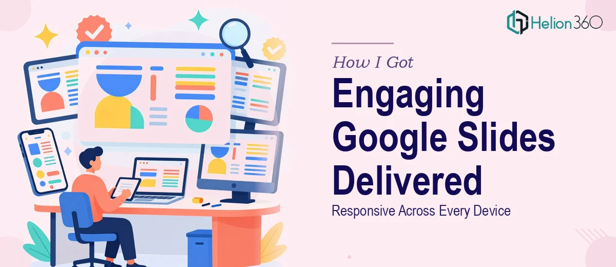
The Presentation Had to Work Everywhere — and Look Great Doing It
We had an important presentation coming up — the kind that gets shared before the meeting, projected on a conference room screen, and then pulled up again on someone's phone during a follow-up call. It wasn't a pitch deck in the traditional sense, but it was representing the brand in a high-stakes context, and the visual quality was absolutely going to be noticed.
The problem was that the existing Google Slides file was built without any real design system behind it. Fonts were inconsistent, layout proportions broke on smaller screens, and the overall look didn't reflect the brand we'd spent time building. With a firm deadline and a distributed audience that would be viewing across devices, this wasn't something that could be patched up with an afternoon of tinkering. It needed to be done right.
What Doing This Well Actually Involves
I spent some time researching what a properly built, visually consistent Google Slides presentation requires — and the answer was more layered than I expected.
The first thing that surfaced was how much of the work happens before a single slide is touched. Responsive, polished Google Slides presentations require a structured master slide system — custom layouts, theme-level font assignments, and a defined color palette applied globally. Without this foundation, every edit becomes a manual, error-prone process.
The second thing was how specific the visual mechanics need to be. Professional Google Slides design isn't just about making things look nice — it involves decisions about aspect ratio handling (16:9 is standard, but it needs to be tested), grid-based alignment, and typography scaling that reads clearly both at projection size and on a mobile screen.
The third signal was brand consistency at scale. Applying a brand identity across twenty or thirty slides — with icons, imagery, and text all behaving predictably — is a craft problem, not just a style preference. Getting it wrong means a presentation that looks assembled rather than designed.
What the Work Itself Actually Requires
The foundation of any well-built Google Slides presentation is its master slide architecture. Proper execution means defining custom slide layouts within the theme editor — not just one or two, but a working set that covers title slides, content layouts, data slides, and transition frames. Typography hierarchy follows strict rules: a title at 36–40pt, subheadings at 24pt, and body text at 16–18pt, all assigned at the theme level so they cascade consistently. Getting this right takes time even for someone who knows the platform well. For someone new to Google Slides' master system, the learning curve alone can consume most of a working day before a single content slide is actually built.
Visual mechanics are where design decisions compound quickly. A 12-column grid governs horizontal alignment, and maintaining it across slides with mixed content types — text-heavy layouts next to image-forward layouts, for example — requires constant discipline. Color palette application follows a strict rule: no more than 4 brand colors in active use per presentation, with one primary, one accent, one neutral, and one text color. Every deviation from this creates visual noise that audiences notice subconsciously, even if they can't articulate why the deck feels off. Responsive behavior adds another layer — objects need to be sized and anchored so they don't shift or crop when the presentation is opened on a screen with different proportions.
The final layer is polish and brand consistency across the full slide set. This means icon style must be uniform — outline icons don't mix with filled icons, and sizing stays within a defined range (typically 24px–48px for inline use). Image treatment needs a consistent approach: same overlay opacity, same corner radius if rounded, same masking shape throughout. A presentation that nails individual slides but loses consistency between them reads as unfinished. Auditing thirty slides for these micro-decisions, correcting them, and stress-testing the file across devices is methodical, time-intensive work — and it's exactly the kind of thing that gets underestimated until you're three hours in.
Why I Brought in Helion360 to Handle It
I looked at what the project actually required — a master slide rebuild, a full visual system, brand application across every slide, and device testing — and I recognized immediately that attempting this myself wasn't the right call. Not because the individual skills are impossible to learn, but because doing it well requires a combination of depth and speed I didn't have available.
Helion360 handled the full project end-to-end. That meant auditing the existing file, rebuilding the master slide architecture from scratch, applying the brand system across all slides with proper typography hierarchy and grid alignment, and delivering a file that rendered cleanly across projection, desktop, and mobile contexts. The turnaround was fast — done in days, not weeks. The kind of execution depth this work requires — the master layout system, the palette discipline, the responsive testing — was already built into how their team works. There was no ramp-up time, no trial and error, and no back-and-forth on basics.
What Came Back — and What I'd Tell Anyone in the Same Position
The delivered presentation looked like a different product. The master slide system meant that every layout was consistent without manual intervention. The typography scaled properly at every viewing size. The brand colors were applied with discipline — nothing felt arbitrary. The file was clean enough that future updates could be made without breaking the design, which turned out to matter almost immediately when we needed to add a section before the presentation went out.
The business outcome was straightforward: we went into a high-visibility context with a presentation that reflected the quality of the brand rather than undermining it. That's not a small thing when the audience is forming impressions at every touchpoint.
If you're looking at a similar situation — a Google Slides presentation that needs to be device-ready, brand-consistent, and built on a real design system — and you want it handled end-to-end without the weeks of learning curve, Helion360 is the team I'd engage. They delivered fast and brought exactly the execution depth this kind of work demands.