

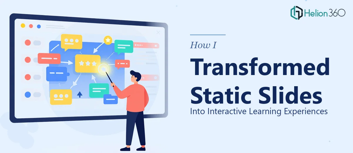
The Slides Were There — But They Weren't Working
We had a full library of PowerPoint presentations built over two years. They covered technology, business fundamentals, and creative disciplines. The content was solid. The problem was everything else.
Slide after slide was just text on a background. No visual hierarchy, no animation logic, no multimedia integration. For online learners sitting through a 45-minute course, these slides weren't teaching — they were just scrolling.
I knew we needed to transform these into interactive PowerPoint presentations that matched how people actually learn. I decided to take a crack at it myself first.
Where the DIY Approach Hit a Wall
I started by picking one module and reworking it. I cleaned up the layouts, added some slide transitions, and dropped in a few icons. It looked better. But it still felt flat.
The real challenge came when I tried to add interactive elements — clickable quizzes, branching navigation, embedded video with captions, and infographic-style data slides. PowerPoint can technically do a lot of this, but doing it well across 200-plus slides, while maintaining consistent branding and accessibility standards, was a different problem entirely.
I also realized I was spending design time instead of course development time. Every hour I spent adjusting master slides or troubleshooting animation triggers was an hour not spent on curriculum.
That's when I reached out to Helion360. I explained the scope — dozens of course modules, mixed topics, inconsistent formatting, and a need for interactive elements that would actually support different learning styles. Their team understood the brief immediately and took over from there.
What the Redesign Actually Involved
Helion360 started by auditing the existing slide decks and establishing a clean master template that reflected our brand — consistent fonts, a structured color system, and reusable layout grids for different content types: lecture slides, activity prompts, data-heavy slides, and summary pages.
From there, the work moved into the interactive layer. Quizzes were built directly into PowerPoint using trigger-based animations, so learners could click an answer and get immediate visual feedback without leaving the slide. Navigation menus were added to longer modules so learners could move non-linearly through content. Videos were embedded with supporting caption overlays. Infographics replaced walls of bullet points for complex statistical content.
The team also paid close attention to accessibility — color contrast, readable font sizes, and layouts that didn't rely solely on visual cues to communicate meaning. This was something I'd thought about but hadn't had the bandwidth to implement properly.
The Difference in the Finished Product
When I reviewed the completed modules, the contrast was significant. What had been 12 text-heavy slides became a structured, visual learning sequence. Learners now had something to interact with — not just read.
Engagement metrics from the first batch of redesigned modules showed noticeably longer session times and lower drop-off rates at the points where learners previously lost interest. The content hadn't changed. The structure and visual design had.
Beyond the numbers, the redesigned slides were far easier to update. Because everything was built on a consistent slide template system, adding new content or swapping out a section took minutes rather than hours.
What I Learned From This Process
Transforming educational PowerPoint presentations into genuinely interactive tools requires more than good design instincts. It requires a deep understanding of PowerPoint's feature set, a systematic approach to branding, and the patience to apply both consistently across a large volume of slides.
I could handle individual improvements. But a full-scale transformation across multiple course modules — while keeping everything on-brand, accessible, and interactive — needed a dedicated team.
The experience also changed how I think about course production going forward. Getting the slide design right from the start saves time in every revision cycle after. It's not a one-time cost — it's infrastructure.
If you're in the same position — a library of course slides that work in theory but don't land in practice — Helion360 is worth a conversation. They handled the complexity I couldn't manage alone and delivered something genuinely usable.