

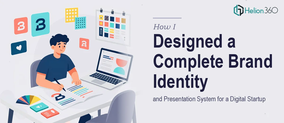
The Moment I Realized We Had a Real Problem on Our Hands
We were weeks out from our first major push to get our digital startup's story in front of potential partners and early customers. The brief seemed manageable on paper: pull together a presentation, some supporting graphics, and a brand package that made us look like we knew what we were doing. But when I actually mapped out what "cohesive and professional" meant in practice — slide layouts, data visuals, infographics, logo, business cards — I realized these weren't separate small tasks. They were one interconnected system, and every piece had to work with every other piece.
The stakes were real. First impressions with early-stage audiences are hard to recover from. A mismatched logo, inconsistent typography, or a slide deck that looked like it was assembled from three different templates would quietly signal that we weren't ready. I needed this done right, and I needed it done fast.
What I Found Out This Work Actually Requires
I spent a couple of days researching what a properly executed startup visual identity and presentation system actually involves. The list got long quickly.
A brand identity isn't just a logo. It's a visual brand identity kit — a defined color palette (typically 3 to 5 carefully chosen hex values), a typography pairing that works at display scale and body scale, spacing rules, and usage guidelines that keep everything consistent across every surface. Get any of that wrong and the logo looks fine in isolation but falls apart on a slide or a business card.
The presentation layer adds another dimension entirely. Slide masters need to be built so that the brand system propagates correctly across every layout. Infographics require a completely different skill set — information architecture decisions made before a single visual element is drawn. Custom charts need to be rebuilt from scratch to match the brand, not just recolored from defaults.
What I saw was a project requiring expertise across several disciplines simultaneously. That's not a weekend project for someone who doesn't do this every day.
The Work That Needs to Happen
The structural and narrative layer comes first, and it's where a lot of startup presentations quietly fail. A proper slide system starts with a content audit — identifying which messages need which formats (narrative slide, data slide, feature highlight, social proof) — and then mapping a story arc that carries the audience from problem to solution to proof without losing momentum. A well-structured deck typically uses a maximum of one primary message per slide, with a clear visual hierarchy running at 36pt title, 24pt subhead, and 16pt body. Getting that hierarchy to feel right across 20 or 30 different slide layouts takes real iteration, and collapsing it because a single slide feels crowded is one of the most common mistakes that makes decks look amateur.
The visual mechanics layer is where brand identity and presentation design intersect. A 12-column layout grid ensures that every element — text block, chart, image, icon — sits in consistent spatial relationships across the full deck. The brand color palette needs to be applied with discipline: typically no more than 4 active brand colors, with one dominant, one accent, and two neutrals. Typography choices need to be made and locked before layout begins, because changing a font family mid-build cascades through every master slide and requires hours of correction. Infographic design adds a further layer — each visual needs to communicate a specific relationship (part-to-whole, sequential, comparative) and the wrong chart type for the wrong relationship actively misleads an audience.
Polish and consistency across the full package — deck, logo, business card, graphics — is where the hours accumulate fastest. Brand application rules need to be enforced at the component level: icon sets must share a single stroke weight, color fills must reference the same hex values throughout, and spacing between elements must follow a defined unit system (commonly an 8px base grid). Someone unfamiliar with master slide architecture will find that a single layout adjustment breaks alignment across a dozen other slides. This is the layer that separates a presentation system that holds together from one that looks slightly off in ways the audience can't name but will feel.
Why I Brought in Helion360 to Handle It
I didn't attempt this myself. Looking at the full scope — brand identity system, presentation master build, infographic design, data visualization, and collateral — it was immediately clear that this was a full project requiring a team with the tooling and process already in place.
Helion360 handled the entire project end-to-end. That meant the brand identity work (logo, color system, typography rules), the full slide deck built on properly structured masters, the custom infographics and chart redesigns, and the collateral pieces — all executed as one coherent system, not as separate deliverables that had to be reconciled afterward.
What made the decision easy was speed. This work was turned around in a fraction of the time it would have taken me to learn the tools, make the decisions correctly, and execute without errors. Done in days, not weeks — which, given the timeline pressure we were working under, was the difference between showing up ready and showing up with something half-finished.
The Result, and What I'd Tell Anyone in the Same Position
What came back was a presentation system and complete visual brand system that held together as a single visual language. The deck looked like it belonged to the brand. The infographics communicated the right relationships without needing explanation. The logo translated cleanly to every surface. Early audiences noticed — not because the design was flashy, but because it was consistent and clear, which is what professional actually means at this stage.
If you're staring at a similar scope — a startup brand identity, a presentation system, or both at once — and you're honest about what doing it well actually requires, Helion360 is the team to engage. They delivered fast, handled the full execution depth this kind of work demands, and made it easy to show up ready.