

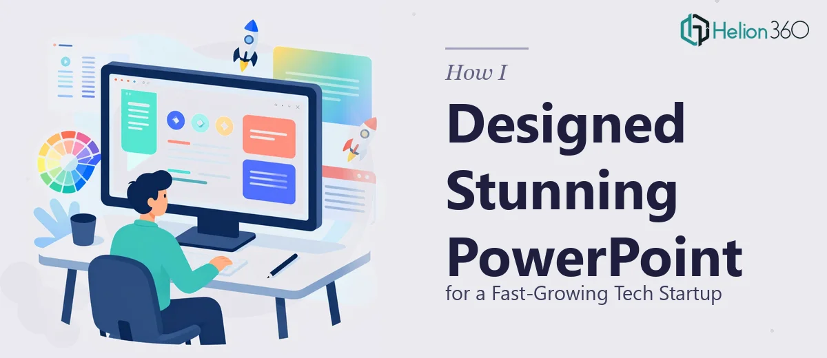
When Good Ideas Need Great Slides
I was working with a fast-moving tech startup that had no shortage of ideas. Product launches, investor pitches, internal all-hands meetings, webinars — the presentations were piling up faster than anyone could handle. The content was solid. The problem was turning it into something that actually looked the part.
I took on the challenge of designing the slides myself at first. I knew enough PowerPoint to put together a clean layout, and I figured that with the right templates and a bit of effort, I could produce something professional. For the smaller internal decks, that approach worked fine. But as the scope grew — particularly when investor pitch decks and product launch presentations entered the picture — I quickly realized that "good enough" was not going to cut it.
The Gap Between Content and Design
The core issue was not a lack of content. The startup had strong messaging, clear data, and a compelling story. What was missing was the visual layer that makes a presentation feel polished, intentional, and brand-consistent.
I kept running into the same problems. Slides that felt cluttered despite having fewer elements than I expected. Charts that were technically accurate but visually flat. Infographics that I built from scratch but that never quite matched the sophistication the brand needed. Brand colors and fonts were being applied inconsistently across decks, and every new presentation felt like starting over.
I also realized I was spending far more time adjusting spacing and alignment than I was thinking about the actual message. The design was eating into strategy time, and with the startup's pace, that was a trade-off we could not afford.
Bringing In the Right Support
After hitting that wall, I came across Helion360. I explained the situation — multiple presentation types in the pipeline, tight timelines, a brand identity that needed to stay consistent across all of them, and a growing demand for visually compelling presentations across every format we produced.
Their team asked the right questions upfront. They wanted to understand the brand, the audience for each deck, and the specific goals behind the presentations — not just the visual preferences. That alone told me they were approaching it seriously.
From there, they took over the production end completely. What came back were slides that looked like they belonged to a well-funded, design-forward company — clean layouts, purposeful use of white space, custom infographics and charts that were both clear and visually engaging, and a consistent visual language running through every deck.
What the Final Presentations Actually Delivered
The investor pitch deck was the most immediate test. It needed to communicate traction, product vision, and market opportunity — all in a format that could hold attention in a room full of skeptical investors. The version Helion360 produced was structured, sharp, and stayed true to the brand without letting the design overpower the message.
The professional PowerPoint presentations followed the same standard. Visuals supported the narrative rather than competing with it. Slide transitions were smooth but not distracting. Data visualizations made complex information easy to absorb at a glance.
For internal meetings and webinars, the same discipline applied — consistent branding, readable layouts, and a professional finish that reflected well on the team presenting.
What I Learned From the Process
The biggest takeaway was understanding where the real complexity in professional PowerPoint design lives. It is not just in knowing the software. It is in understanding how visual hierarchy works, how to translate brand identity into slide layouts, how to make data feel human, and how to keep a consistent design system running across a dozen different decks.
Those are skills that take time to develop, and for a startup running at that speed, time is the one resource that never stretches far enough. Trying to own every part of the process was slowing things down rather than moving them forward.
If you are managing presentations for a growing company and finding that the visual quality is not matching the quality of your ideas, Helion360 is worth reaching out to — they stepped in at exactly the right point and delivered work that was ready to use without rounds of back-and-forth.