

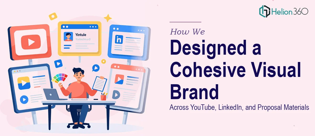
The Challenge
The client came to us with a clear but multifaceted need: their brand was showing up inconsistently across several high-visibility touchpoints — YouTube, LinkedIn, and client-facing proposals — and it was costing them credibility. Each channel had developed its own visual language in isolation, with no shared system tying them together. The real complexity lay not just in producing individual assets, but in engineering a cohesive visual identity that could flex across very different content formats while still feeling unmistakably like one brand. YouTube thumbnails demand bold, high-contrast compositions optimized for small-screen legibility. LinkedIn graphics require a more polished, professional aesthetic suited to a B2B audience. Proposal documents need to convey trust, authority, and attention to detail. Making all three feel like they came from the same creative mind — without any of them feeling forced or generic — was the core design challenge.
Our Approach
Helion360 began by establishing a unified visual foundation before touching a single deliverable. This meant auditing existing brand assets, defining a consistent typographic hierarchy, locking in a refined color palette, and setting rules for layout spacing and imagery treatment that could translate across all three formats. Rather than designing assets in isolation, the team worked from a shared design system that ensured every element — from a thumbnail headline to a proposal cover — drew from the same visual DNA. YouTube thumbnails were crafted for maximum click-through impact, using bold type, expressive imagery, and strong contrast. LinkedIn post graphics were designed to stop the scroll without sacrificing the professional tone the audience expected. Proposal documents were built to feel premium and structured, reinforcing the client's authority and attention to detail at every page turn. All creative was produced using provided briefs and imagery, with the design team translating raw inputs into polished, brand-aligned outputs at each stage.
The Outcome
The engagement delivered a fully cohesive visual brand system across three distinct content channels. The client received a suite of YouTube thumbnails optimized for viewer engagement, a set of LinkedIn post graphics aligned to their professional positioning, and redesigned proposal materials that presented the brand with clarity and confidence. Every deliverable shared the same typographic system, color language, and visual tone — giving the client a consistent identity that worked whether a viewer was scrolling a feed, clicking a video, or reviewing a proposal. The result was a brand that finally looked as intentional and professional as the work it represented.
Helion360 brings this same systems-thinking approach to every multi-channel design engagement — building visual identities that scale without losing coherence.