

The Challenge
The client was mid-rebrand — a critical, high-stakes moment where the wrong visual choices could fragment their existing audience while failing to attract the new one. They needed a unified visual identity system that covered a cohesive color palette, carefully selected typography, and a foundational set of website graphics. The core tension was balancing continuity with transformation: the new identity had to signal a meaningful shift in brand values without severing the visual thread that made them recognizable. Rebranding projects of this nature require more than aesthetic decision-making — they demand a strategic understanding of how color, type, and graphic language work together as a system, not as isolated elements.
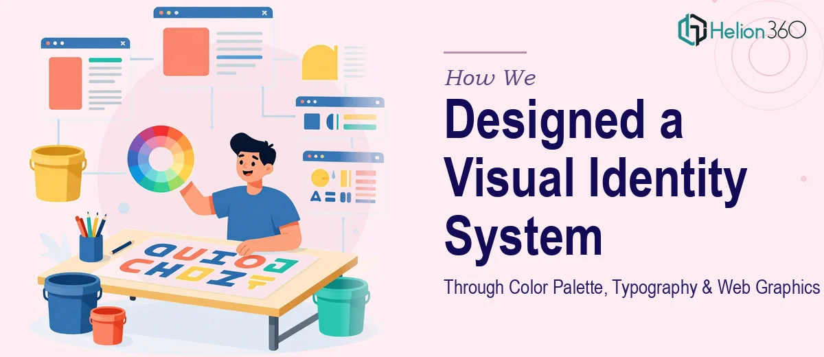
Our Approach
Helion360 began with a brand audit phase, reviewing the client's existing visual touchpoints to identify which elements carried equity worth preserving and which needed to be retired. From there, the team developed a curated color palette anchored by a primary brand color with carefully balanced secondary and accent tones — each chosen for both emotional resonance and digital accessibility. Typography selection followed a dual-typeface logic: a strong display font to carry brand personality in headlines and a highly legible body typeface for web readability. Every font pairing was tested across mockups to ensure visual harmony at multiple scales. The web graphics phase translated the palette and type choices into a suite of reusable interface assets — section backgrounds, iconographic elements, and supporting graphic motifs — built to maintain consistency across the client's digital presence. Throughout the process, design decisions were documented in a structured reference framework so the client's internal team could apply the system independently going forward.
The Outcome
The final deliverable was a complete visual identity system encompassing a five-tone color palette with defined usage rules, a two-typeface typographic system with hierarchy guidelines, and a set of web-ready graphics designed for immediate deployment across the client's website. The brand's new visual language successfully honored its legacy while clearly articulating its evolved positioning — giving stakeholders, designers, and developers a single, reliable system to work from. The client left the engagement with a production-ready identity toolkit and the confidence that their digital presence would speak with one coherent visual voice.
Helion360 regularly supports brands at pivotal rebranding moments, translating strategic intent into visual systems that are both distinctive and scalable.