

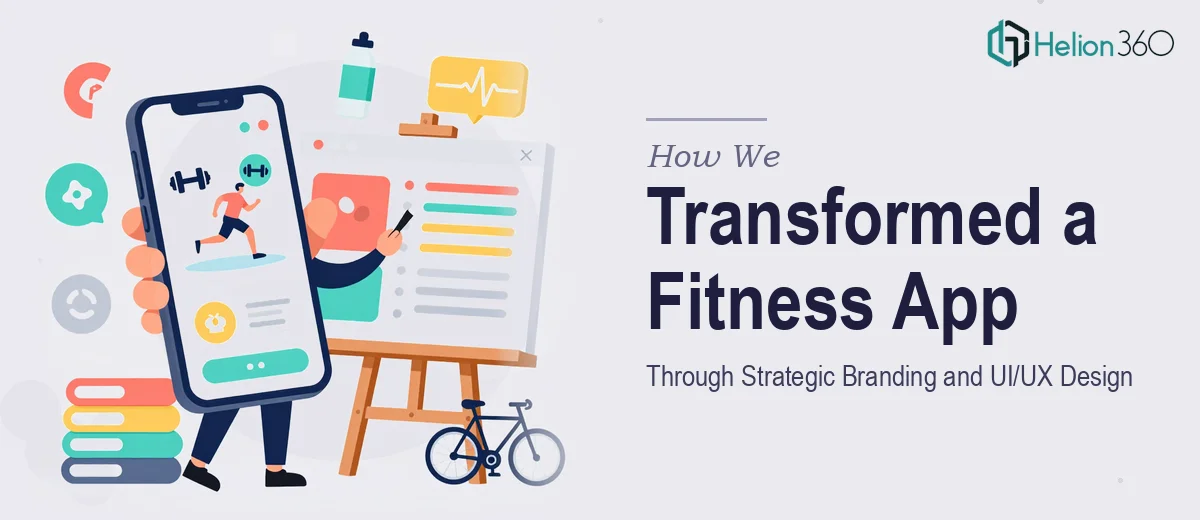
The Challenge
A rapidly growing technology company based in Silicon Valley came to us with a familiar but complex problem: their fitness lifestyle app and accompanying website had outgrown their original visual identity. The brand no longer reflected the energy, values, or ambition of the product — and inconsistencies across the digital touchpoints were quietly eroding user trust and engagement. The client needed more than a cosmetic refresh. They required a unified branding strategy, an intuitive and accessible user experience across both the web and mobile app, and a visual design language capable of resonating with a fitness-conscious audience that has high aesthetic standards. Delivering all three disciplines in sync, without disrupting an already active product, made this a genuinely layered creative challenge.
Our Approach
Helion360 approached this engagement as an integrated brand and product design project rather than treating branding, UI/UX, and graphic design as separate workstreams. The team began with a brand audit — examining the existing identity, competitor positioning in the fitness and wellness space, and the emotional language the client wanted to own. From there, a new brand direction was established, anchoring the visual system around clarity, motivation, and accessibility. The UI/UX work followed a structured process: user flow mapping, wireframing key screens for both the app and website, and iterative prototype reviews to ensure the interface felt natural and reduced friction at every step. Typography, color systems, and iconography were developed in parallel so that every interface decision reinforced the broader brand story. The graphic design layer wove these elements together across marketing-facing surfaces, ensuring consistency from the app's onboarding screen all the way through to the website's hero sections.
The Outcome
The result was a fully cohesive digital presence — a redesigned website and fitness app UI that shared a single, confident visual language. The client received a complete brand identity system, revised UI component library, high-fidelity screen designs for the app, and production-ready web layouts. Navigation was simplified, visual hierarchy was strengthened, and the overall experience was made significantly more accessible across device types. The brand now communicates the energy and credibility expected of a Silicon Valley product competing in the fitness lifestyle market. Internal stakeholders reported stronger alignment between the brand's mission and how it presents to users, and the design system put in place gave the product team a scalable foundation for future feature development.
If you are looking to align your digital product's visual identity with the experience your users actually deserve, Helion360 brings the strategic and creative depth to make that transformation cohesive and lasting.