

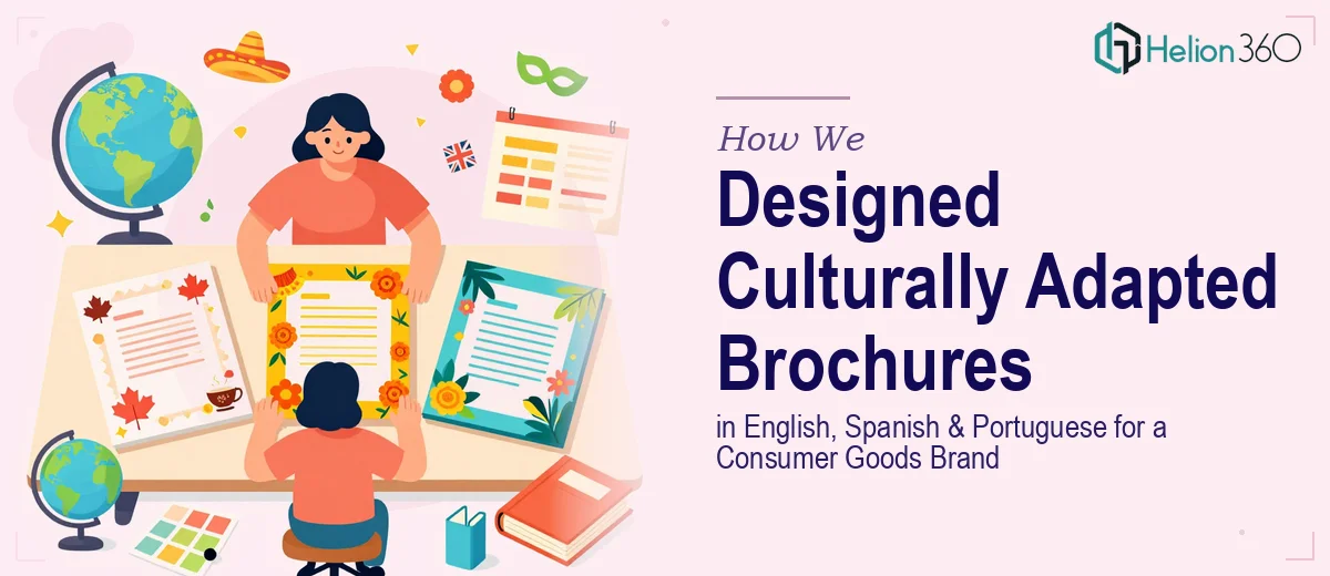
The Challenge: One Product, Three Markets, Zero Cultural Nuance
Our client, a fast-growing consumer goods brand expanding across North America and Latin America, had a problem that many scaling companies face: they had a single product brochure written in English and machine-translated into Spanish and Portuguese. The results were flat, off-brand, and — in several instances — culturally tone-deaf. Their sales teams in Mexico, Brazil, and Colombia were quietly shelving the materials because they simply didn't resonate with local buyers.
They came to Helion 360 with a clear mandate: rebuild their product brochure suite from the ground up for three distinct audiences — English-speaking North American consumers, Spanish-speaking Latin American markets, and Portuguese-speaking Brazilian consumers — without losing brand cohesion across all three.
Our Approach: Culture-First, Then Copy, Then Design
Discovery and Cultural Audit
We began with a structured cultural audit of the existing materials, working alongside native-fluent copywriters and regional market consultants for each target language. This wasn't just a translation review — we examined imagery choices, color psychology by region, idiomatic expressions, formality levels, and purchasing motivators that differ meaningfully between a buyer in São Paulo, Mexico City, and Chicago.
Messaging Architecture by Market
Rather than translating one master document, we built three distinct messaging frameworks. The English version led with efficiency and innovation — values that resonate with North American B2C buyers. The Spanish version leaned into trust, family benefit, and community value, reflecting the relational purchasing culture prevalent across many Spanish-speaking markets. The Portuguese (Brazilian) version emphasized aspiration, lifestyle elevation, and a warmer, more conversational tone consistent with Brazilian communication norms.
Design Adaptation
Visual localization was equally intentional. We adapted photography direction, layout hierarchy, and typographic choices for each version. The Brazilian Portuguese brochure used warmer color palettes and more expressive visual storytelling. The Spanish version balanced vibrancy with approachability. The English version maintained a cleaner, more minimal aesthetic aligned with North American design expectations. Every version passed through a regional design review before final production.
Production and Delivery
We delivered print-ready PDFs optimized for both professional offset printing and digital distribution, along with editable source files in Adobe InDesign for each language version. A short style guide was also produced to help the client's internal team maintain cultural consistency in future updates.
The Outcome
The client's regional sales teams reported an immediate improvement in how prospects received the new materials. The brochures were no longer being set aside — they were being actively used as conversation starters in sales meetings. The client subsequently commissioned two additional product line brochures using the same culturally adapted framework we established.