

The Challenge
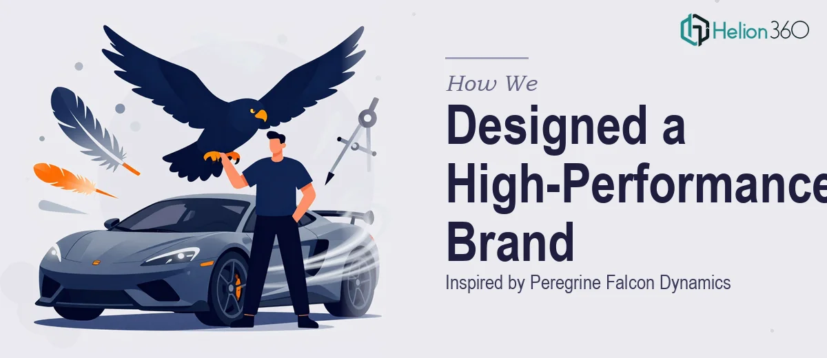
A high-performance automotive parts brand came to us with a clear but demanding vision: build a complete brand identity that would communicate speed, precision, and agility — while still carrying an air of sophistication that separates premium engineering brands from the pack. The creative brief centered on the peregrine falcon, the fastest animal on earth, as the conceptual anchor. Translating a natural phenomenon into a scalable, commercially viable brand system is a nuanced challenge. The identity needed to work seamlessly across digital touchpoints such as social media profiles and product pages, as well as physical applications including packaging and labels — all while maintaining visual consistency without becoming rigid or generic.
Our Approach
Helion360 began with deep conceptual research into the peregrine falcon's physical characteristics — its swept-wing silhouette, tapered precision, and the aerodynamic geometry that defines its dive. These visual cues became the structural language of the logo mark. Rather than creating a literal bird illustration, the team abstracted the falcon's form into a sharp, angular emblem that reads as both speed and authority at a glance.
From there, the design direction expanded into a full brand identity system. Typography was selected to reflect the same balance of precision and power — clean lines with enough weight to command attention in industrial contexts. The color palette drew from high-performance aesthetics: deep matte tones grounded in engineering credibility, contrasted with a sharp accent hue that mirrors the falcon's intense, focused energy. Every element of the system was tested across mockup environments — social media profiles, product packaging, and branded collateral — to ensure scalability and consistency at every size and application.
The Outcome
The final deliverable was a complete visual identity system built around the peregrine falcon concept, including a primary logo mark, alternate logo configurations, a defined color palette, typography system, and usage guidelines ensuring the brand could be applied consistently across all mediums. The client received a brand that genuinely reflects their product philosophy — cutting-edge performance wrapped in visual elegance — and a system flexible enough to grow with the company as it scales into new markets and product lines.
Helion360 brings the same level of conceptual rigour and design craft to every branding engagement, whether the brief calls for nature-inspired symbolism or pure geometric abstraction.