

The Challenge
An emerging artisanal olive oil boutique came to us with a clear ambition but a blank canvas: they needed a complete brand identity built from the ground up — one that could communicate natural quality, culinary sophistication, and premium positioning all at once. The challenge was layered. The logo had to be distinctive enough to command shelf space in specialty retail, yet refined enough to translate seamlessly across digital storefronts, business cards, and website headers at any scale. The packaging needed to do even more — it had to evoke freshness, purity, and an artisanal heritage while remaining commercially functional and production-ready. In a category where branding often defaults to predictable Mediterranean clichés, the client wanted something genuinely modern and differentiated.
Our Approach
Helion360 began by establishing the brand's visual language through a deep exploration of the client's positioning — a boutique olive oil offering that speaks equally to health-conscious consumers and culinary enthusiasts. The team developed a mood direction rooted in earthy, warm tones balanced with clean modern geometry, avoiding the overused rustic tropes of the category. A versatile logo mark was designed with scalability at its core, tested across multiple sizes and formats to ensure legibility from bottle label to favicon. The packaging concept was developed in parallel, with careful attention to material feel, label hierarchy, and the emotional resonance of colour and texture. Typography was selected to carry a sense of quiet confidence — elegant without being ornate. Every element was designed as part of a cohesive system, ensuring the brand would hold together whether experienced in a boutique store or an online product listing.
The Outcome
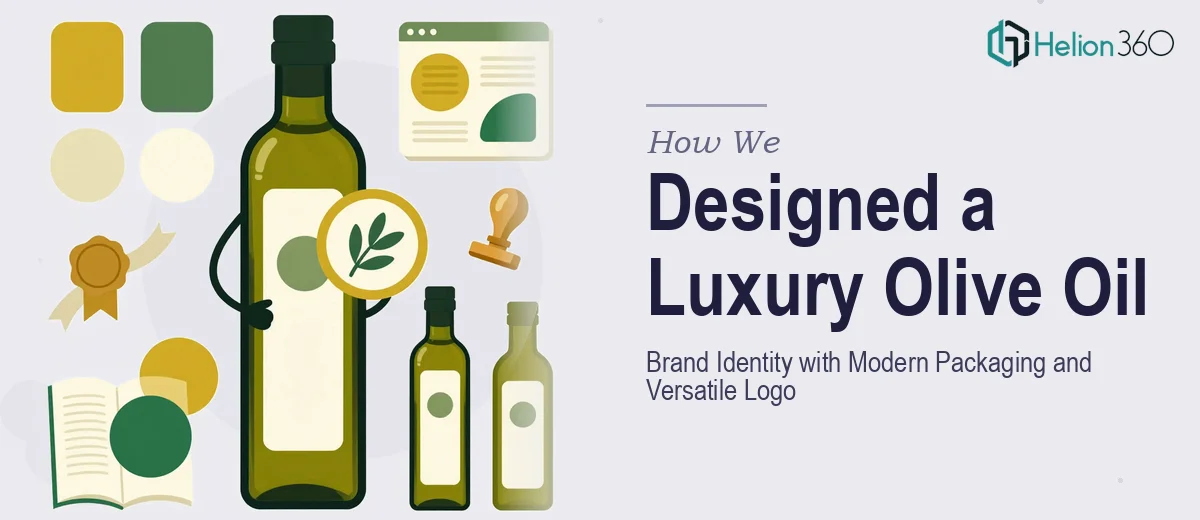
The final deliverables included a primary logo with multiple format variants, a complete visual brand identity system, and fully designed packaging artwork ready for production. The brand identity captured the natural and luxurious essence of the product while standing apart visually from competitors in the premium food segment. The packaging design used a considered palette of warm greens, deep golds, and soft neutrals — evoking the Mediterranean origin of the product without relying on cliché. The logo performed cleanly at every scale, from a 16px favicon to a full-width banner, giving the client a flexible asset they could deploy immediately across all channels.
Helion360 delivered a brand system that was not only visually compelling on launch day but built to grow with the business as it expands its product range and retail presence.