

The Challenge
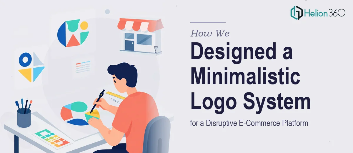
A small creative agency building a disruptive e-commerce platform needed a logo that could do more than just look good — it had to communicate the brand's core values of simplicity, innovation, and reliability at a glance. The brief called for a minimalistic, geometric aesthetic that would resonate with a tech-savvy audience accustomed to clean, modern design. Complicating the project was the dual requirement: two distinct logo variations, one featuring the brand name in bold standalone typography and another where the name was subtly embedded within the geometric composition itself. The final deliverables also needed to include a complete brand guidelines document, making consistency scalable across every digital and physical touchpoint from launch day forward.
Our Approach
Helion360 began with a deep-dive into the brand's positioning — a platform targeting design-literate consumers who expect visual refinement alongside functional innovation. The design direction centered on geometric primitive forms: circles, triangles, and angular compositions that implied precision and forward momentum without visual clutter. Each shape choice was intentional, reflecting the brand's emphasis on structural simplicity and technological credibility.
Rather than treating the two logo variations as separate executions, the team developed them as a unified system. The wordmark variation used a custom-weight bold typeface that balanced authority with approachability, while the integrated mark cleverly merged letterforms with the geometric icon to create a seamless, memorable symbol. Color exploration focused on a restrained, contemporary palette — avoiding trend-chasing in favor of tones that would age well and maintain contrast across digital interfaces, packaging, and marketing materials.
The deliverables were packaged in high-resolution formats including PNG and SVG, ensuring the client could deploy the logo across web, mobile, and print without degradation. The brand guidelines document covered color palette specifications with hex, RGB, and CMYK values, approved typeface pairings, clear spacing and exclusion zone rules, and guidance on correct and incorrect logo usage across backgrounds.
The Outcome
The client received a complete, launch-ready logo system comprising two polished logo variants alongside a comprehensive brand guidelines document. The geometric mark successfully captured the platform's identity as a modern, innovation-driven e-commerce brand without relying on visual noise or complexity. The guidelines empowered their internal team and future vendors to maintain visual consistency as the brand scaled — a critical asset for any company entering a competitive digital marketplace.
Helion360 delivers brand identity work that is built not just for aesthetics, but for long-term scalability and strategic coherence across every brand expression.