

The Challenge
A trading card game creator came to us with a rich creative vision: a fantasy-themed game built around mythical creatures and enchanted realms, but without the visual identity to bring it to life. The ask was not simply to design a single logo — it was to create five distinct yet cohesive logo systems, each representing a different mythological creature: a phoenix, a griffin, a unicorn, a mermaid, and an elf. Each design needed to work both as a standalone primary icon and as an in-game card element, meaning it had to hold visual weight at multiple sizes and contexts. On top of that, each logo needed to carry the game's official color palette of light blue and gold while also incorporating subtle mechanical references — a spell icon for magic-based cards and a weapon icon for attack-based cards — so that players could identify card types at a glance. Balancing fantasy illustration, brand consistency, and functional game design logic within a single visual system was the core design challenge.
Our Approach
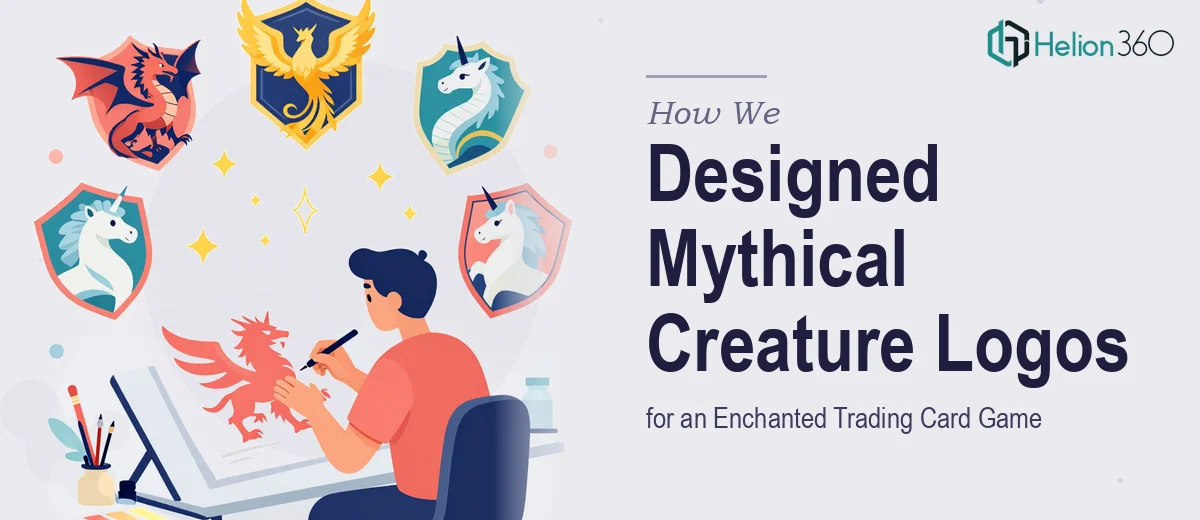
Helion360 began by establishing a unified visual language before touching any individual creature concept. The team defined a shared design grammar — stroke weight, icon proportion, symbol placement conventions, and how the light blue and gold palette would interact across dark and light card backgrounds. From this foundation, each of the five creature logos was developed as its own expressive identity while remaining unmistakably part of the same game world. The phoenix was rendered with upward-sweeping forms and warm gold gradients to evoke rebirth and fire; the griffin balanced power and nobility through symmetrical crest geometry; the unicorn leaned into flowing line work and soft luminosity; the mermaid used fluid, wave-integrated forms to ground her in both water and magic; and the elf carried an angular elegance that hinted at ancient knowledge. Throughout each design, the mechanical icons — spell and weapon — were embedded as compositional elements rather than afterthoughts, woven into the creature's silhouette or surrounding frame so they felt native to the artwork rather than stamped on.
The Outcome
The final delivery comprised five fully realized 2D logo systems, each exported in formats suitable for card printing, digital gameplay interfaces, and promotional materials. Every logo functioned independently as a primary icon and scaled cleanly for use within card layouts. The shared palette and icon grammar created instant visual coherence across the full creature roster, giving the game a polished, world-ready identity that matched the client's vision of wonder and magic. The embedded spell and weapon indicators resolved a key usability need, helping players recognize card types without disrupting the artwork.
Helion360 works with game creators, entertainment brands, and visual storytellers who need design systems that are both beautiful and functional — reach out if you are building something similar.
Related work: