

The Challenge
An automotive repair shop owner came to us with a clear vision but a challenging brief: create a logo and physical signage that embodied the rugged, boundary-pushing spirit of outlaw culture while remaining polished enough to attract a discerning clientele. The design had to walk a fine line — bold and edgy without veering into kitsch, vintage in feel without looking dated, and distinctive enough to make passing customers stop and take notice. The owner had already established a general color direction and conceptual references rooted in vintage motorcycles, open-road iconography, and classic American rebelliousness, but translating that emotional language into a cohesive, scalable brand mark was the real creative challenge.
Our Approach
The team began by immersing itself in the visual vernacular of outlaw culture — studying everything from hand-lettered 1950s garage signage to the graphic traditions of custom chopper culture and hot rod aesthetics. Rather than borrowing surface-level clichés, the goal was to distill the underlying design principles that made that era feel timeless: weighted typography, raw textures, deliberate imperfection, and commanding silhouettes.
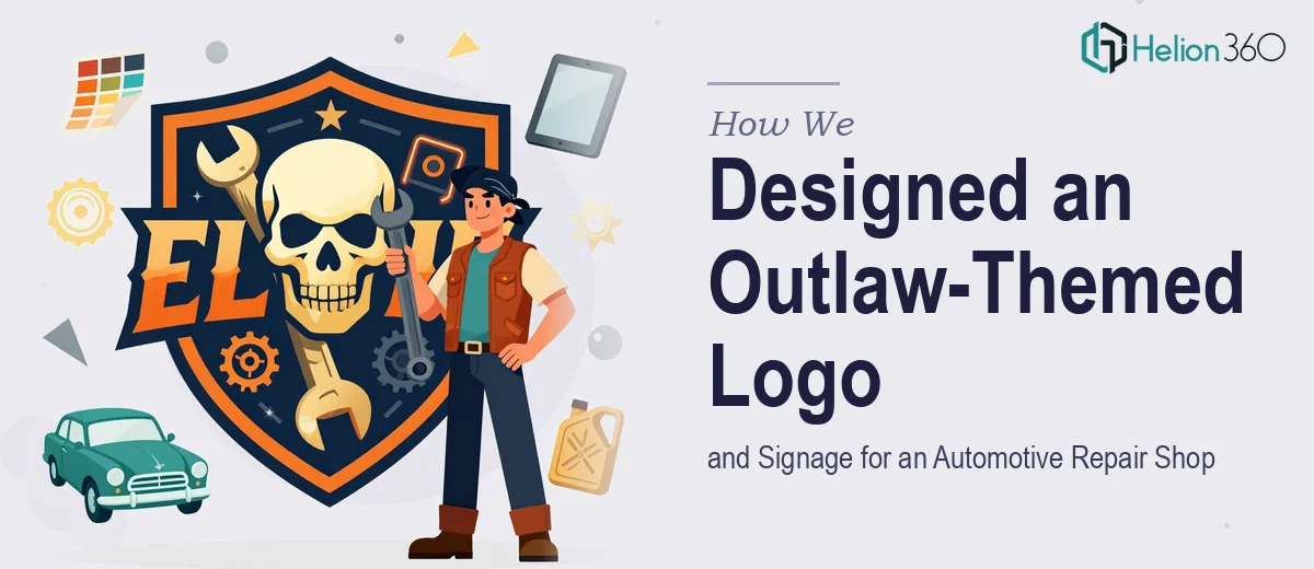
The logo concept was built around a strong central mark — a badge-style composition that referenced vintage road culture while incorporating subtle automotive details. Typography was selected to balance masculine weight with enough refinement to feel premium. Color choices leaned into a controlled, high-contrast palette that would hold up across both digital applications and large-format physical signage. Once the core logo was locked, the team adapted it into a full signage layout, accounting for viewing distance, fabrication constraints, and the physical environment of the shop exterior.
The Outcome
The final deliverables included a fully resolved primary logo, alternate orientation variants for different use contexts, and a signage design prepared for physical production. The mark struck the precise tonal balance the client had envisioned — something that reads as authentically outlaw without being inaccessible, and that communicates craftsmanship and confidence from the moment a customer pulls into the parking lot. The shop now has a brand presence that sets it apart from generic repair shop aesthetics and gives its loyal customer base something they can genuinely identify with.
Helion360 approaches niche brand identity projects like this with the same rigor applied to enterprise work — because whether the canvas is a Fortune 500 rebrand or a single-location auto shop, the craft of building a brand that resonates is exactly the same.