

The Challenge
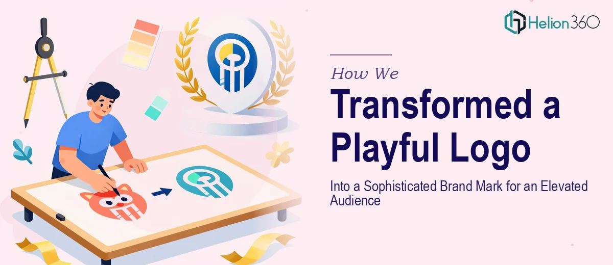
The client came to us with a logo they genuinely loved — one that had already earned positive reception since its launch. The problem was that the brand had evolved. As their target audience aged up and the brand positioned itself in a more premium, high-end space, the existing logo's playful, cartoon-like aesthetic had become a liability rather than an asset. The challenge was delicate: preserve the character and uniqueness that made the original logo memorable, while stripping away the qualities that felt too informal or juvenile for the brand's new direction. Getting that balance right demanded both strategic thinking and refined visual craft.
Our Approach
Helion360 began by conducting a thorough audit of the existing logo — studying its forms, proportions, color palette, and illustrative style to understand exactly what was working and what was pulling the mark toward the cartoon spectrum. The team identified specific elements that carried the brand's core identity and could be retained in a more mature form. From there, a redesign direction was developed that shifted the logo toward cleaner geometry, more considered typography, and a refined color application — all while preserving the distinctive qualities that made the original recognizable. Multiple concept directions were explored to ensure the final result felt elevated without losing the brand's personality. Each iteration was reviewed against the client's stated brand values and their target audience profile to keep the work anchored in strategic purpose rather than aesthetic preference alone.
The Outcome
The final deliverable was a revised logo that successfully bridged the gap between the brand's creative roots and its premium market positioning. The cartoon-like qualities were replaced with sophisticated linework, a more restrained color palette, and typographic choices that communicated confidence and quality. The revised mark retained enough visual continuity to feel like a natural evolution rather than a complete rebrand, protecting the equity already built with the existing audience. The client received a brand mark that could credibly represent them in high-end contexts — whether on premium packaging, professional presentations, or upscale digital environments — while still standing apart from generic corporate design.
Helion360 works with brands at exactly this kind of inflection point — where the visual identity needs to grow up alongside the business without losing what made it compelling in the first place. Explore how we've helped other brands achieve similar transformations in our logo redesign work.