

The Challenge
The client came to Helion360 with a clear but demanding brief: their existing logo no longer reflected where the company stood or where it was headed. They needed a complete logo redesign that communicated innovation, reliability, and forward-thinking — three values that are easy to articulate but notoriously difficult to translate into visual form. The added complexity was versatility. The new logo had to perform equally well across digital platforms, social media profiles, app interfaces, printed signage, merchandise, and corporate collateral. Designing a mark that holds its integrity at every scale and across every medium requires a precise command of form, color, and typography — and that is exactly what made this project a meaningful design challenge.
Our Approach
Helion360 began with a structured discovery phase, reviewing the client's industry positioning, competitive landscape, and target audience to ensure the creative direction was grounded in strategic intent rather than aesthetic preference alone. The team developed multiple distinct logo concepts, each exploring a different visual language — from geometric precision that signals reliability to dynamic forms that convey forward momentum. Every concept was accompanied by a written rationale explaining the thinking behind the form, the color palette selection, and the typographic choices, giving the client full visibility into the creative process.
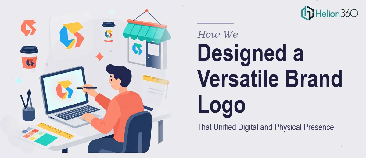
Color theory was applied deliberately across all concepts. Palette decisions were made with digital rendering and print reproduction in mind simultaneously, ensuring consistent brand perception whether the logo appeared on a retina display or an embossed business card. Typography was selected for both character and function — balancing personality with legibility at small sizes. Each concept was also presented in multiple mockup environments to demonstrate real-world versatility before any direction was locked in.
The Outcome
The engagement produced a refined, production-ready logo system that the client could immediately deploy across all brand touchpoints. The final mark successfully unified the company's digital and physical presence under a single, coherent visual identity — one that communicates professionalism and forward-thinking at a glance. The client received the complete logo suite including variations for light and dark backgrounds, horizontal and stacked lockups, and monochrome versions for specialized print applications. Delivered within the two-week timeline, the redesign gave the brand a visual foundation strong enough to support its next stage of growth.
Helion360 brings the same strategic and craft-driven approach to every brand identity engagement — ensuring that what looks good also works hard across every context where your brand shows up.