

The Challenge
Vipers Netball Club, based in the coastal town of Vilamoura, Portugal, had built a passionate and growing community around a sport they love — but their visual identity was not keeping pace with the energy and ambition of the organisation. The club needed a logo that could do more than identify them; it needed to embody the values of teamwork, agility, and inclusive sporting culture that define netball at every age and ability level. The challenge was not simply a cosmetic refresh. The redesign had to feel authentic to an international sports community, resonate with both players and supporters, and hold its own across a wide range of applications — from jerseys and signage to digital platforms and social media. Translating intangible qualities like spirit and dynamism into a single, cohesive visual mark required both strategic thinking and refined design craft.
Our Approach
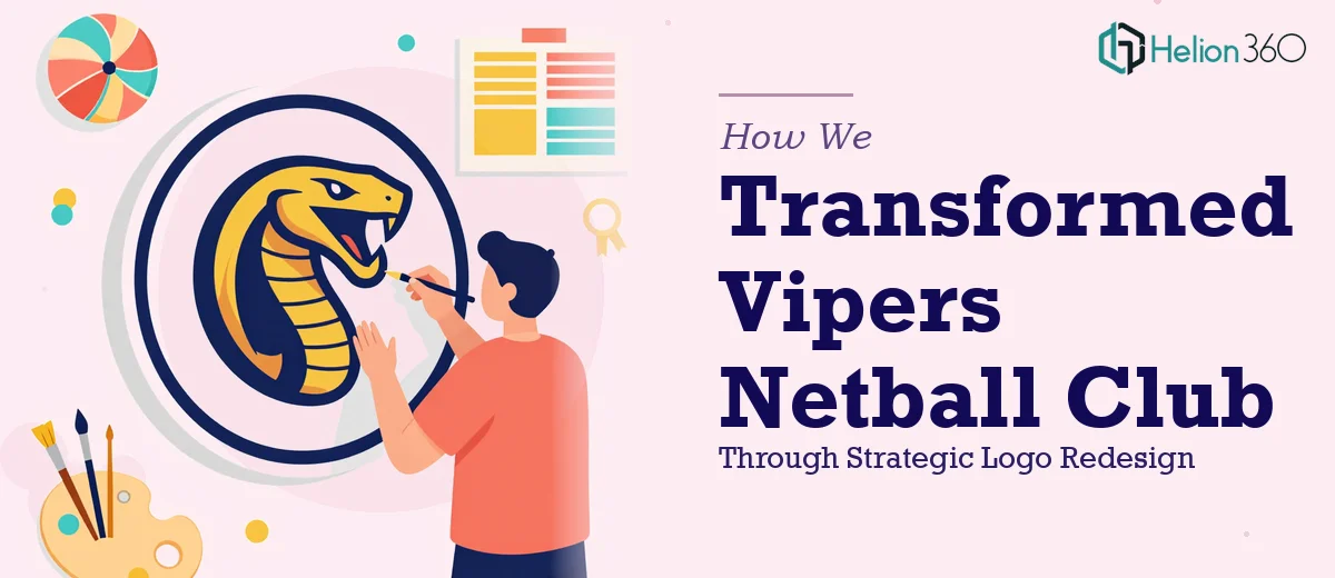
Helion360 began the project by conducting a thorough exploration of the club's values, audience, and competitive landscape within community sports branding. The team developed an understanding of what makes netball visually distinct — its speed, precision, and collective energy — and used that as the foundation for the conceptual direction. Multiple logo concepts were developed, each exploring different visual metaphors for movement and unity, with careful attention to typographic hierarchy, colour psychology, and scalability. The chosen direction brought together a bold, confident mark that referenced both the viper's precision and the fluid athleticism of the sport. Colour palettes were selected to feel vibrant and contemporary without sacrificing the legibility and versatility needed across merchandise and digital formats. Every iteration was refined against practical use-case testing to ensure the final mark worked equally well at small scale on a wristband and large scale on a banner.
The Outcome
The final logo delivered to Vipers Netball Club was a complete, production-ready brand mark — confident in form, flexible in application, and deeply connected to the club's identity. The redesigned logo gave the club a visual language capable of representing them at local competitions, on social media, and across all printed materials with consistency and pride. The new identity was met with strong enthusiasm from the club's membership and leadership, reinforcing the sense of belonging and community that sits at the heart of the organisation. The result was not just a new logo, but a renewed sense of visual purpose for a sports club ready to grow.
Helion360 brings the same strategic depth and design precision to every branding project — whether for a community sports club or a global organisation.