

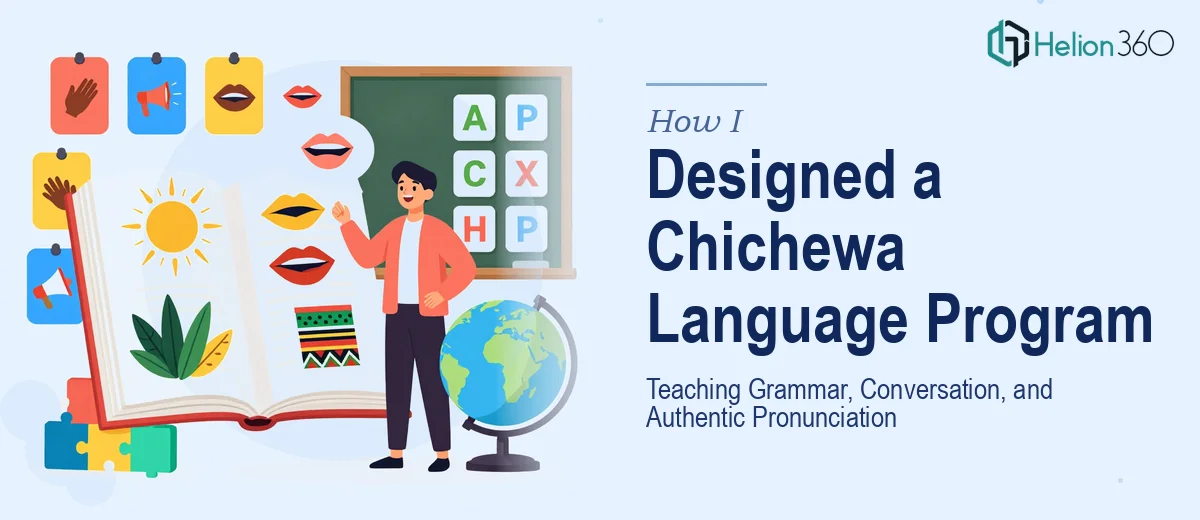
When Teaching a Language Means More Than Writing a Script
I was brought onto a project that seemed straightforward at first: build a structured language program to teach Chichewa, the Bantu language spoken predominantly in Malawi, to a group of students who had no prior exposure to it. The goal was to cover grammar fundamentals, everyday conversational skills, and — perhaps the trickiest part — authentic Chichewa pronunciation.
I have experience putting together educational content, but this assignment was different. Chichewa has tonal qualities and sound patterns that do not map cleanly onto English phonetics. Designing a curriculum was one thing. Turning that curriculum into a presentation format that students could actually learn from — something that felt structured, visually clear, and easy to follow lesson by lesson — was another challenge entirely.
The Complexity of Chichewa Grammar and Pronunciation
I started by mapping out the program structure. Chichewa grammar relies heavily on noun classes and agreement markers, which means even a basic sentence requires understanding how verbs and adjectives adjust depending on the category of the noun. For students learning from scratch, that is a steep entry point.
Pronunciation added another layer. Chichewa has sounds that English speakers find unfamiliar — particular vowel-consonant combinations and syllable stress patterns that need to be heard, not just read. I knew early on that the presentation materials would need to do more than list vocabulary. They needed to visually guide learners through the phonetic logic of the language, alongside the grammar and conversational content.
I drafted initial slides covering basic greetings, noun class tables, and common sentence structures. The content was solid. The visual execution was not. My slides were dense, inconsistently formatted, and did not have a design rhythm that a student could follow from lesson to lesson.
Bringing in Design Support
After a few rounds of revisions that were not closing the gap, I reached out to Helion360. I explained the scope — a multi-lesson Chichewa language presentation covering grammar, pronunciation guides, and conversational exercises — and shared the draft materials I had already built. Their team reviewed everything and came back with a clear plan.
They reorganized the slide architecture so each lesson followed the same visual pattern: an introduction section, a core grammar or vocabulary block, pronunciation callout slides, and a practice dialogue segment. That consistency made the program feel like a real course rather than a collection of slides.
For the pronunciation components, they designed dedicated slide layouts that highlighted syllable stress, phonetic breakdowns, and audio cue indicators — visual markers that would work alongside recorded pronunciation examples. The grammar tables became clean, scannable grids instead of text-heavy boxes. Conversational scripts were formatted like dialogue cards, making role-play exercises easy to follow on screen.
What the Final Program Looked Like
Helion360 delivered a presentation that felt genuinely purpose-built for language education. The Chichewa language content I had written was now wrapped in a business presentation design services system that made it accessible — each slide had enough breathing room, the typography was readable at various screen sizes, and the color coding helped students distinguish between grammar notes, vocabulary, and pronunciation guidance at a glance.
The program covered around forty slides across six structured lessons, moving students from basic greetings and introductions through verb conjugation, noun class logic, and full conversational exchanges. The pronunciation slides were some of the most effective — they gave students a clear visual reference point for sounds that are genuinely difficult to describe in text alone.
For a project rooted in Malawian culture and language, having materials that looked polished and intentional also mattered. It signaled respect for the subject. Students take their learning environment seriously, and a professional presentation template communicates that the content is worth their attention.
What I Took Away from This
Building a Chichewa language program taught me that curriculum design and presentation design are not the same skill set. The linguistic content needs expert handling, but so does the visual structure that delivers it. When those two things work together, the result is something students can genuinely engage with.
If you are working on a language program, cultural education deck, or any subject-matter-heavy presentation that needs to be both accurate and visually functional, Helion360 is worth reaching out to — they took a complex, content-dense project and turned it into something that actually works in the classroom.